Siid.com
Siid is an all-in-one solution for order management and shipping that is geared toward assisting small and medium-sized eCommerce businesses streamline the shipping process.
Founding / Lead Product Designer
World Options, UK
2020-21
Siid.com
Siid is an all-in-one solution for order management and shipping that is geared toward assisting small and medium-sized eCommerce businesses streamline the shipping process.
Founding / Lead Product Designer
World Options, UK
2020-21
Siid.com
Siid is an all-in-one solution for order management and shipping that is geared toward assisting small and medium-sized eCommerce businesses streamline the shipping process.
Founding / Lead Product Designer
World Options, UK
2020-21
↓ Leading the Design of Siid.com
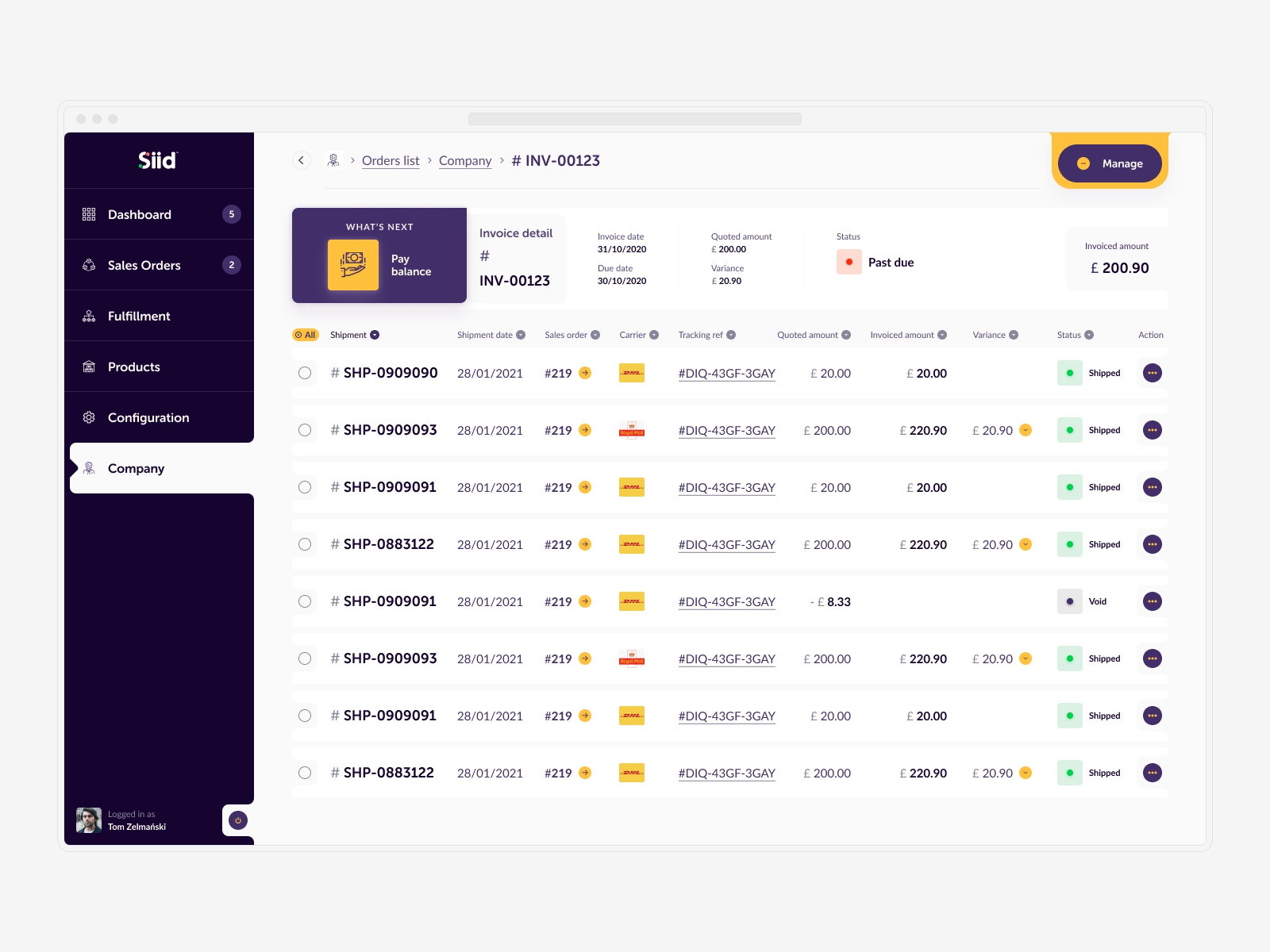
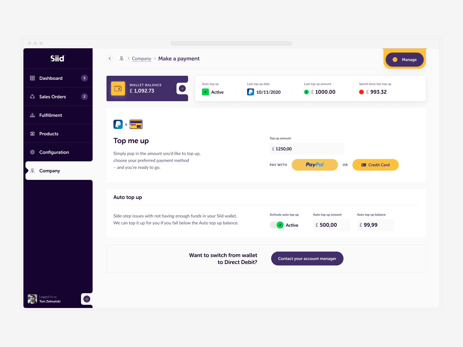
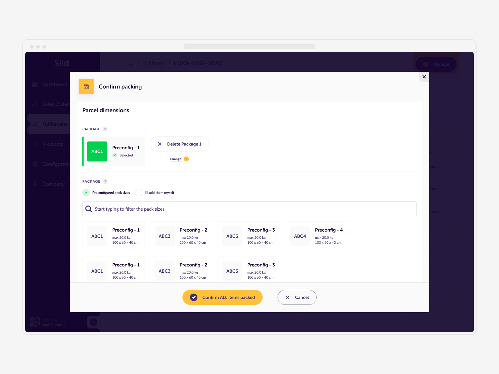
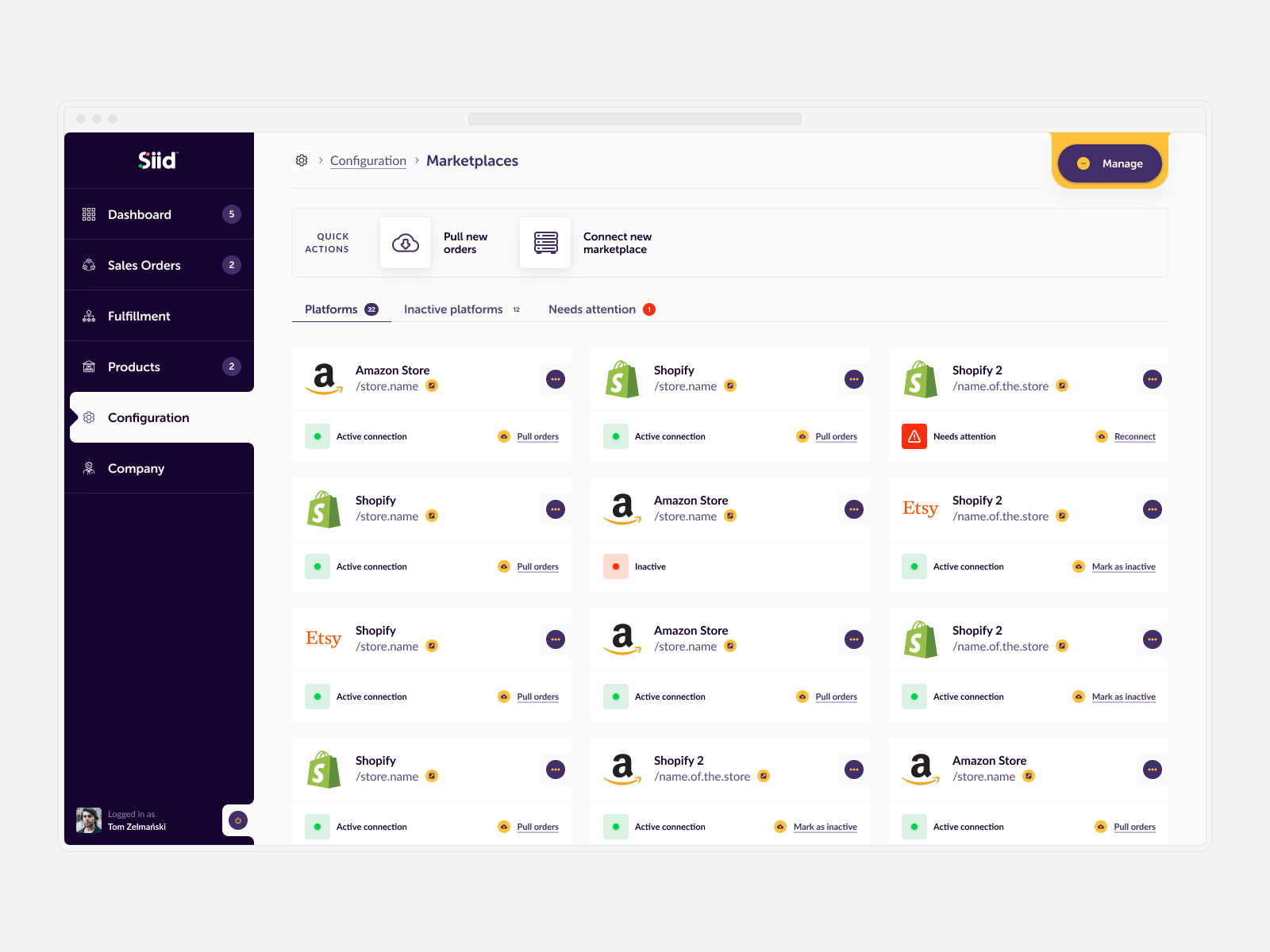
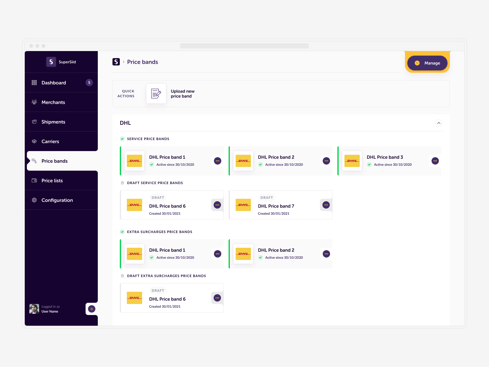
Between October 2020 and November 2021, I worked on designing the Siid.com web app. As the Founding Product Designer, I was responsible for multiple aspects of the project, from the initial workshops and ideation process to the preparation of comprehensive design system documentation.
My role also involved overseeing the work of developers, ensuring seamless collaboration, and creating a roadmap for future releases. This holistic approach allowed us to build a robust and user-friendly web app, laying a strong foundation for ongoing innovation and improvement.
↓ From Single-Sentence Idea to Shipped Product
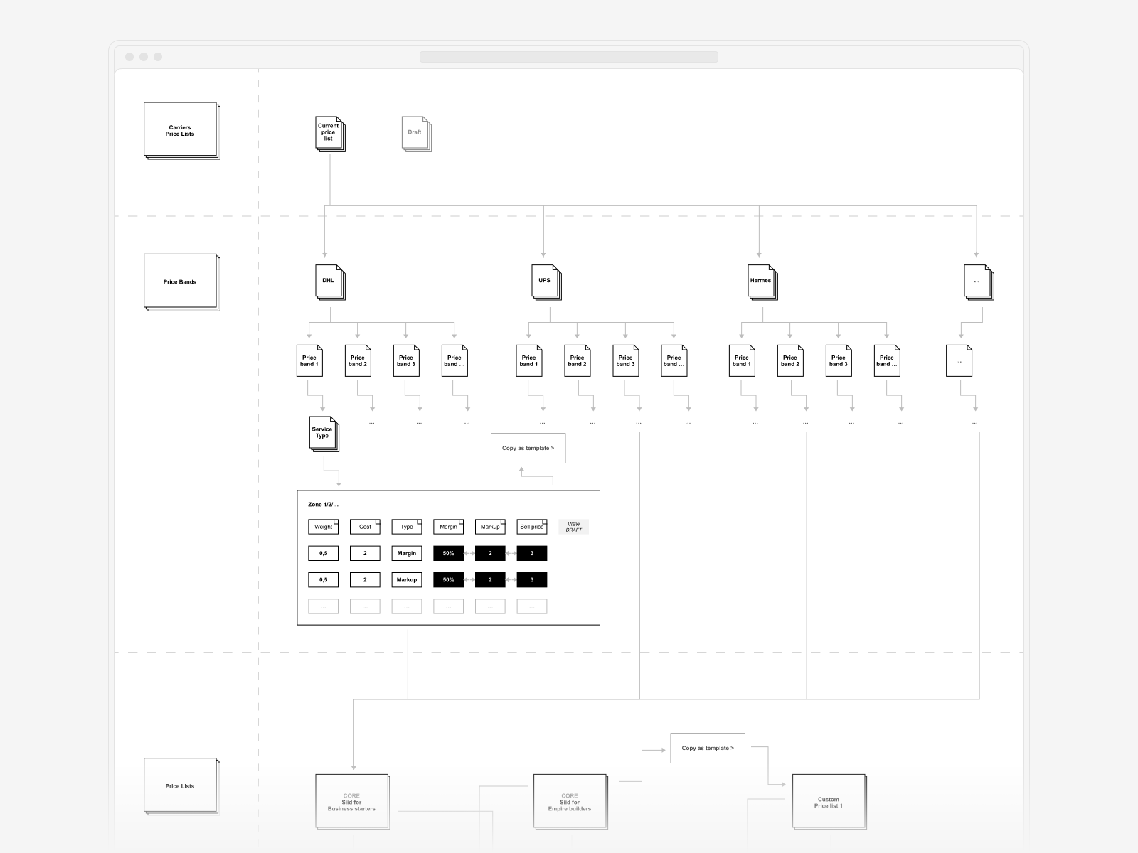
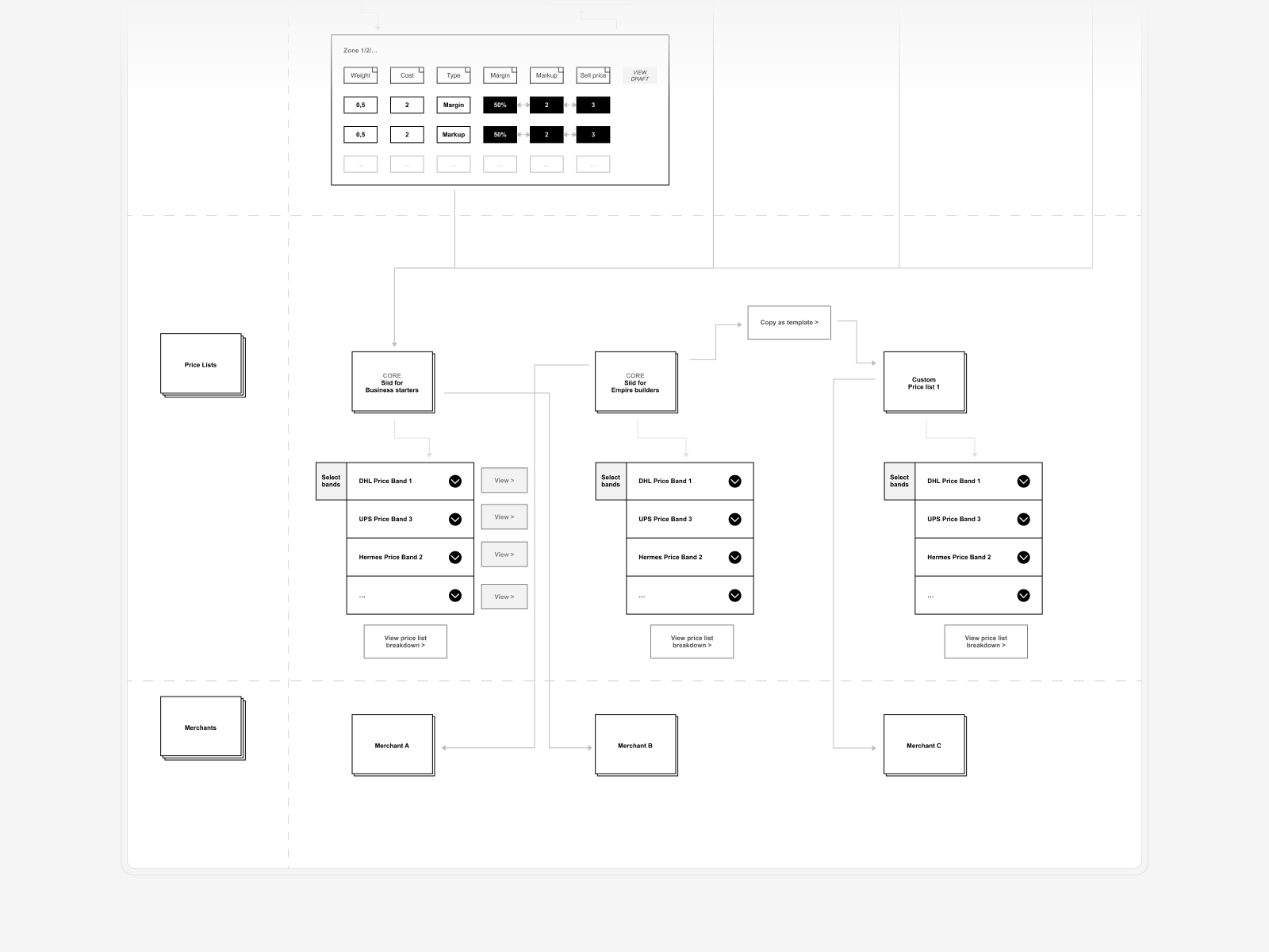
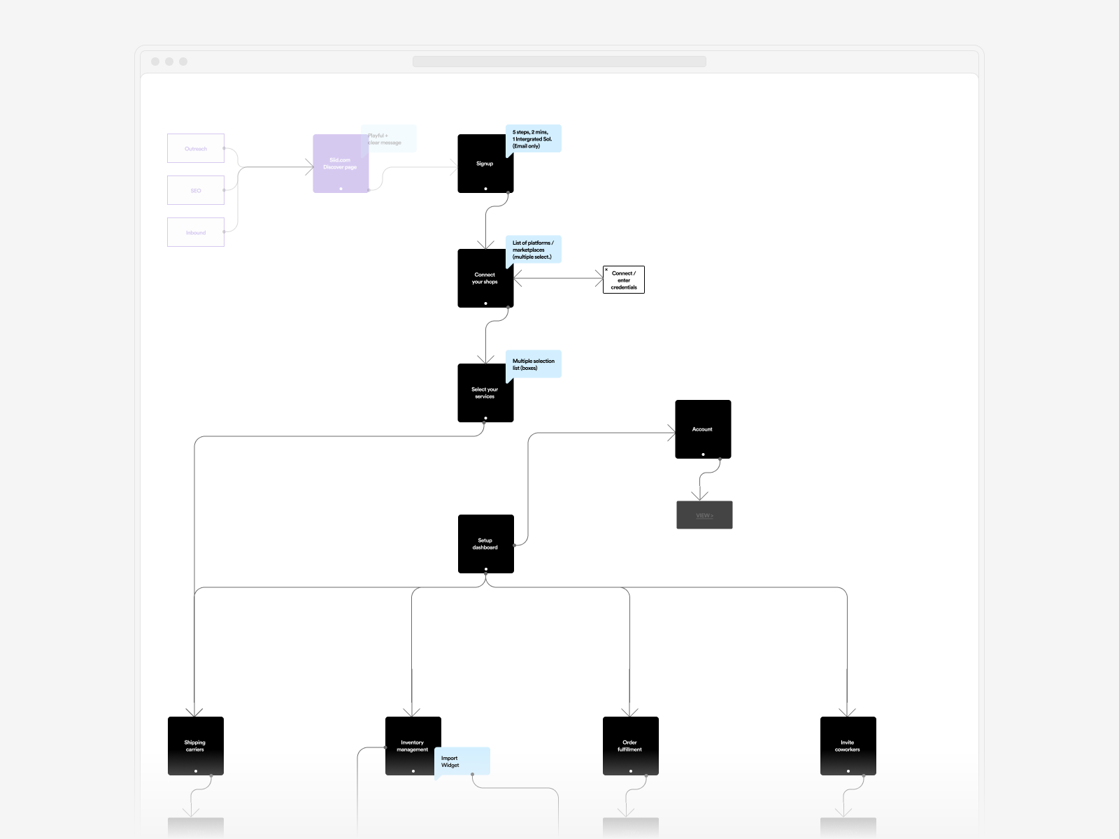
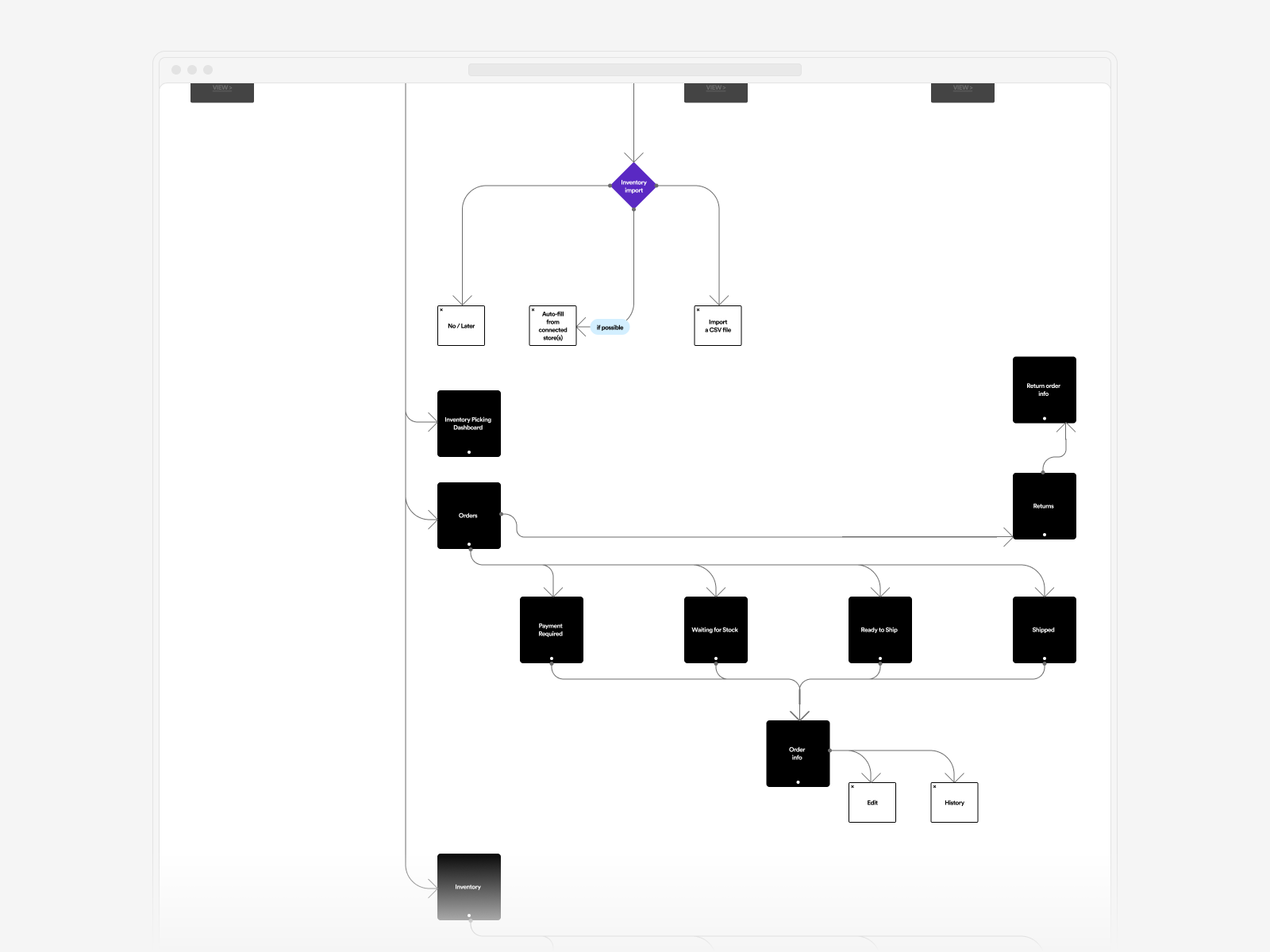
We transformed a single-sentence idea into a shipped product by beginning with a series of workshops with key stakeholders. Together with Sam Hardy, the Head of Design at Obodo, I facilitated these workshops to uncover the project's core requirements and direction.
Following the discovery phase, I simultaneously tackled key aspects of the project to ensure a solid foundation. These included the service design of the main app areas established during the workshops, creating a timeline for the initial MVP release, and developing an early prototype to validate our hypotheses with potential users. Laura Farrant facilitated user interviews, providing valuable insights to refine our approach.
This comprehensive and collaborative effort allowed us to efficiently move from concept to execution, resulting in a successful product launch.
↓ Addressing Users' Needs
After conducting extensive user research, we focused on addressing the identified needs. User testing was performed not only with customers lined up for the MVP release but also with individuals specifically recruited for this purpose. The feedback was overwhelmingly positive, though some challenges were highlighted: the app's vast scope meant users would be handling hundreds of orders daily.
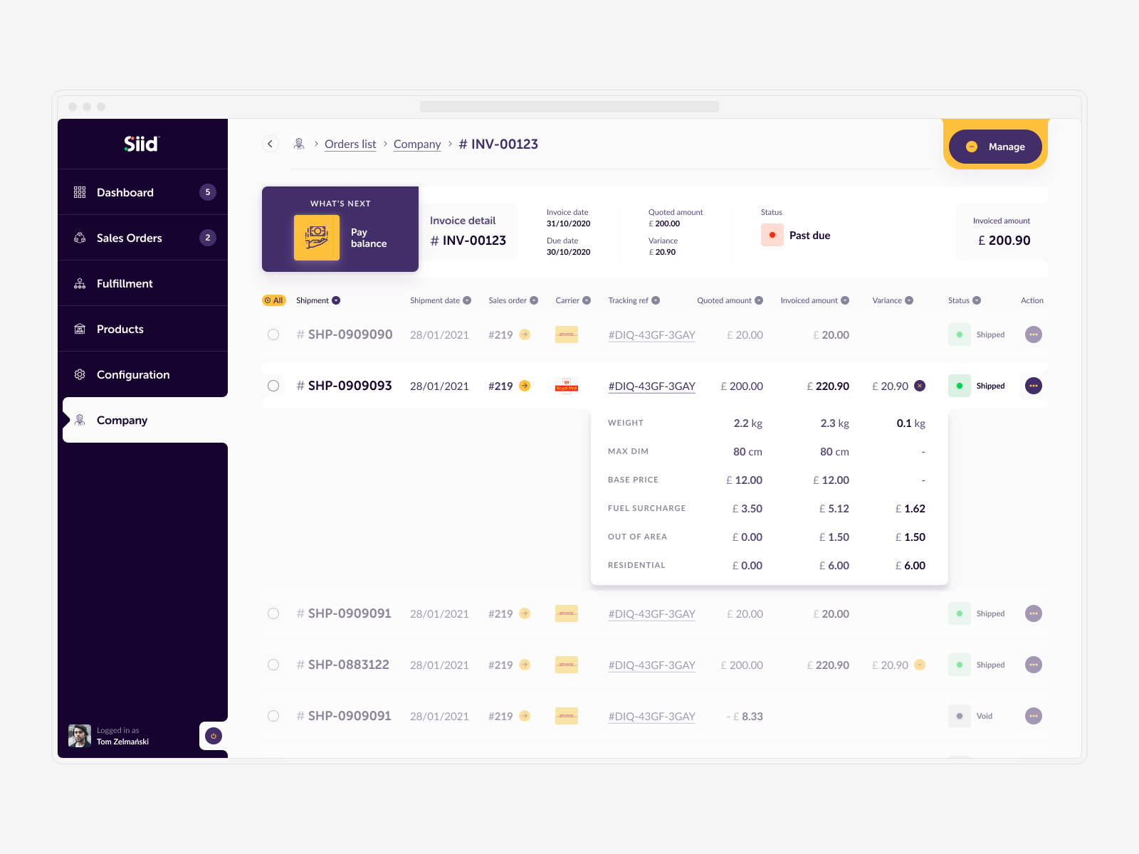
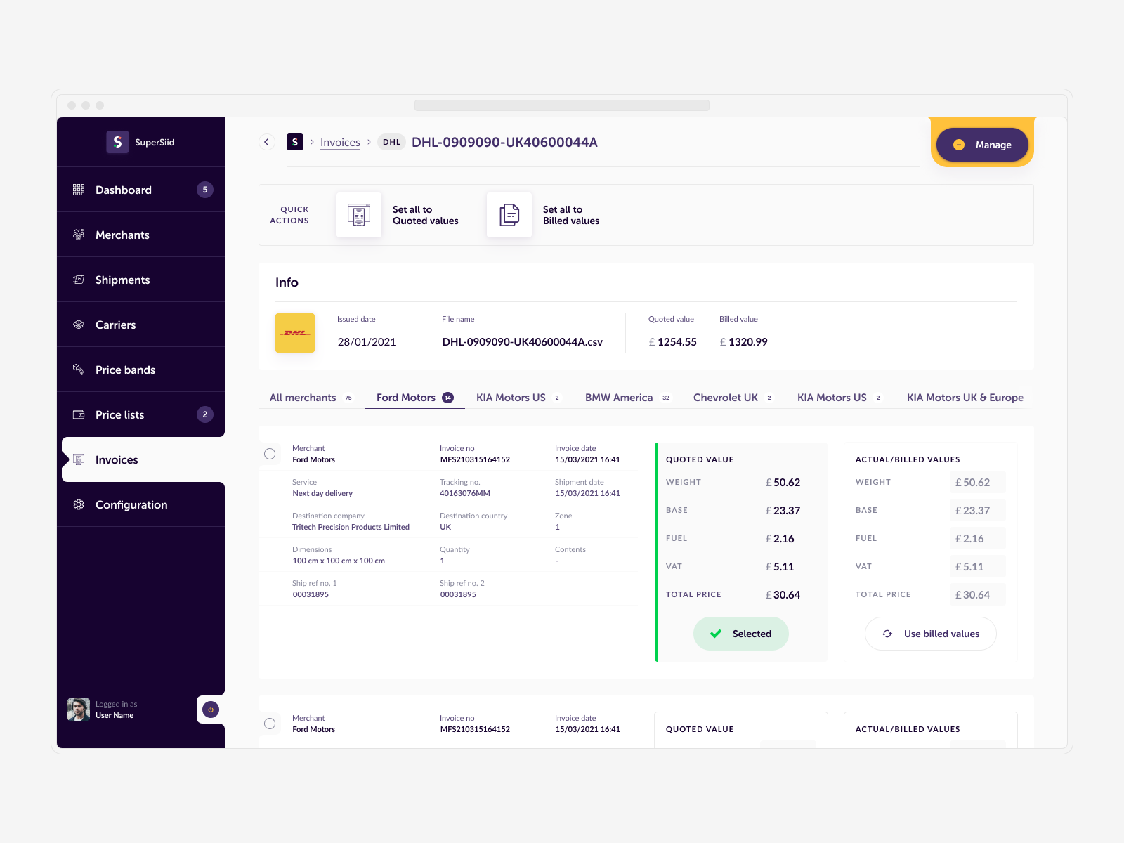
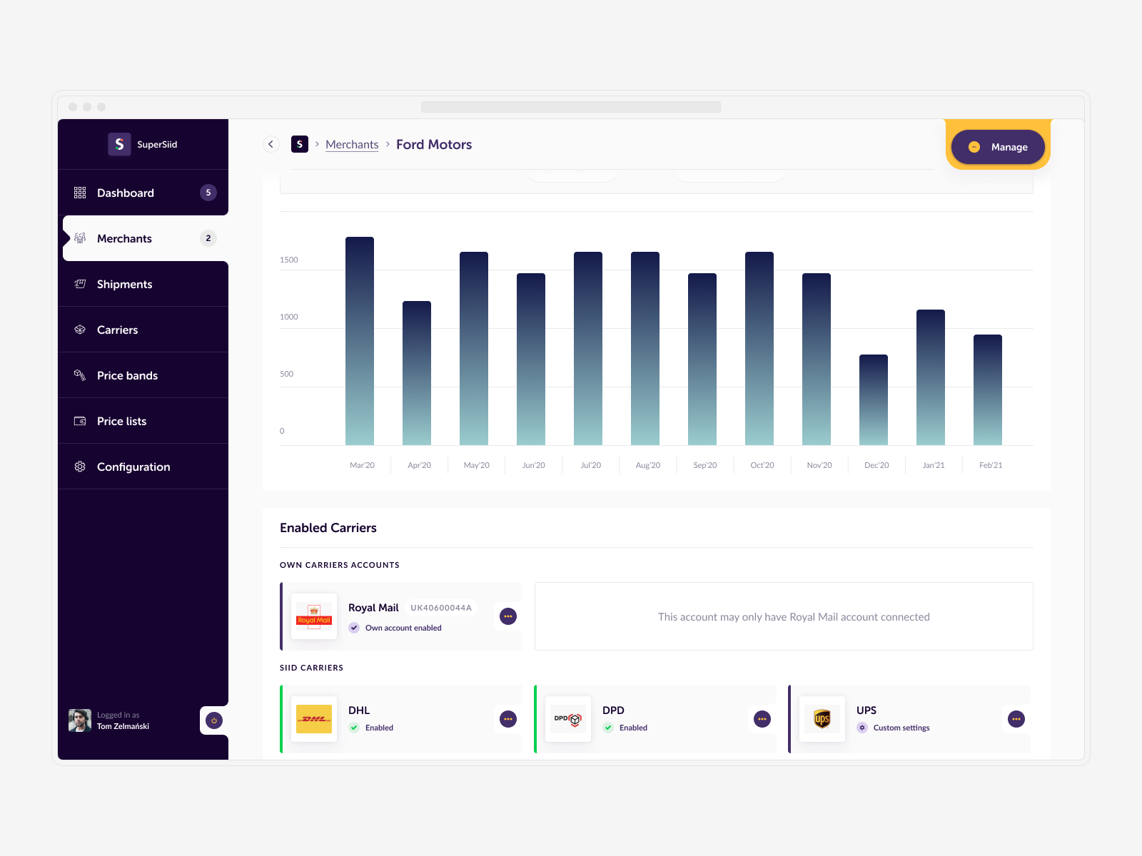
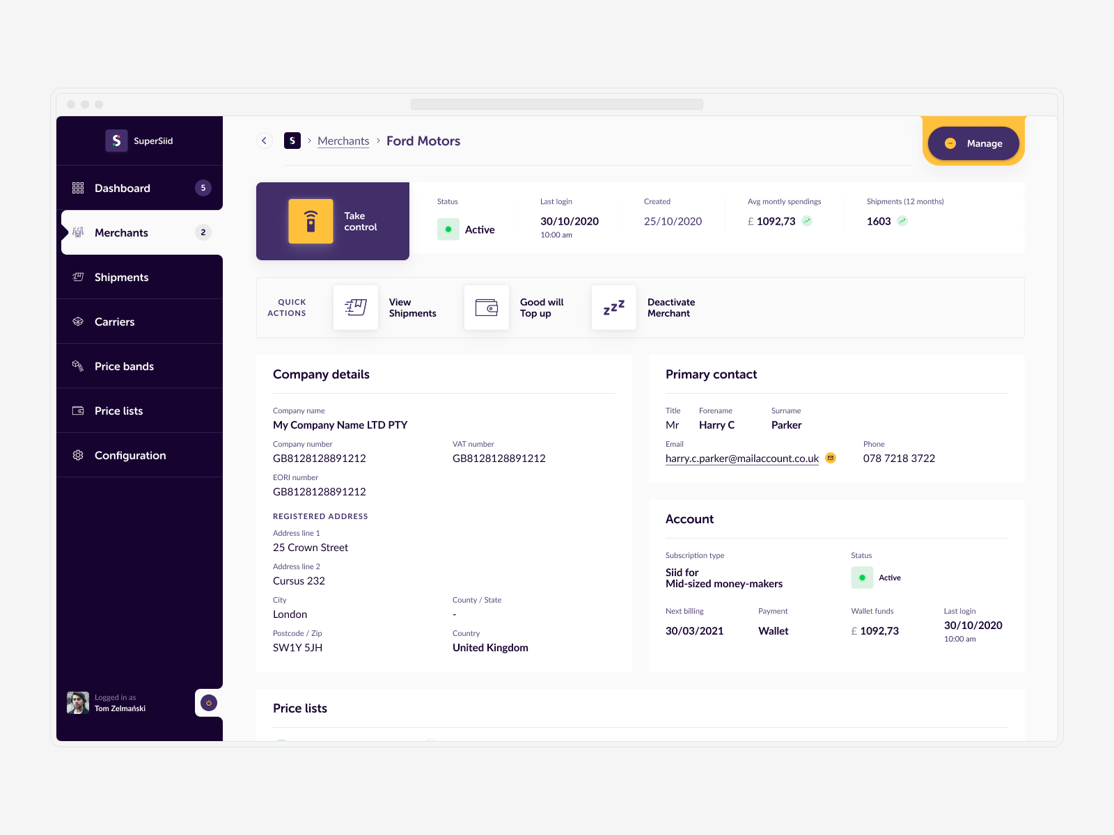
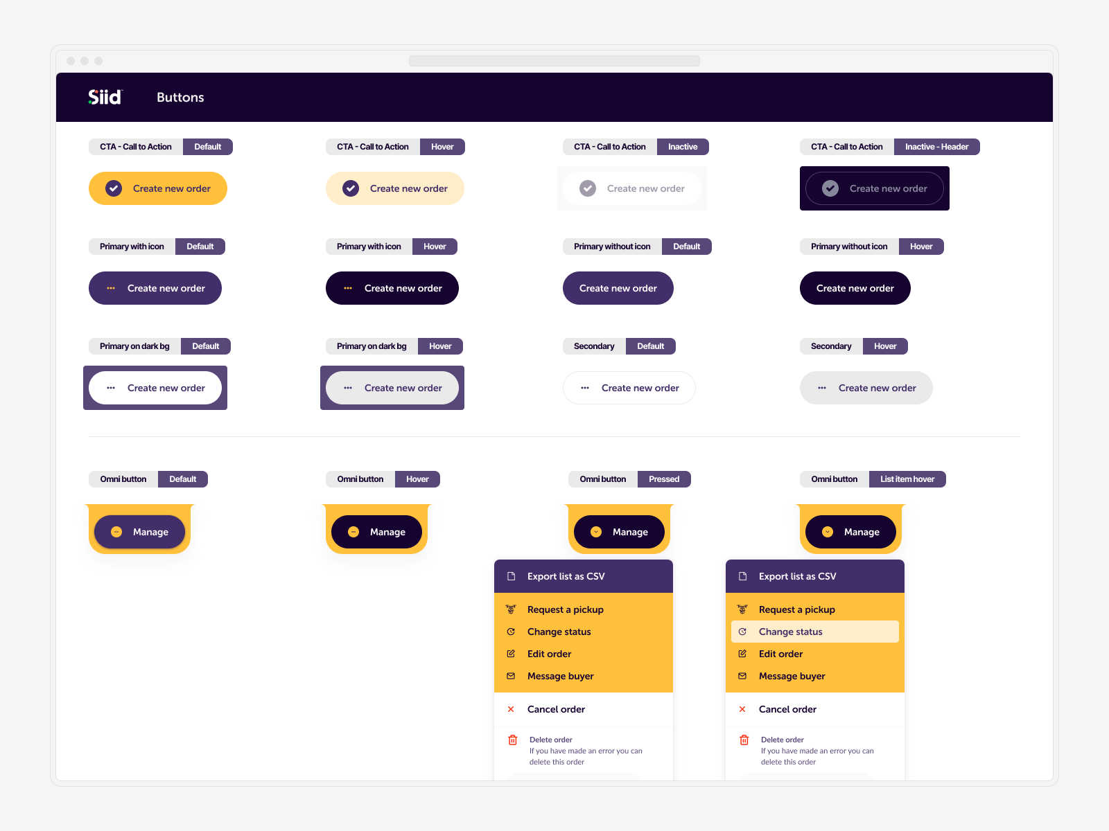
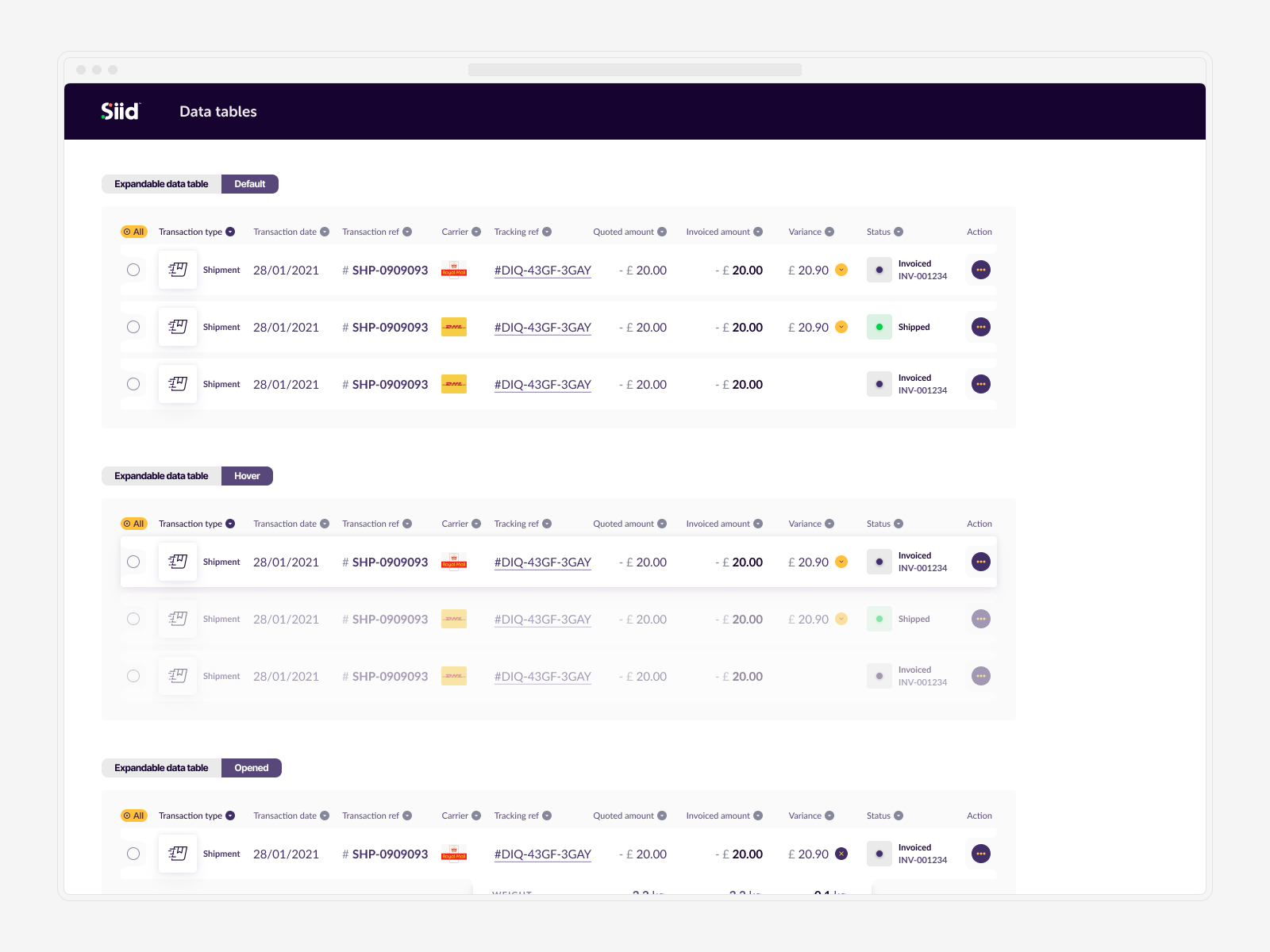
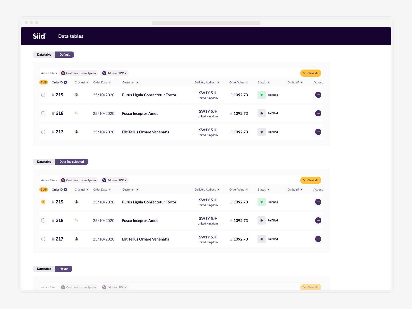
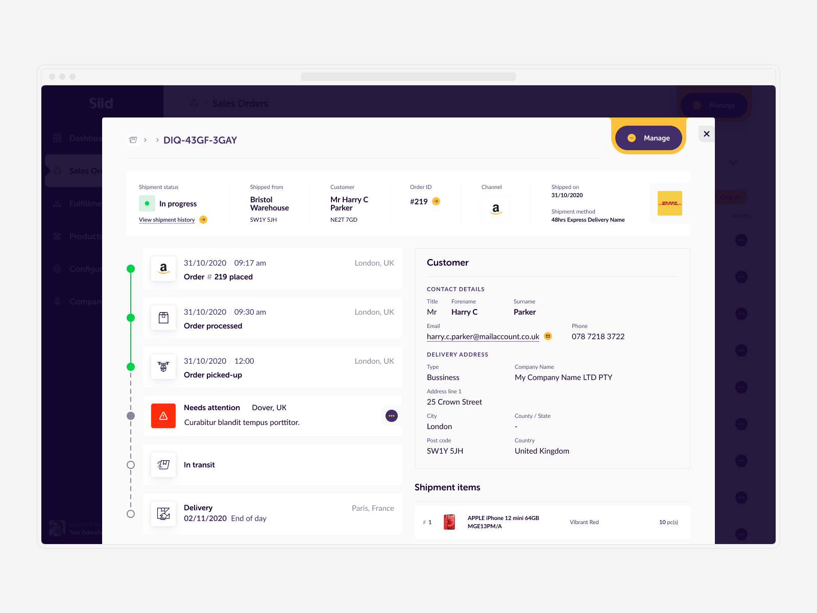
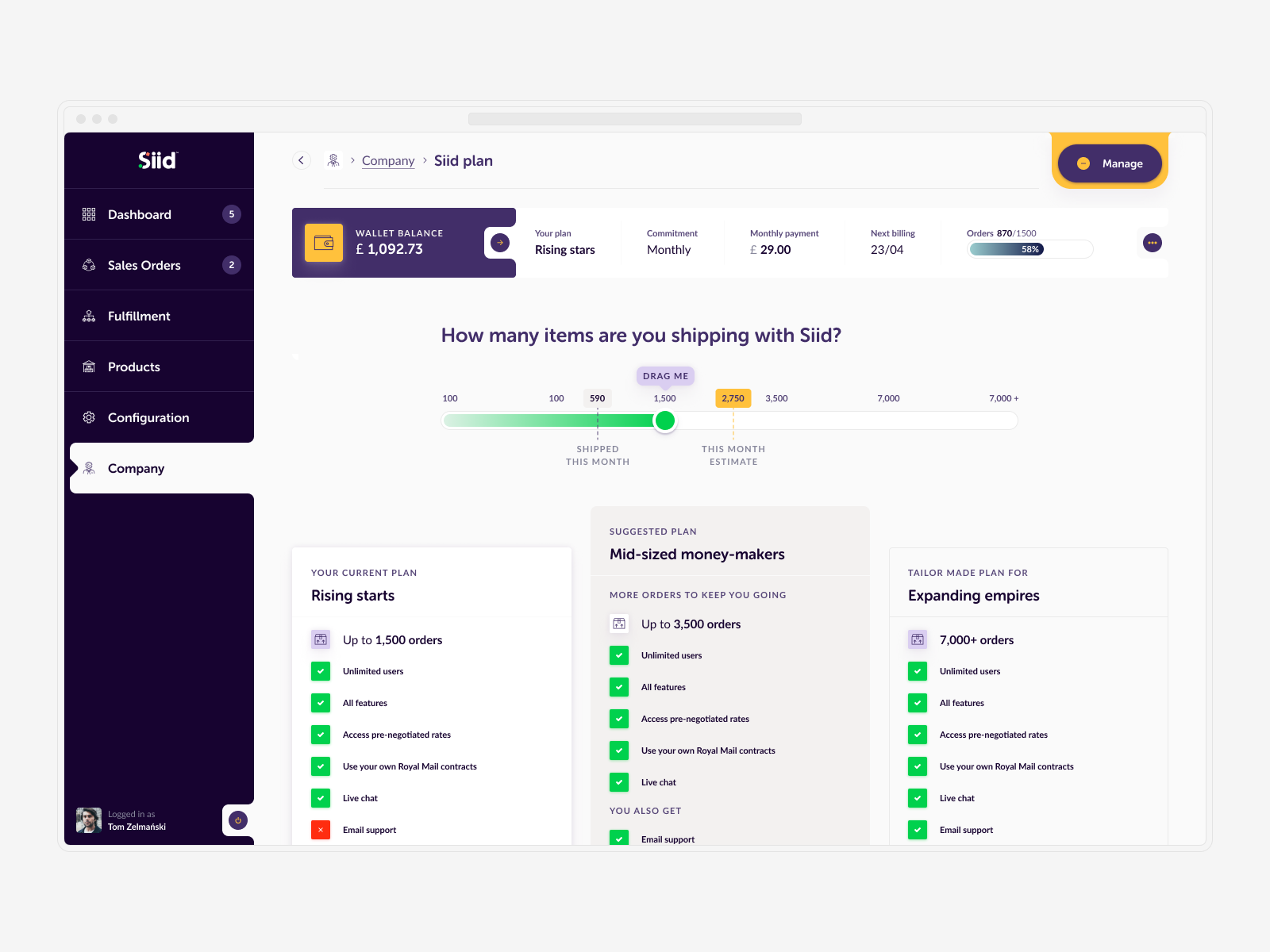
To ease user uncertainty, I proposed and implemented a new component, the "Omni Power Button" called "Manage." This feature allows users to perform key actions relevant to the current content and their selections, enhancing overall usability.
↓ Flexible Design Process
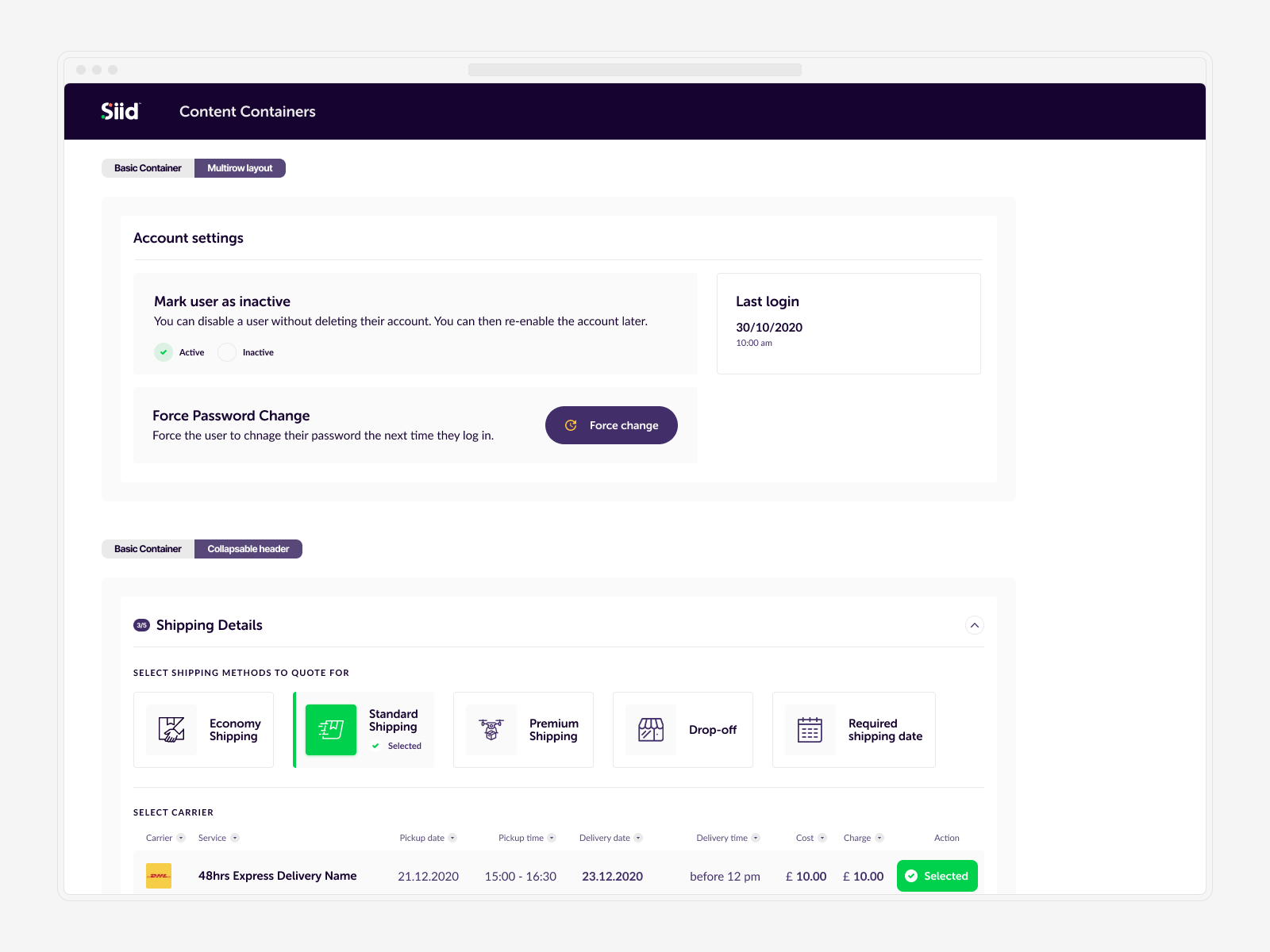
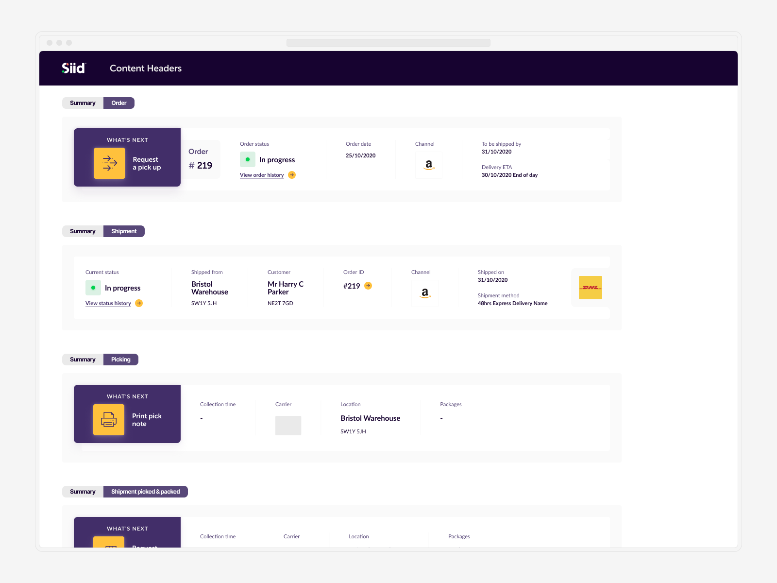
From the outset, I adopted a flexible approach to the design process. Initially, we didn't have a finalized branding or even a settled name for the project. I started with a temporary art direction, using it as a tool to create a compelling prototype for user testing and interviews. My goal was to build a collection of components that would eventually form a robust design system, streamlining the early design process as much as possible.
Once the brand guidelines arrived from an external agency, I conducted a week-long sprint to integrate them into our initial set of design system styles. I worked closely with the branding agency to ensure everything aligned with accessibility guidelines. Following this, a comprehensive workshop with all key stakeholders helped finalize the art direction, paving the way for the exciting development phase.
This iterative and adaptive design process allowed us to effectively respond to user needs and feedback, ensuring a user-friendly and cohesive product..
↓ Crafting a Responsive Design System
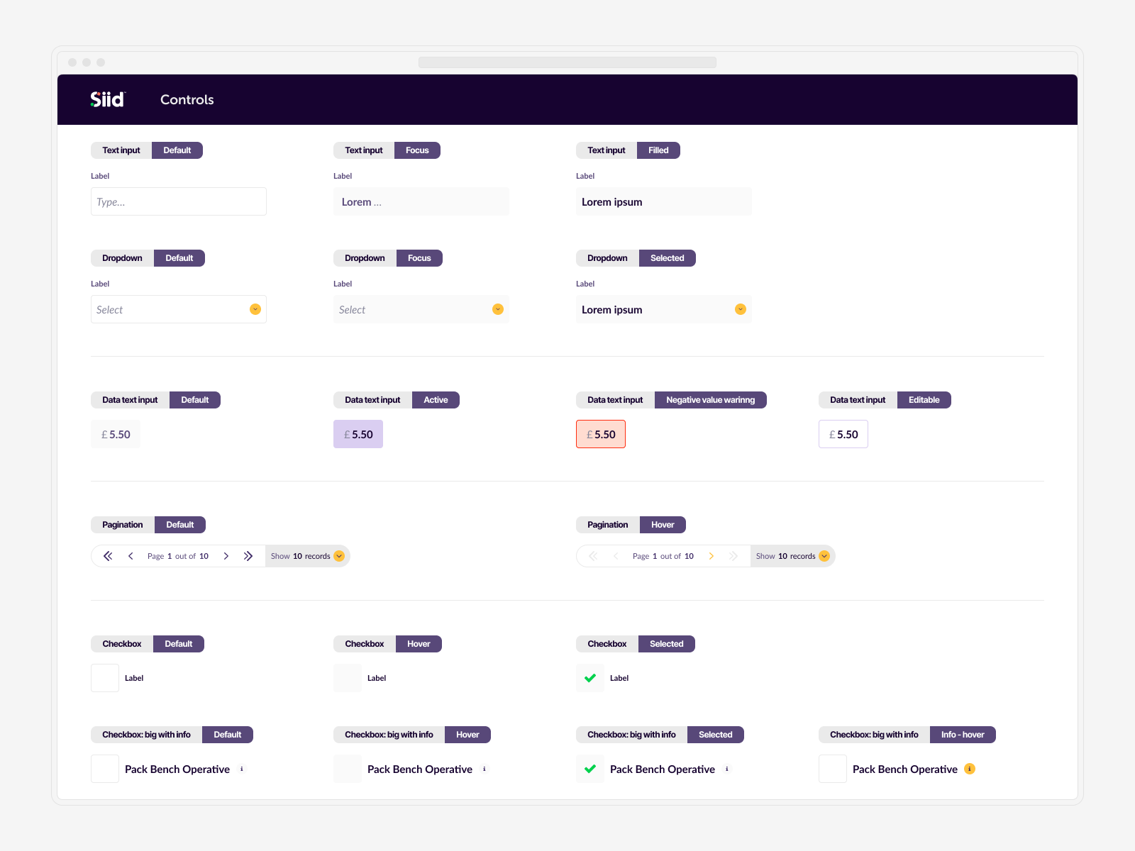
With a tight deadline of just 3 months to wrap up the entire project, planning and a focus on a responsive design system were key.
I created a robust typography system with two specific yet compatible purposes: to be an integral part of the UI and to handle a large volume of data points. This led to the introduction of a secondary mono typeface, ensuring clarity and readability for data-heavy sections.
By focusing on design tokens and responsive components, I was able to quickly adapt the designs for various viewports once the mobile version was ready and tested. This approach streamlined the process and ensured consistency across all devices, allowing us to deliver a polished and cohesive product within the tight timeframe.
↓ 13 Months Later: What We Accomplished
After thirteen months, a minimum viable product (MVP), and two successful releases, I concluded my work on the project. Siid was introduced to the market with great success, with customers starting to use the app from day one. I also laid the groundwork for approximately one year's worth of future development, ensuring a continuous improvement path.
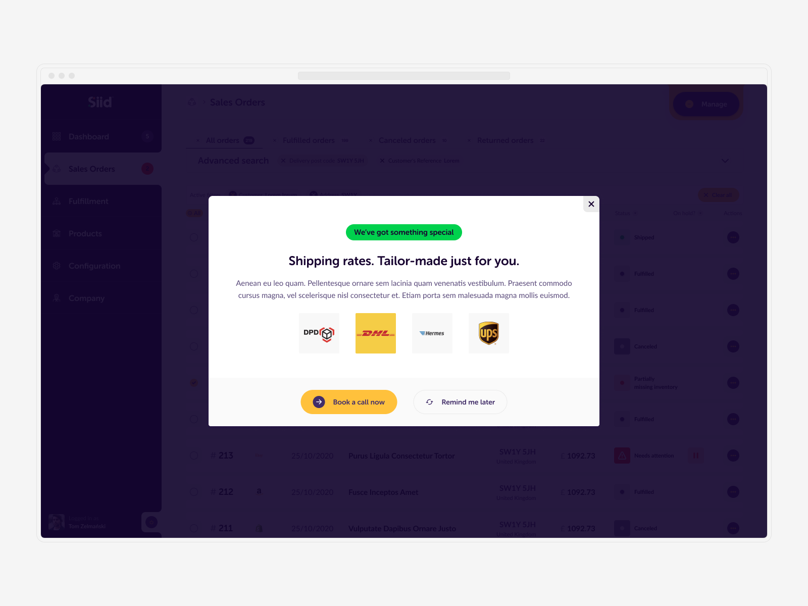
Siid is now well-positioned to assist small and medium-sized eCommerce businesses in achieving their goals. With a solid foundation and an extensive design system in place, these businesses can operate more efficiently without the burden of coordinating and managing supplies. Siid provides access to rates previously reserved for the industry's biggest players, leveling the playing field and empowering smaller businesses to thrive.

© Tomasz Zelmański'24 → tomek@zelmanski.pl → +48 698632226
© Tomasz Zelmański'24
→ tomek@zelmanski.pl
→ +48 698632226

