Polish Olympic Committee - Design System
I developed a design system for the Polish Olympic Committee's digital products, ensuring consistency and streamlined design processes. The first project utilizing this system was the Volunteers Platform, which provided a cohesive and user-friendly experience.
IC Product Designer
Flower Interactive, PL
2023
↓ Design System for the Polish Olympic Committee
I had the pleasure of creating the first design system for the Polish Olympic Committee. In just four months, we built both the design system and the Volunteers Platform from scratch, ensuring everything was ready for the upcoming Olympic Games in Paris.
↓ Crafting a Responsive Design System
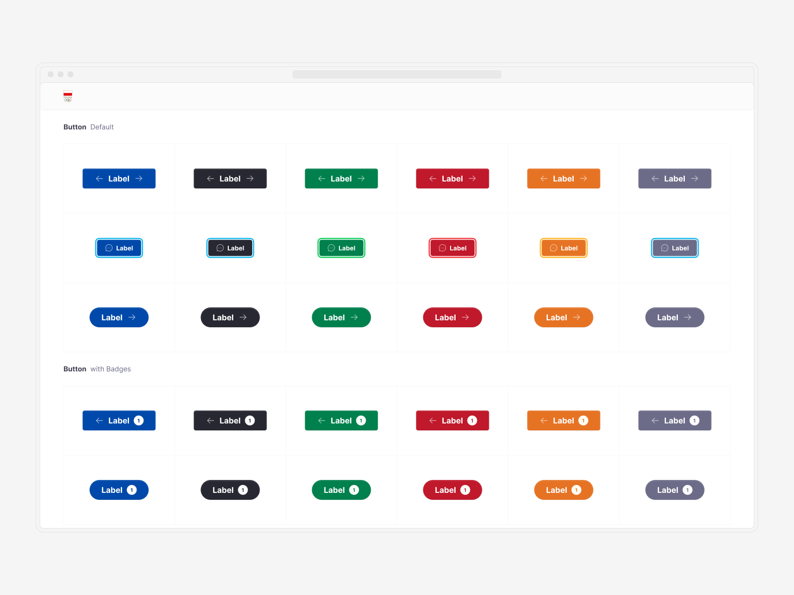
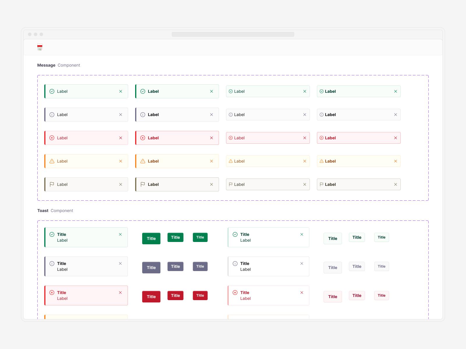
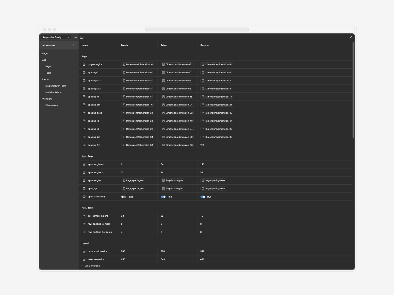
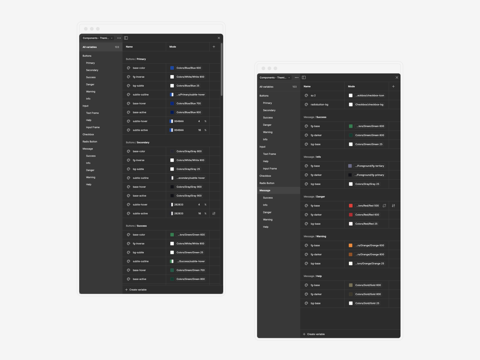
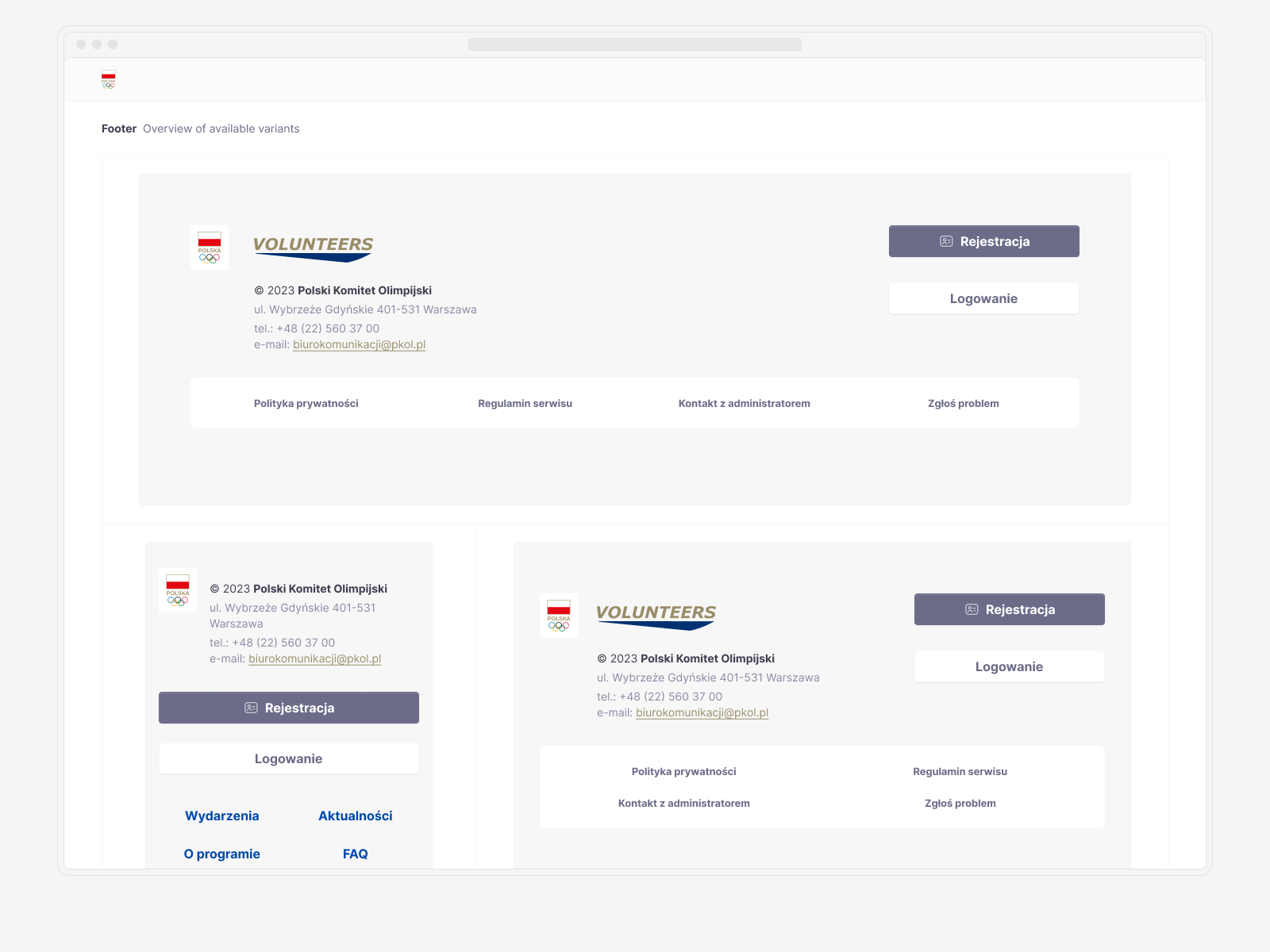
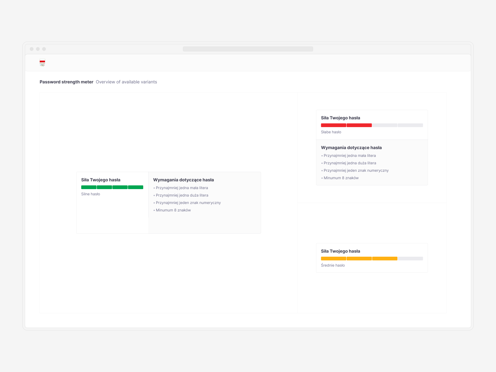
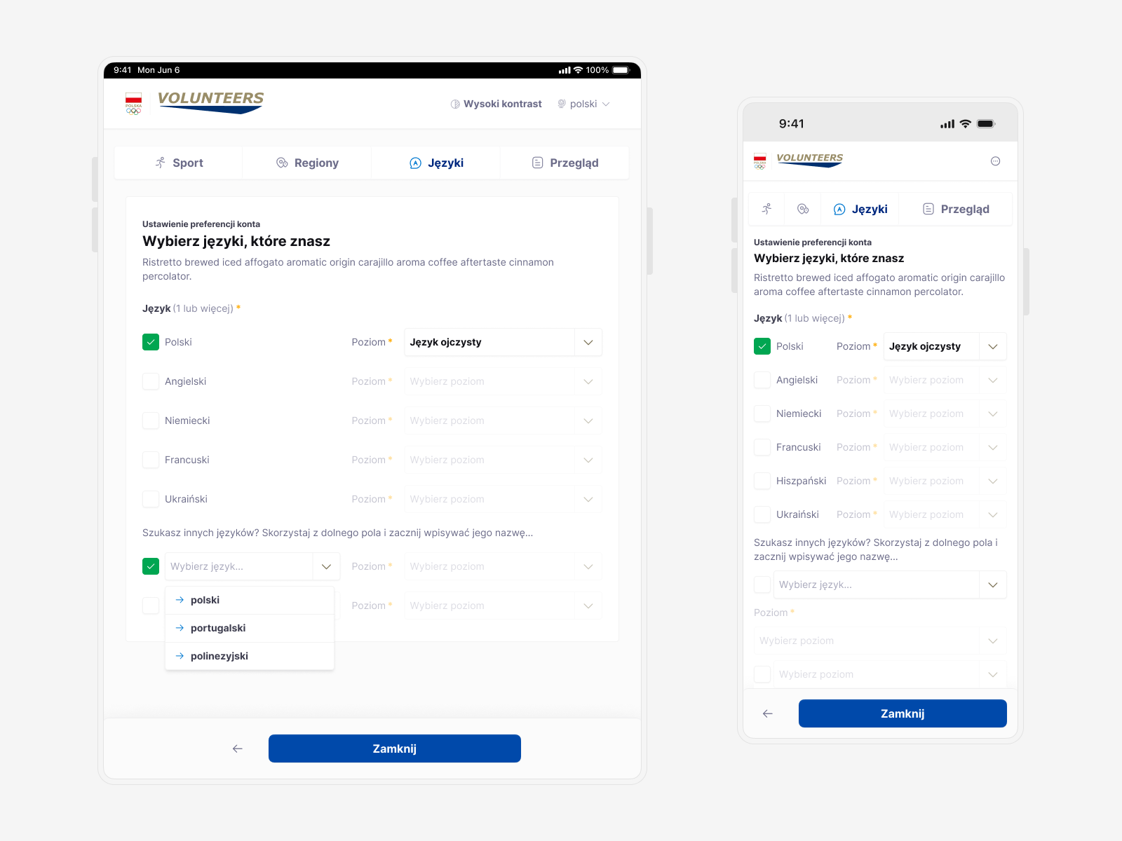
Responsiveness was a crucial part of this project. Each component was crafted to be adaptable to all key viewports, ensuring a seamless experience across devices. Additionally, a color palette inspired by the Olympic rings was created, with common components like buttons, toasts, and messages designed as variants within that scheme, allowing for easy switching between colors.
↓ Becoming Flexible and Scalable
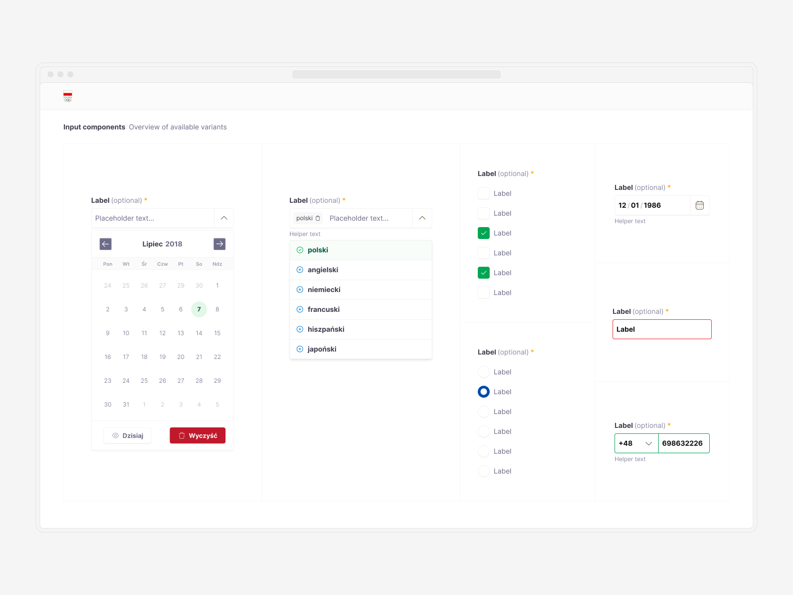
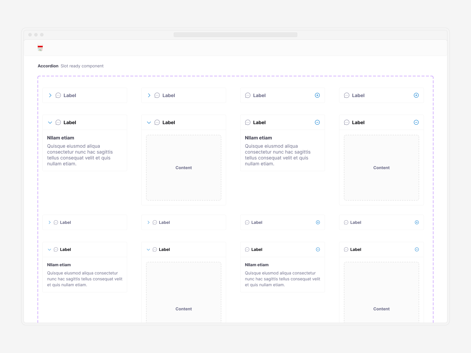
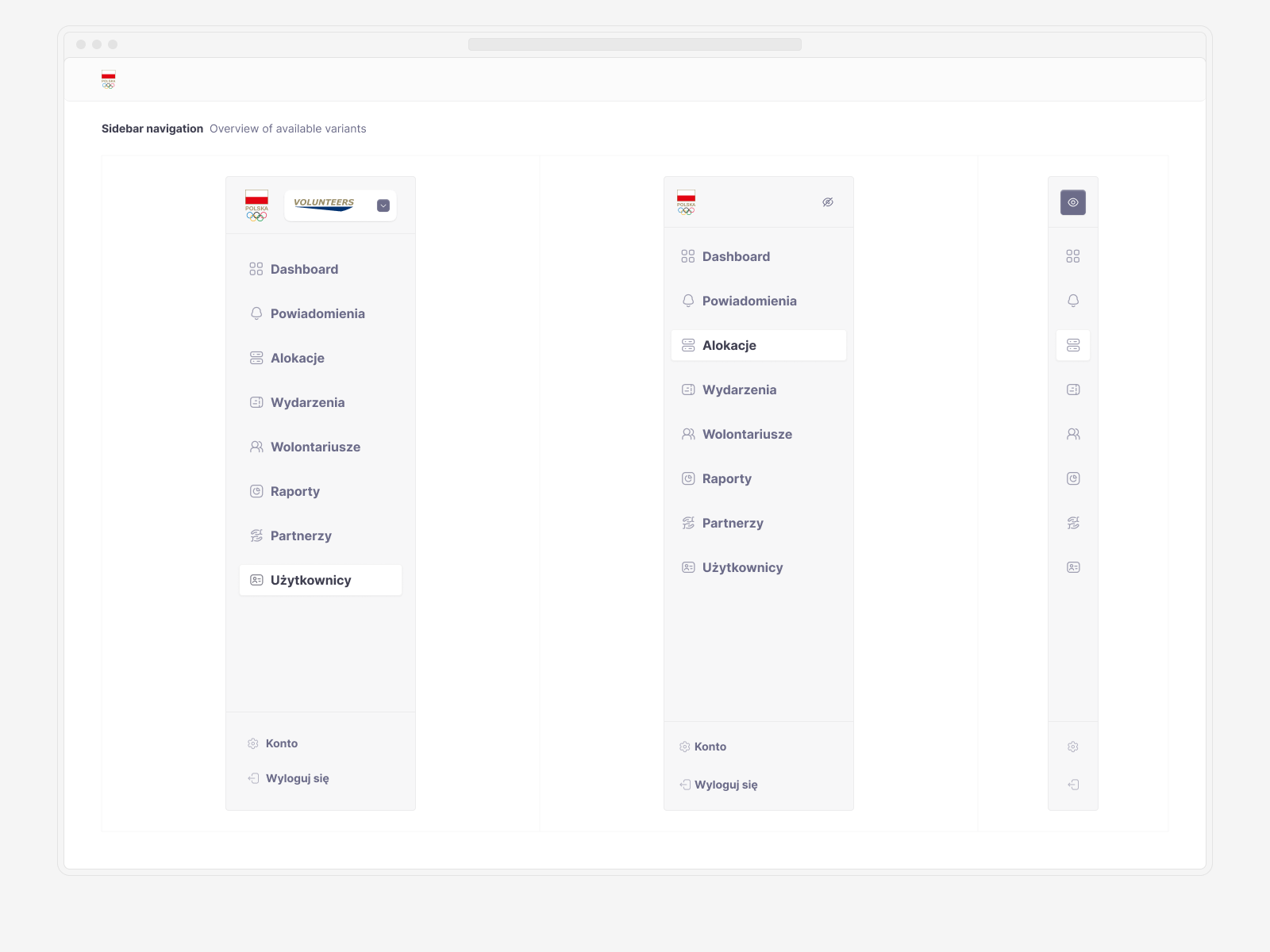
Focusing first on key atomic components and a versatile set of tokens allowed me to quickly create a set of more complex components. This design system was intended to be an all-purpose tool, capable of handling not only typical web applications but also smaller user-facing products.
↓ Early Implementation: Volunteers Platform
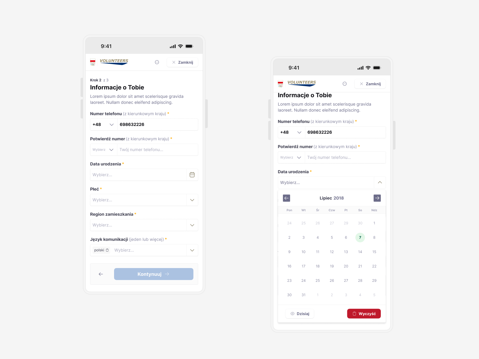
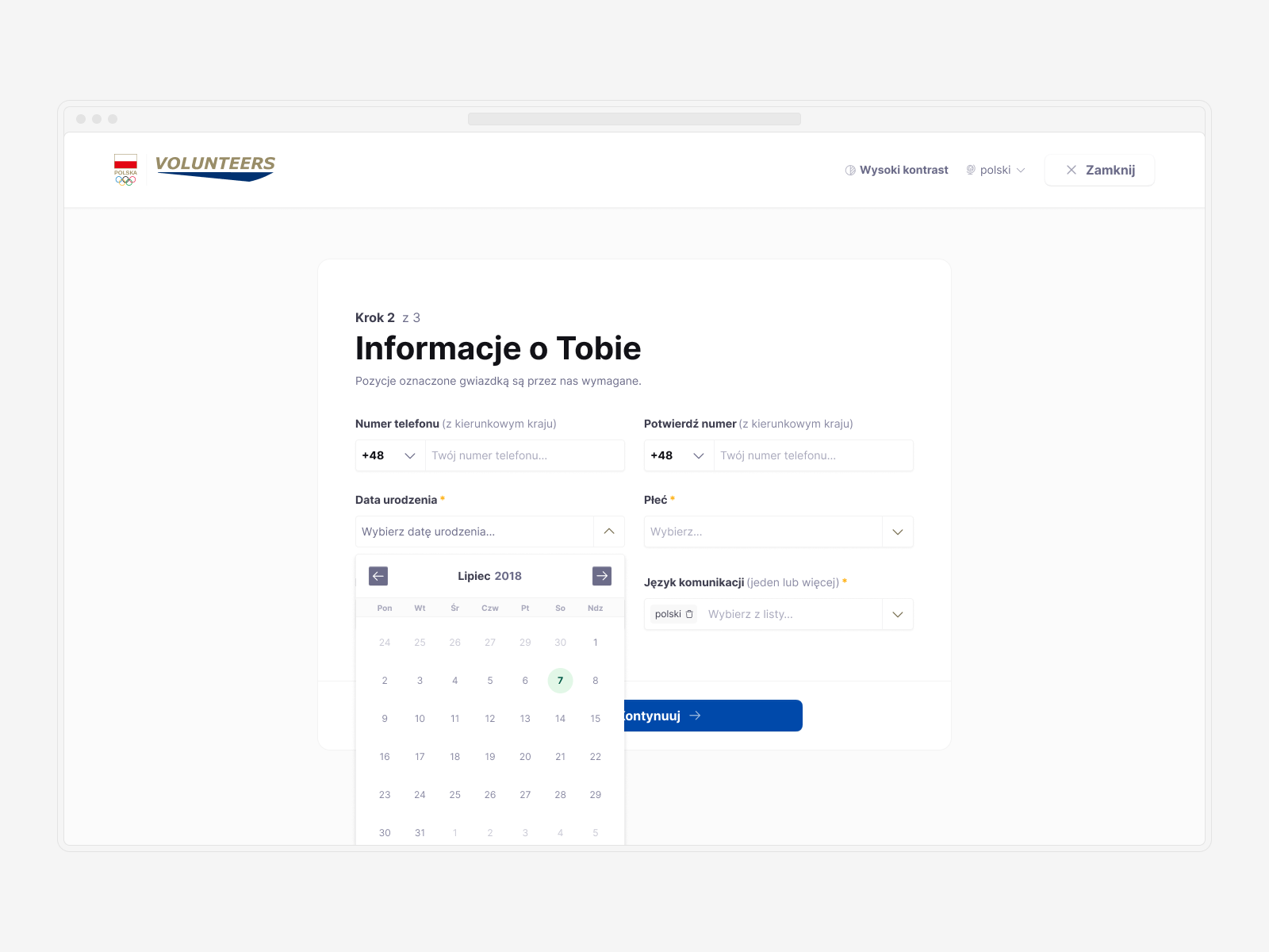
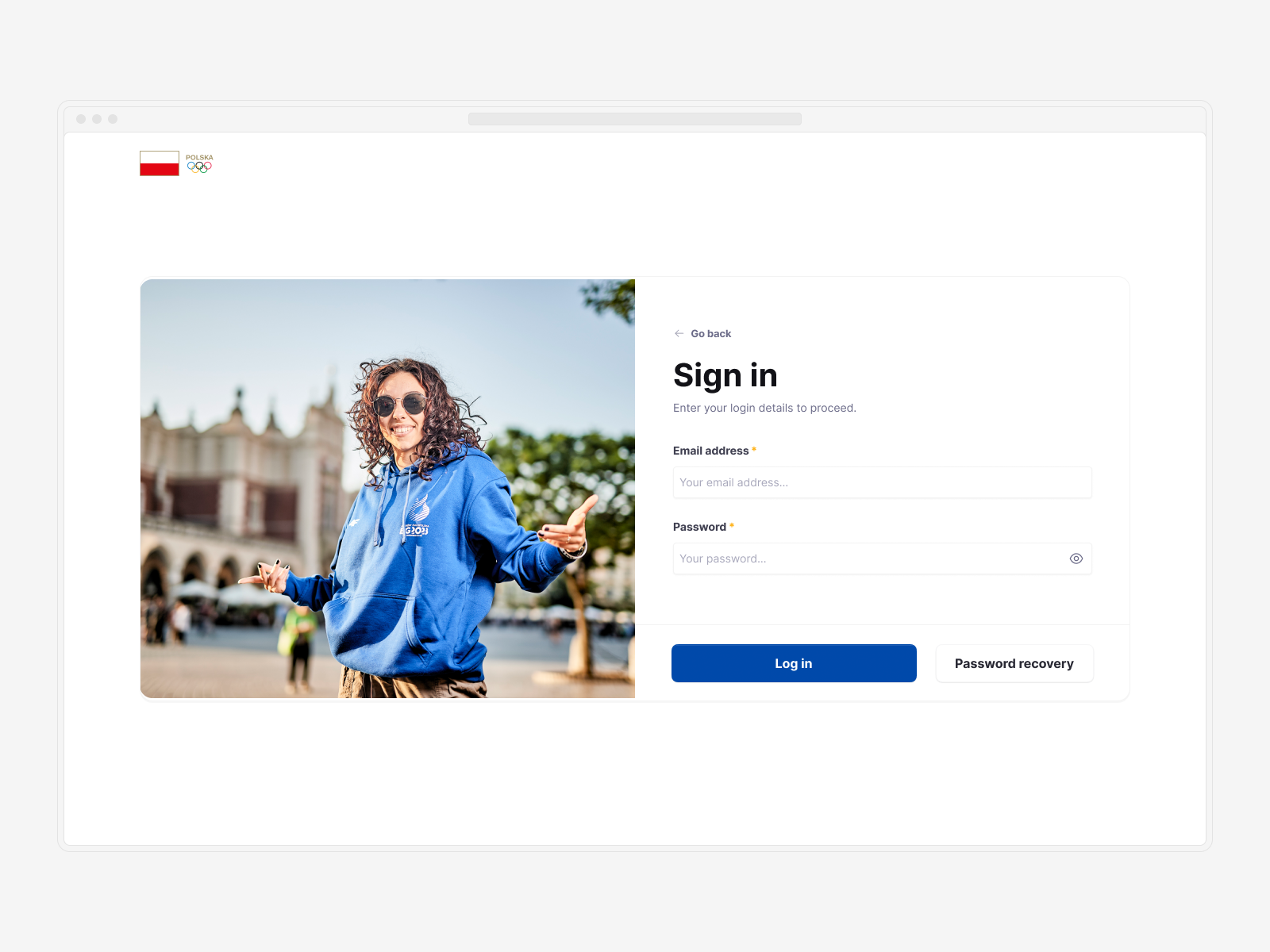
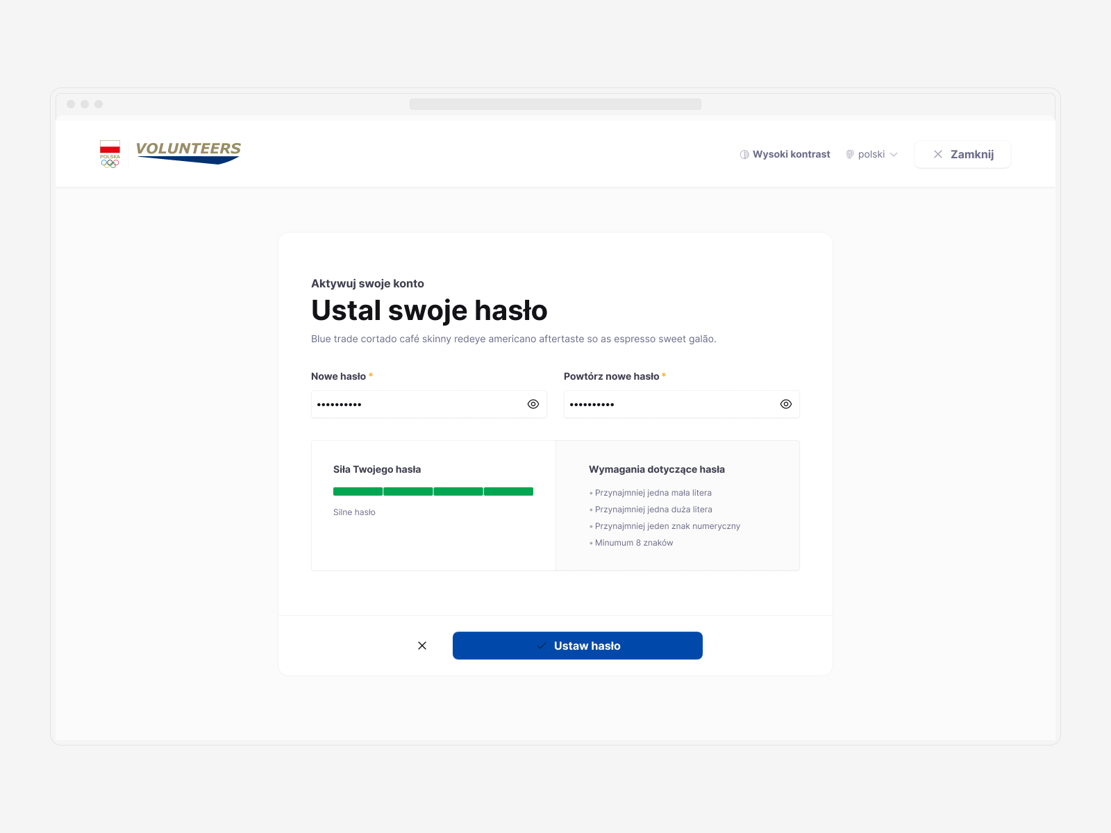
The first opportunity to test this design system came quickly when I was tasked with creating an online platform named Volunteers. After discussing the necessary steps and rapid prototyping, I began working on the onboarding flow.
The responsive approach proved invaluable, allowing me to swiftly create initial screens for each step using a mobile-first strategy. Leveraging Figma's new variable modes, I could easily transform these designs into desktop and tablet viewports in a matter of minutes.
↓ Creating the Public Page
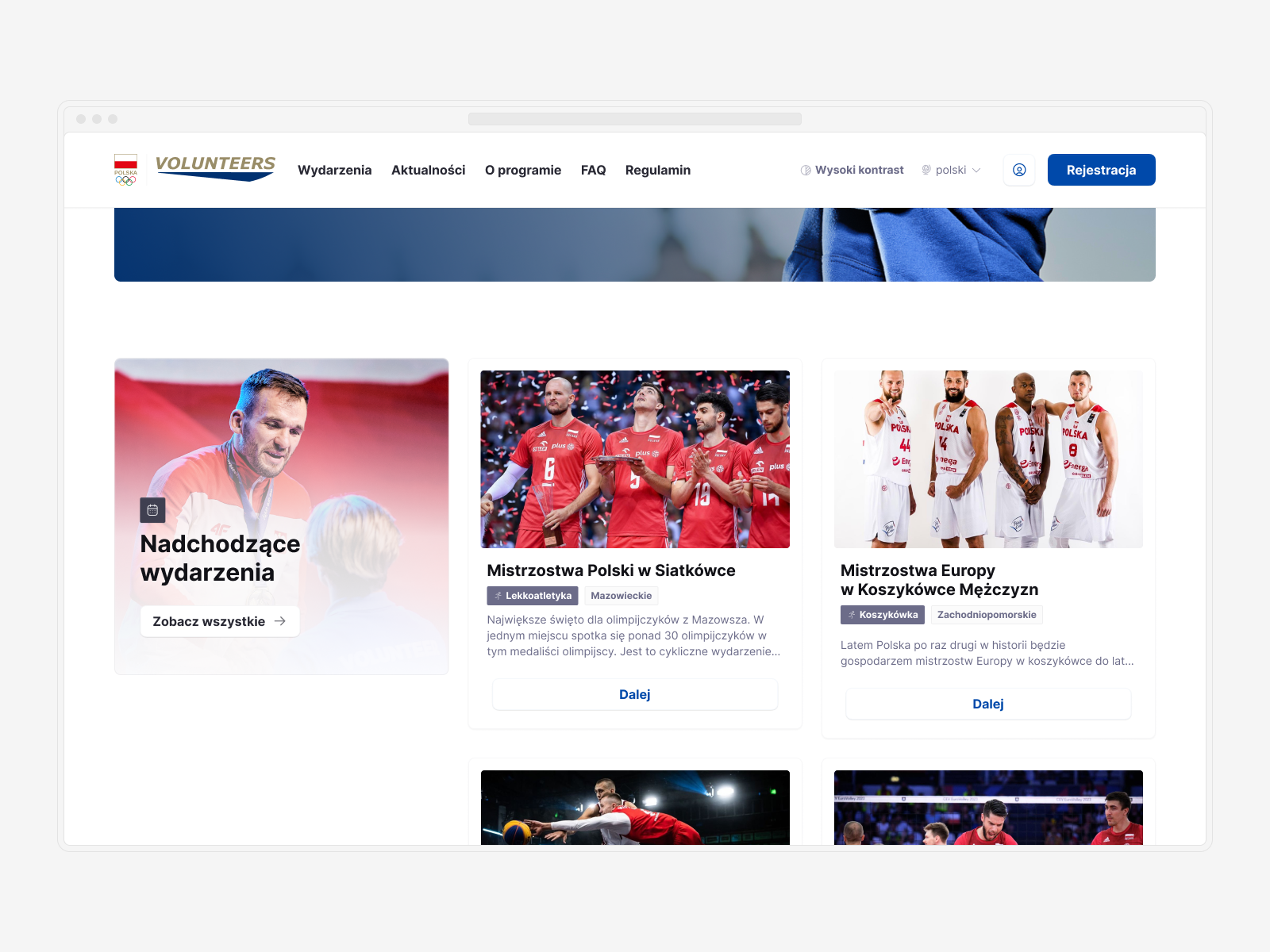
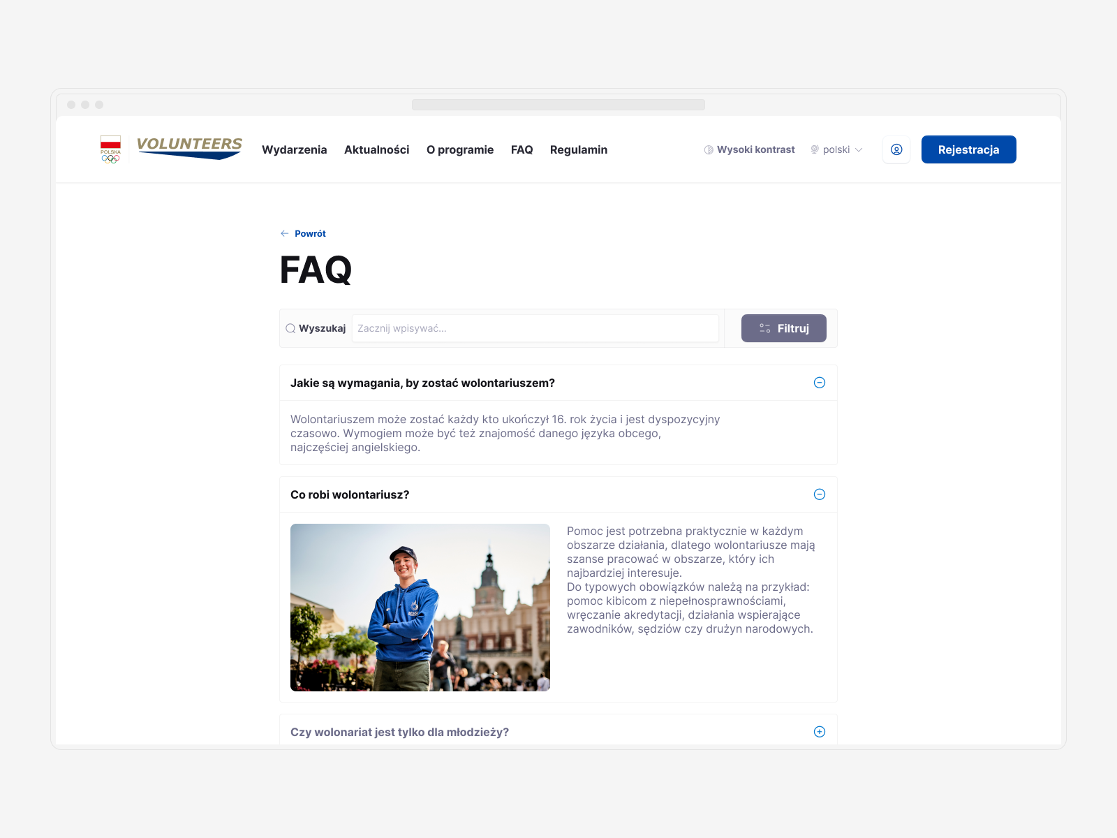
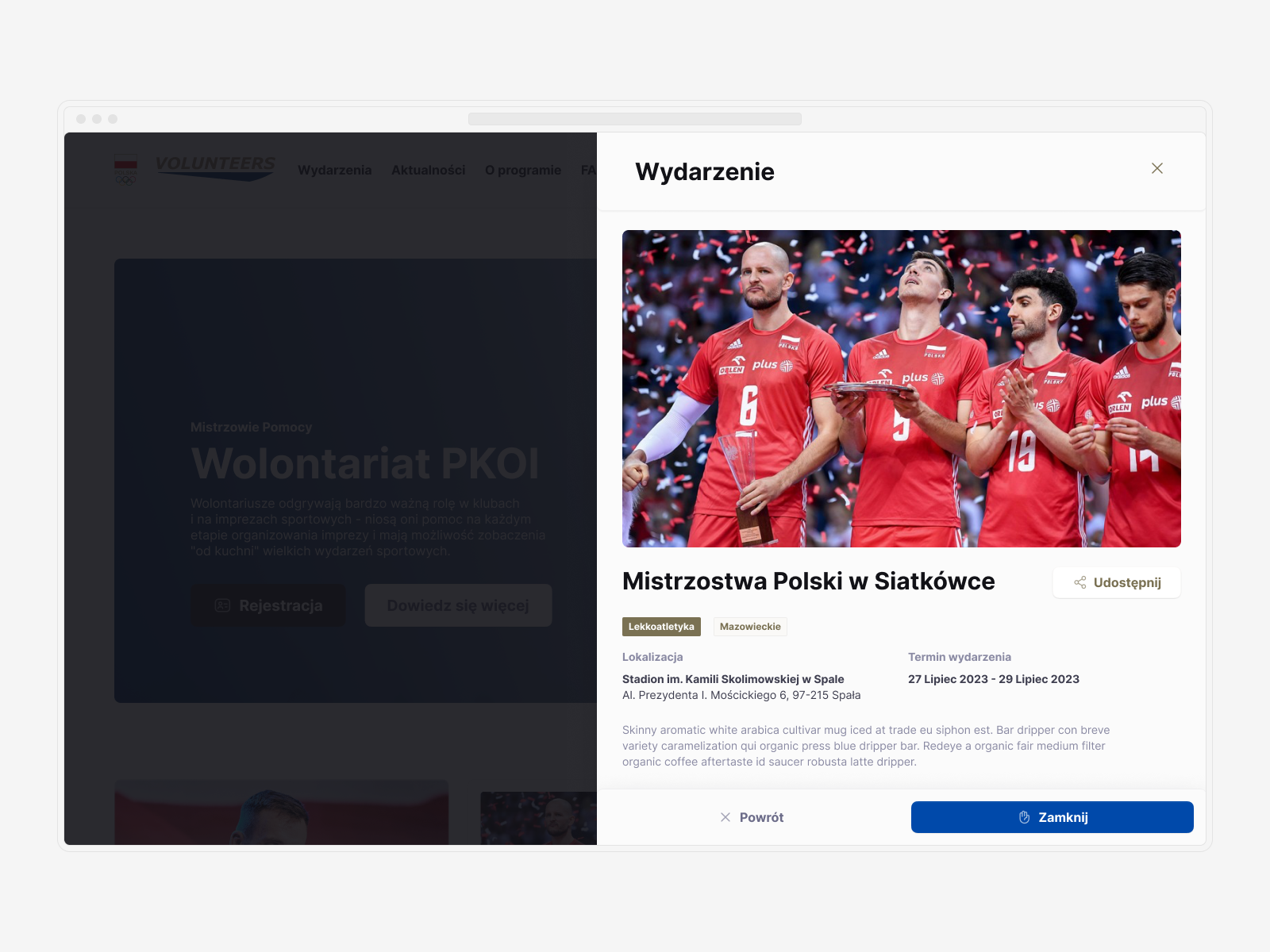
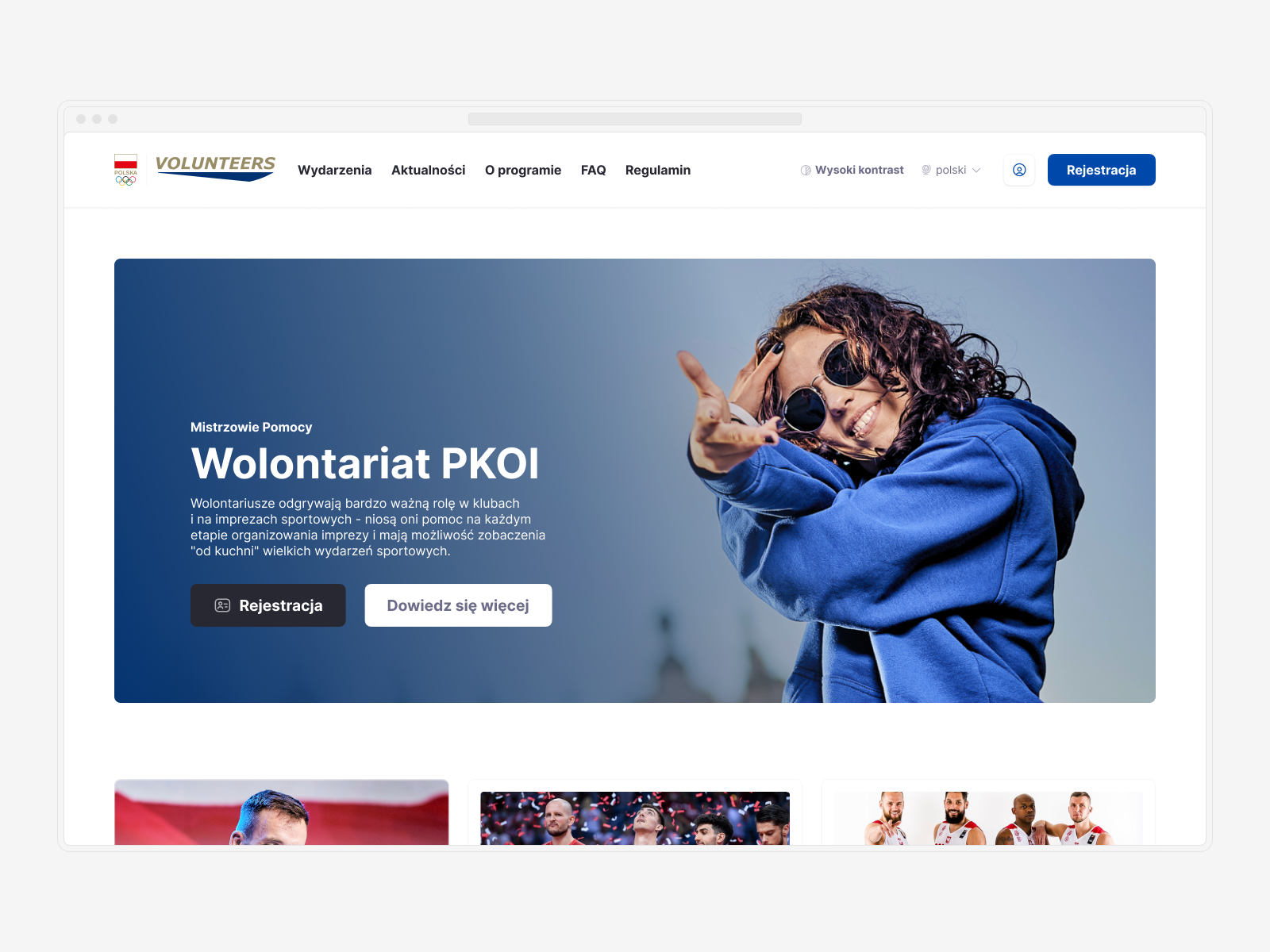
I was also responsible for creating a public page for the Volunteers platform. Utilizing the new design system, I developed a lightweight framework to display information about upcoming events and enable users to send applications for each event.
I added versatile card components to the design system using a "slot design" approach. This allowed me to quickly create visually engaging elements that would capture users' attention effectively.
↓ Developing the Backoffice Framework
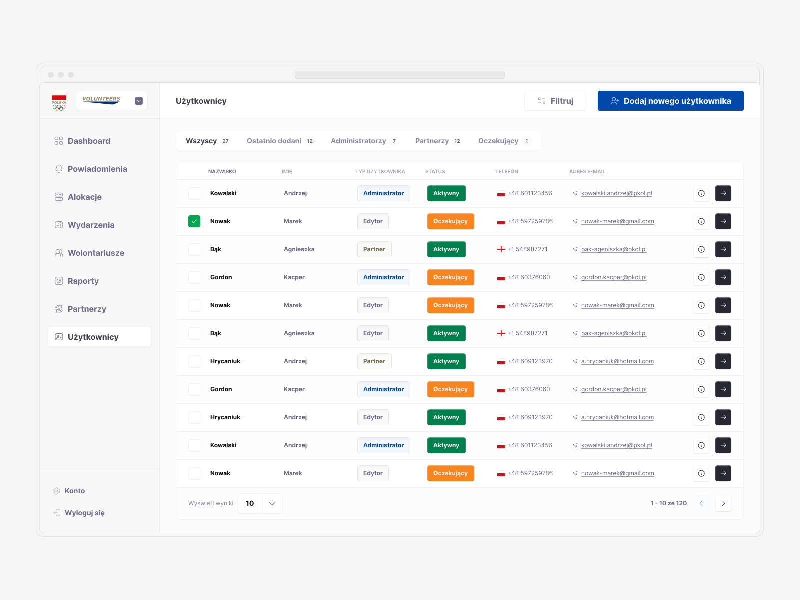
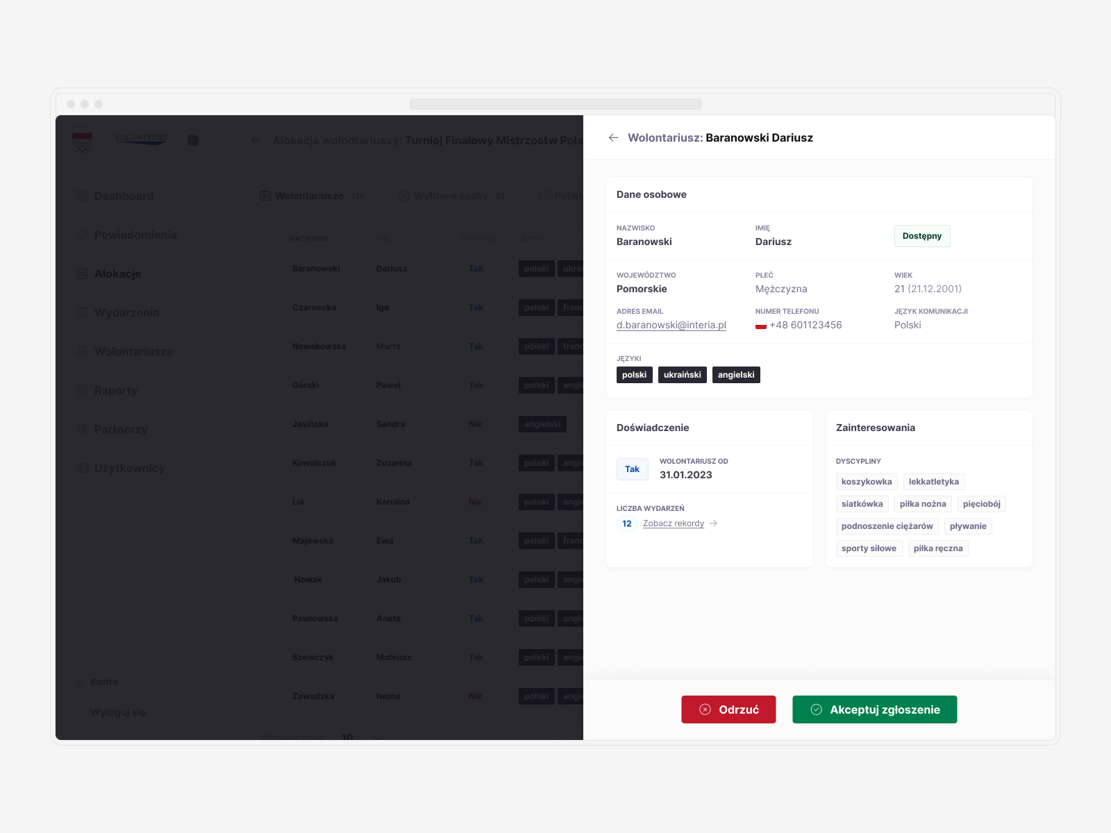
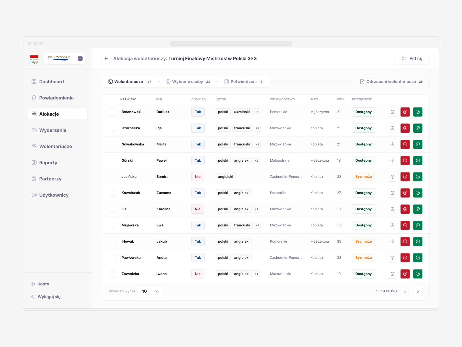
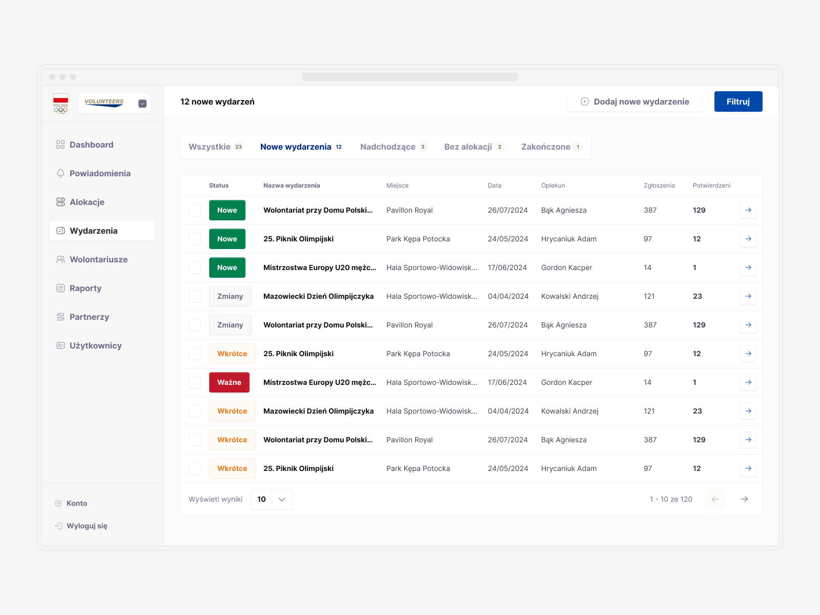
The final step was creating a framework for the backoffice app for the Volunteers platform. I focused mainly on the UX, planning the necessary content and functionalities.
After finalizing the wireframes, I created key layouts to guide the development team, serving as instructions for future designers and developers. Recognizing that work on design systems is never truly finished, I also added components focused on table design and other methods of displaying data.
© Tomasz Zelmański'24 → tomek@zelmanski.pl → +48 698632226
© Tomasz Zelmański'24
→ tomek@zelmanski.pl
→ +48 698632226
