Novexx Solution
Novexx is a German industrial printer manufacturer that required a next-generation B2B approach for its customers.
IC Product Designer
FNX Group, PL
2019
Novexx Solution
Novexx is a German industrial printer manufacturer that required a next-generation B2B approach for its customers.
IC Product Designer
FNX Group, PL
2019
Novexx Solution
Novexx is a German industrial printer manufacturer that required a next-generation B2B approach for its customers.
IC Product Designer
FNX Group, PL
2019
↓ About the project
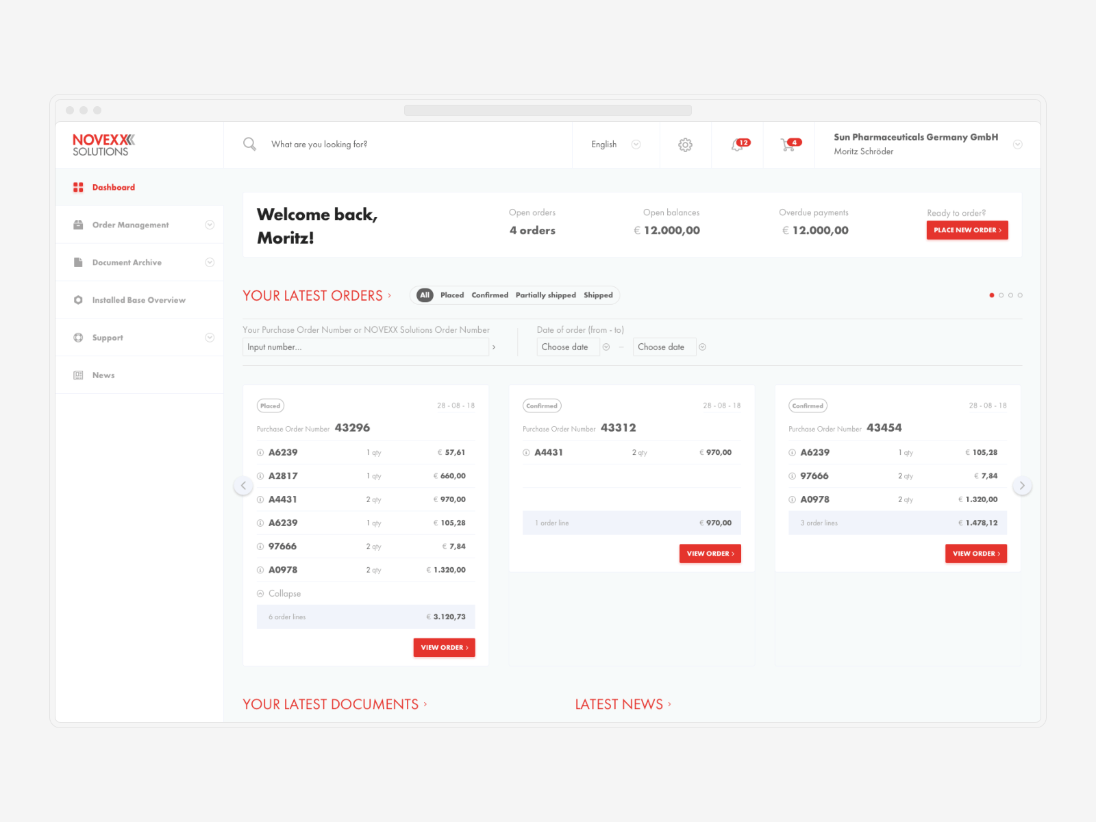
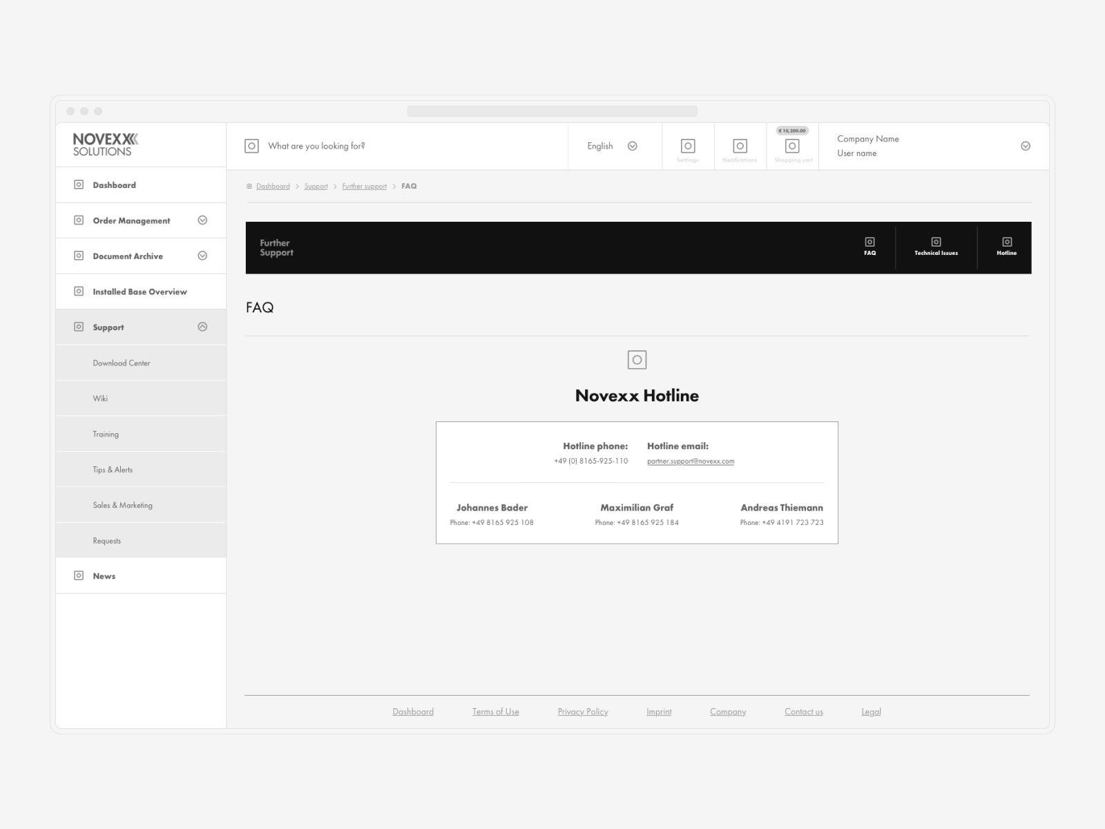
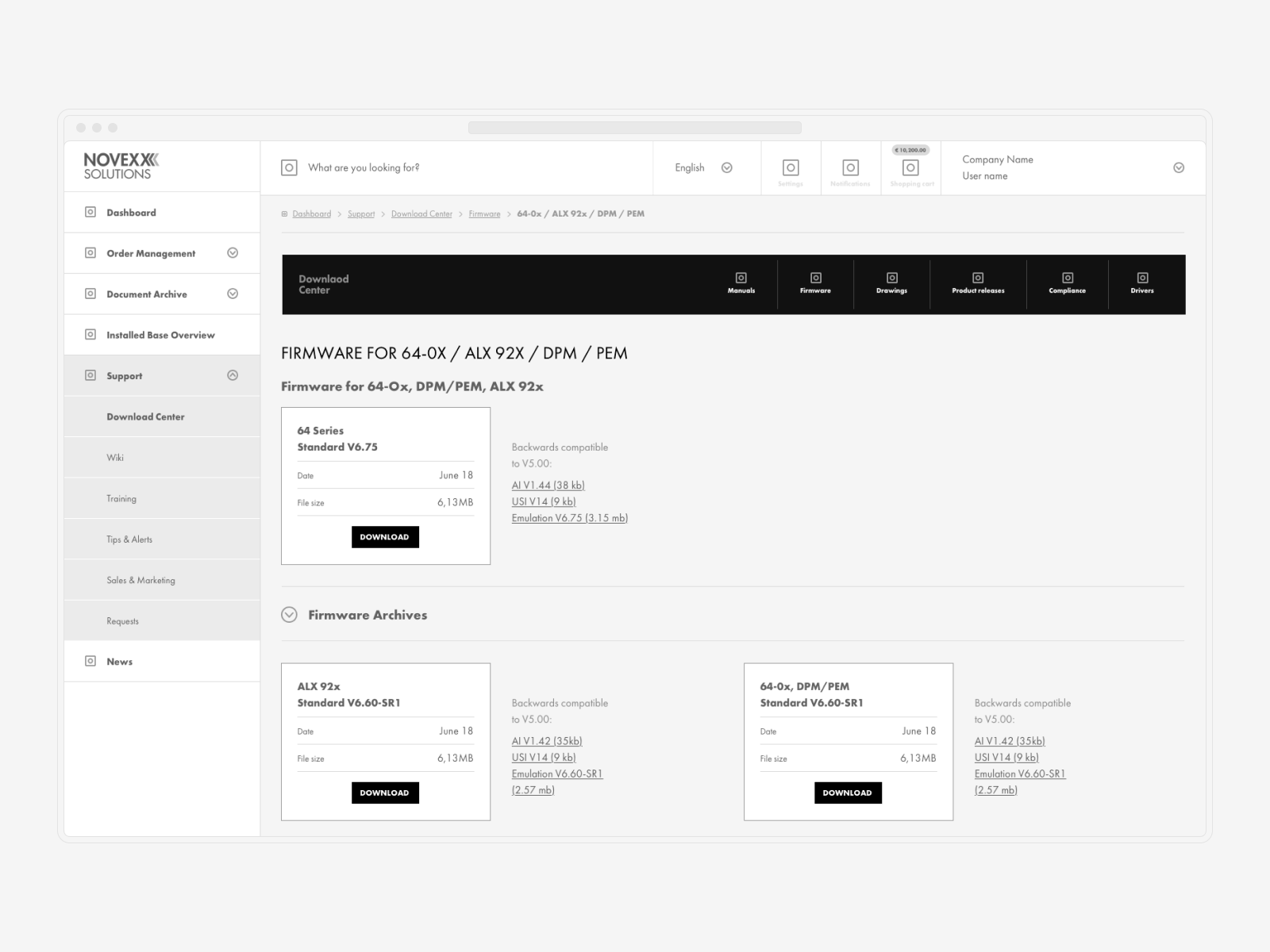
Novexx Solution came to FNX Group with a very complex task: they needed to modernize the way they interact with enterprise clients online, and the goal was very ambitious—to have an interactive platform where they could take their existing enterprise customers and manage their needs throughout the lifetime of that business relationship. What was required was the development of a single platform that would serve both clients and reselling partners as a CRM, Intranet, B2B ordering software, and troubleshooting platform.
↓ All the pieces must precisely fit one another
Novexx Solution gave us with significant documentation, including over 60 separate papers that detailed what was required, the present status of (segmented) solutions, and many samples of data that needed to be shown. Because of the scope, it was critical to get everything correct before going on to the next step.
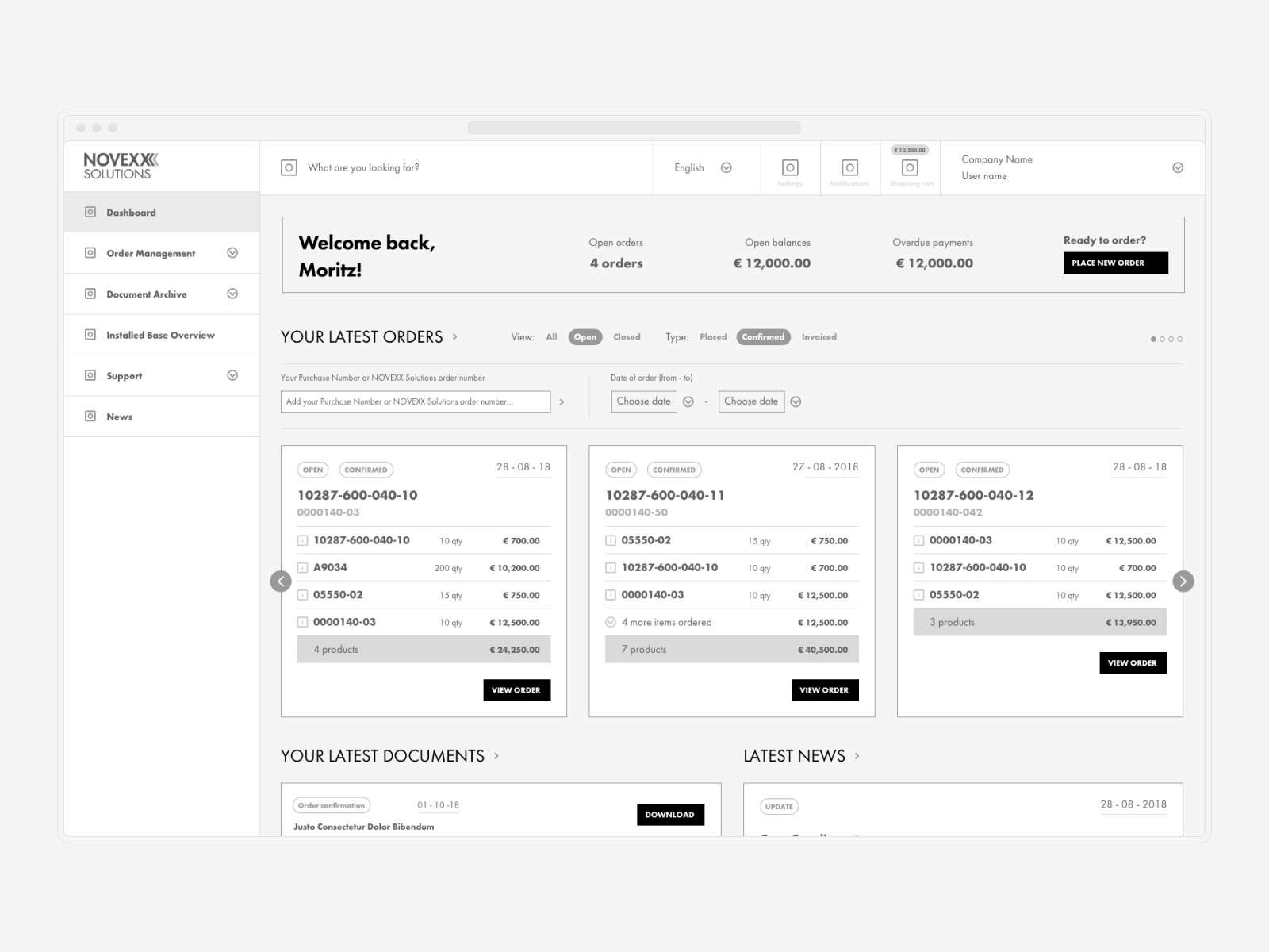
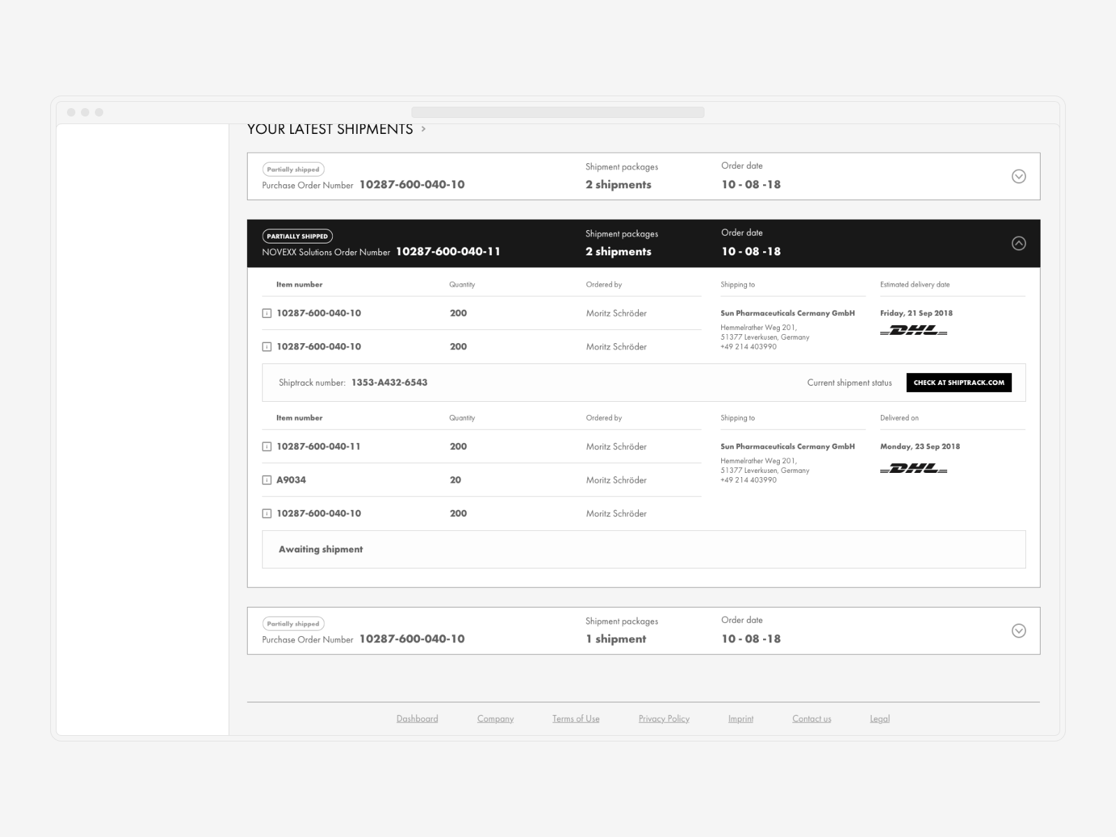
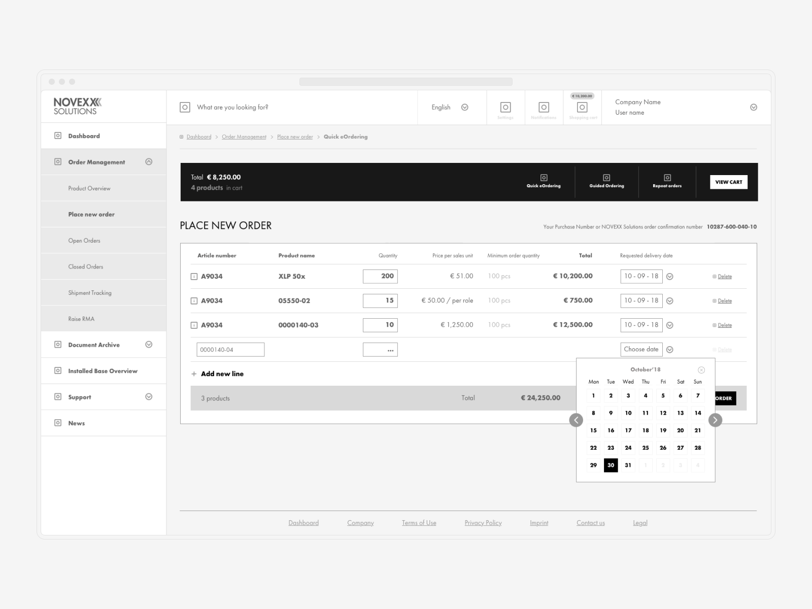
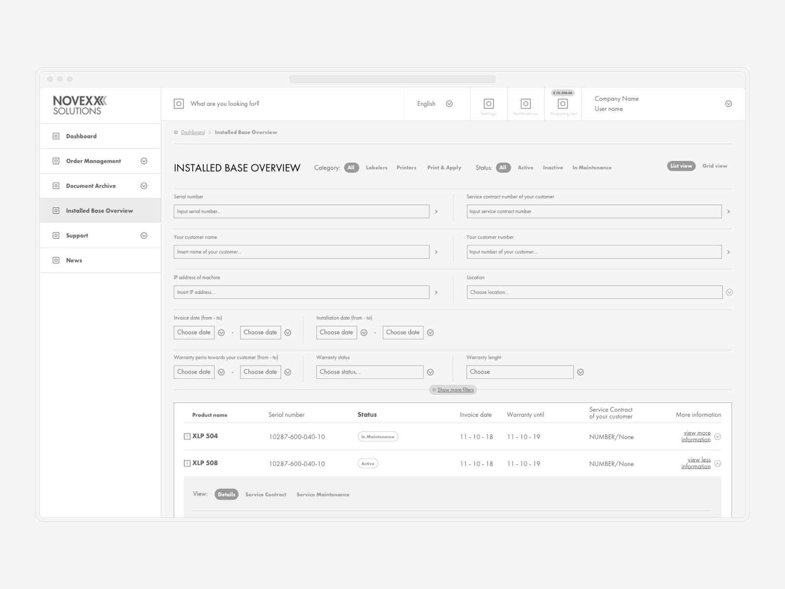
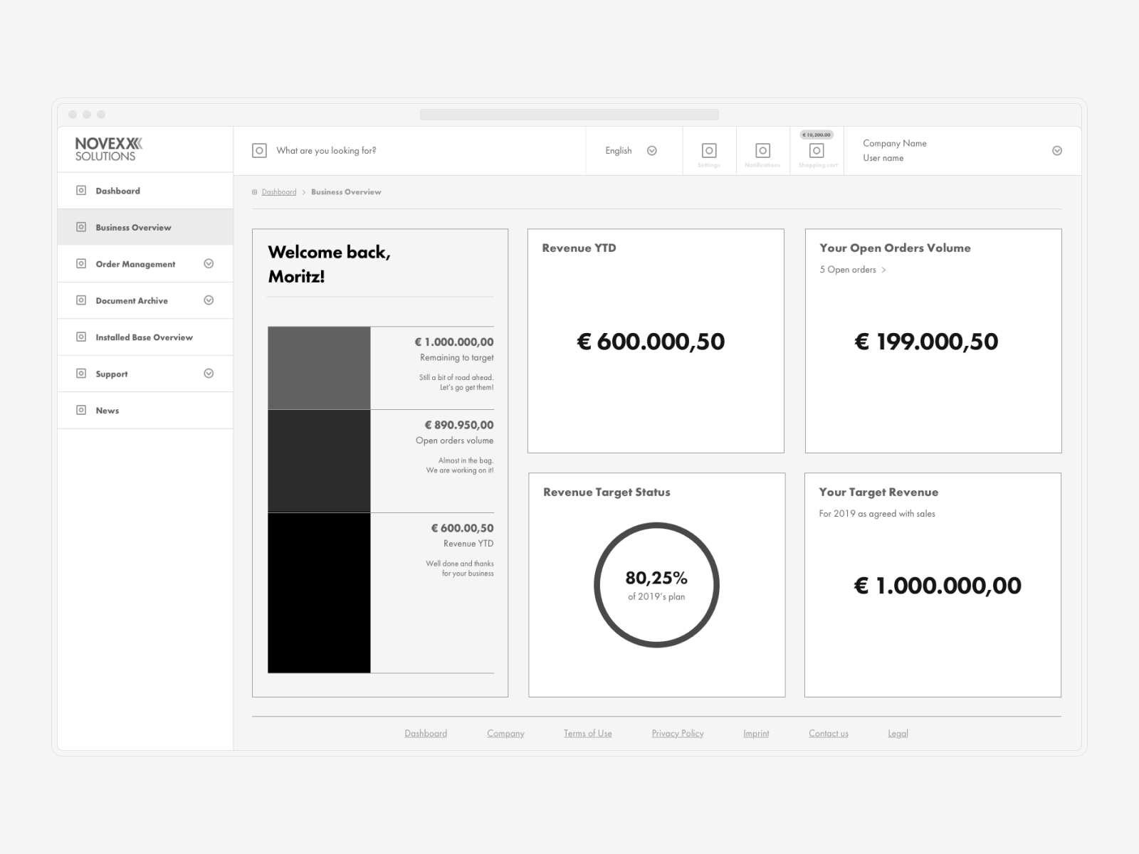
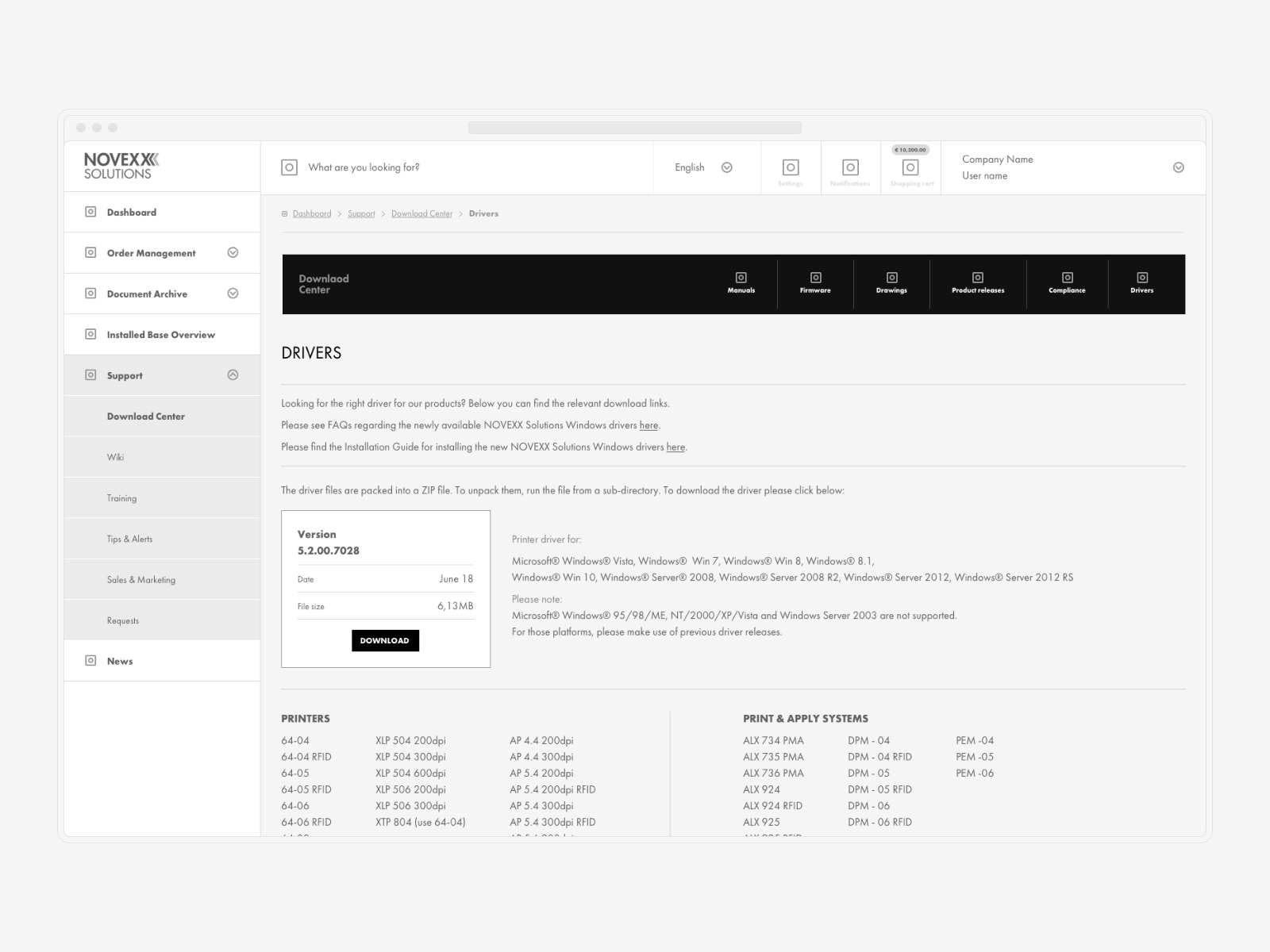
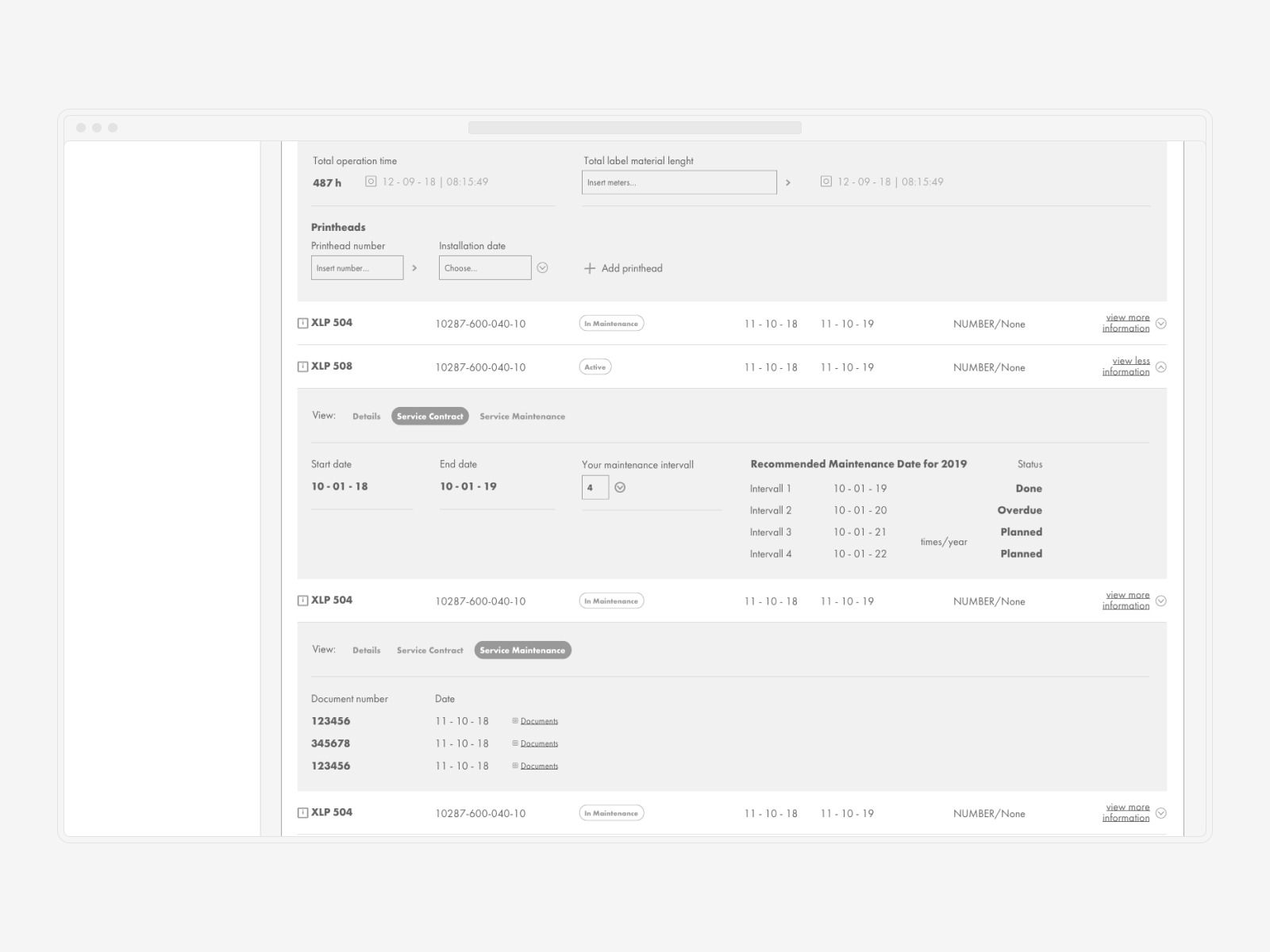
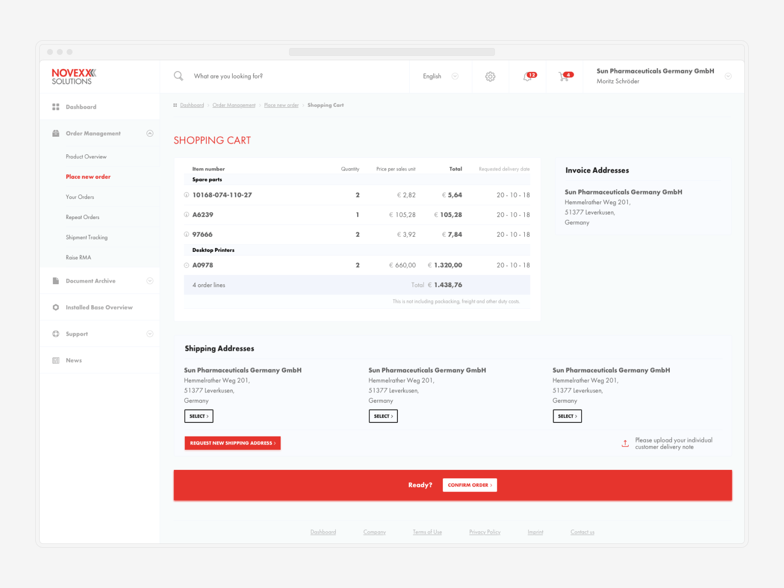
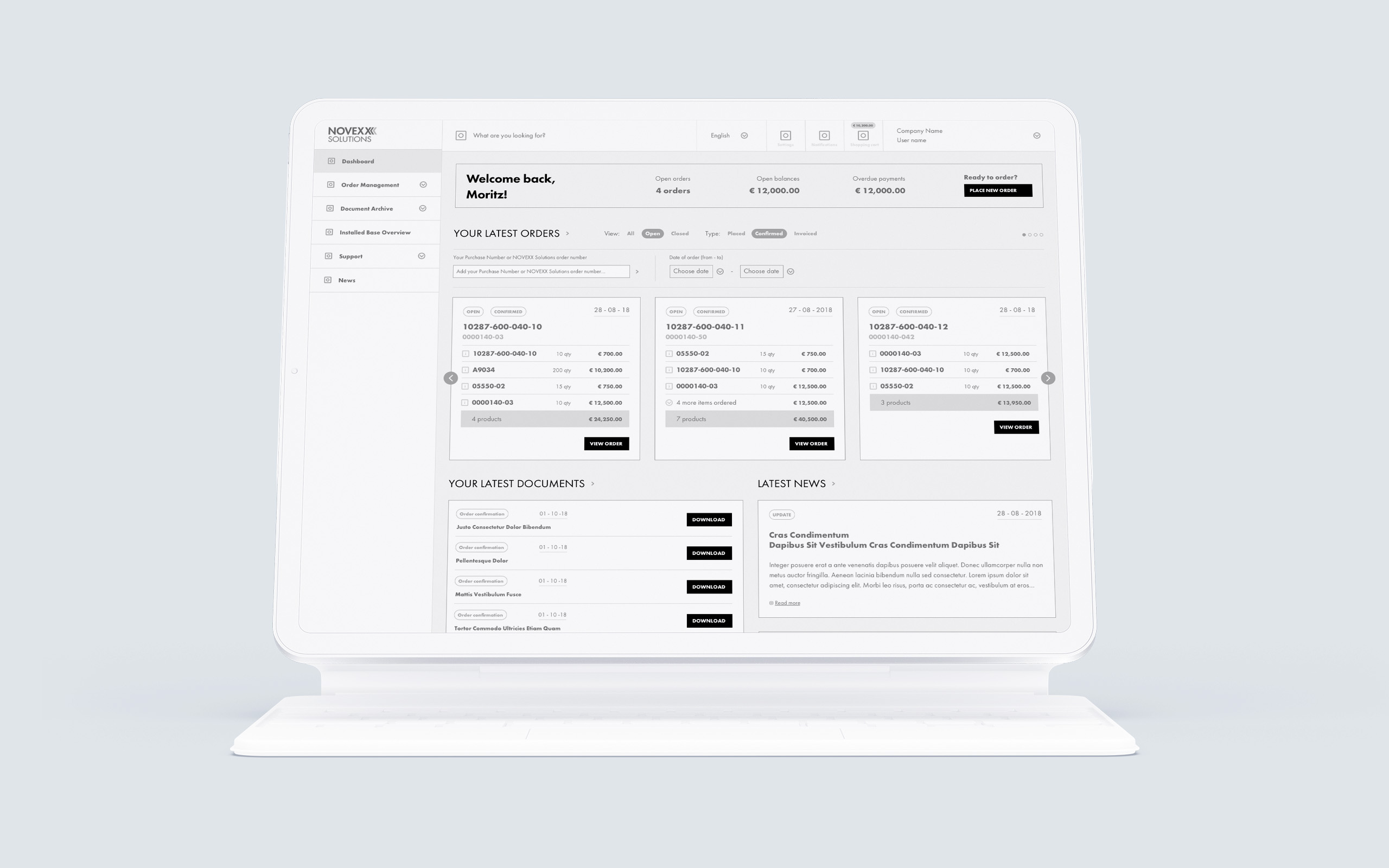
I began by converting those requirements into important user flows, followed by the creation of extremely high-fidelity wireframes. After a few revisions, I felt secure enough to begin user testing, first with stakeholders and then with a few carefully chosen partners. At this stage, we've decided to enhance the ordering part's user experience to suit both older and younger generations by designing two user flows for the first release.
↓ You play with what you are given
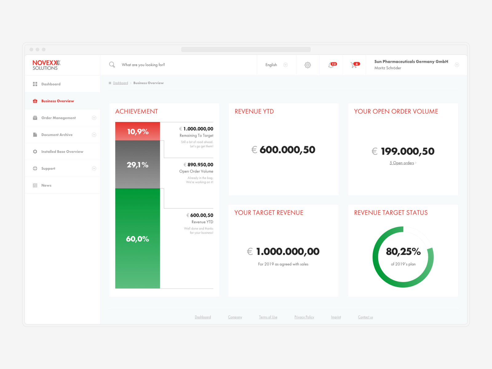
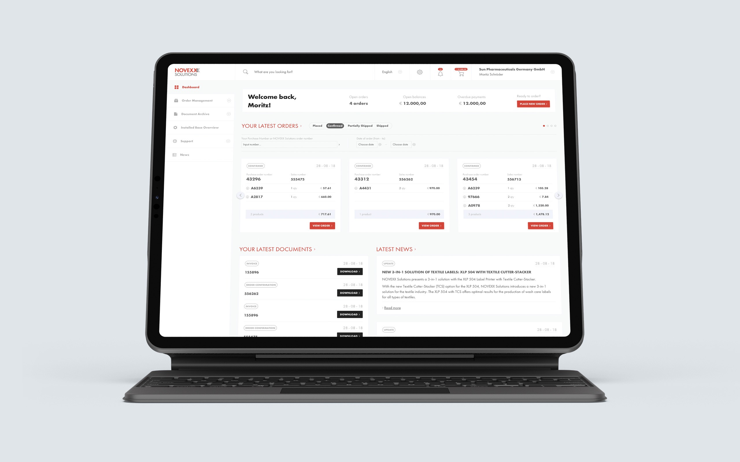
While the majority of design problems were addressed during (high-fidelity) wireframing, one remained: Novexx Solution, a traditionally conservative brand, was reluctant to alter or expand upon its brand guidelines. Their offline brand is well-executed, but their online presence suffers from a lack of adaptability; for example, their limited colour palette with red as an (often-used) accent shade prompted an incredibly clever and well-considered approach to keeping information (especially critical) easily recognizable. The client's needs had to be iterated on a few times before they were in line with the usability standards.
↓ Designed for both older and younger generations
Unanticipated challenges arose as a result of this project. For example, how to ensure that the vast majority of the existing user base is satisfied with their level of comfort while simultaneously developing a brand new system over the course of several years. When it came to ordering (new tools, spare parts, and supplies), the majority of the communication was done via email, and orders were typically sent in a spreadsheet format. As a result, the majority of the users were pretty much old school, having worked with Novexx Solutions for years and being accustomed to outdated methods. It was essential to locate a solution that made it possible for the application to develop into all that it was capable of becoming, but at the same time, it was essential to find a solution that did not disrupt the workflow of the trusted partners. This was a key business objective.
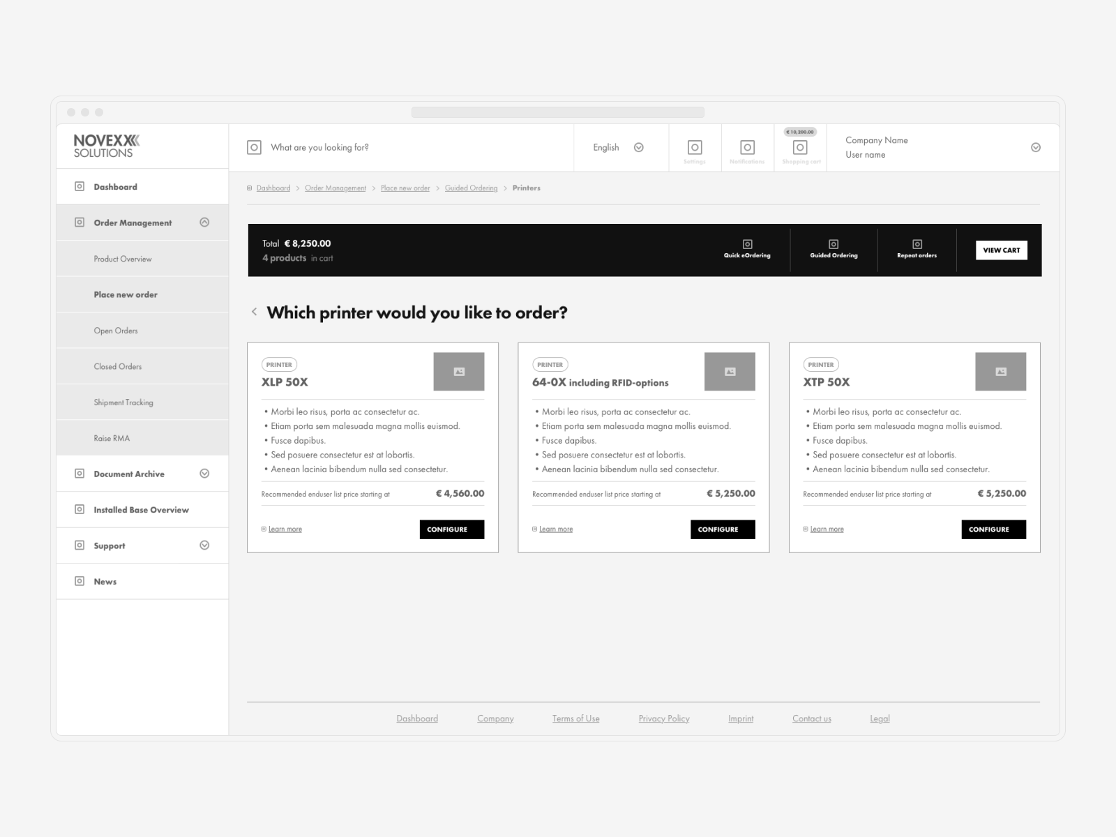
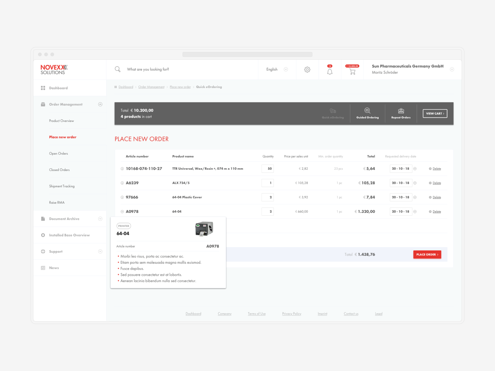
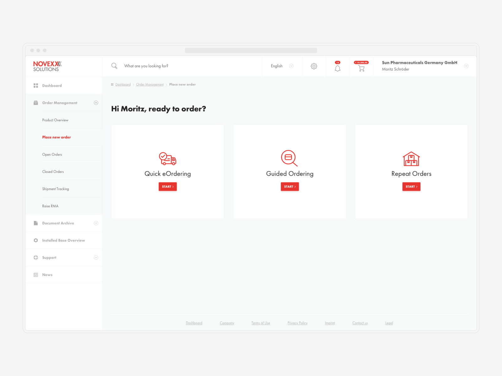
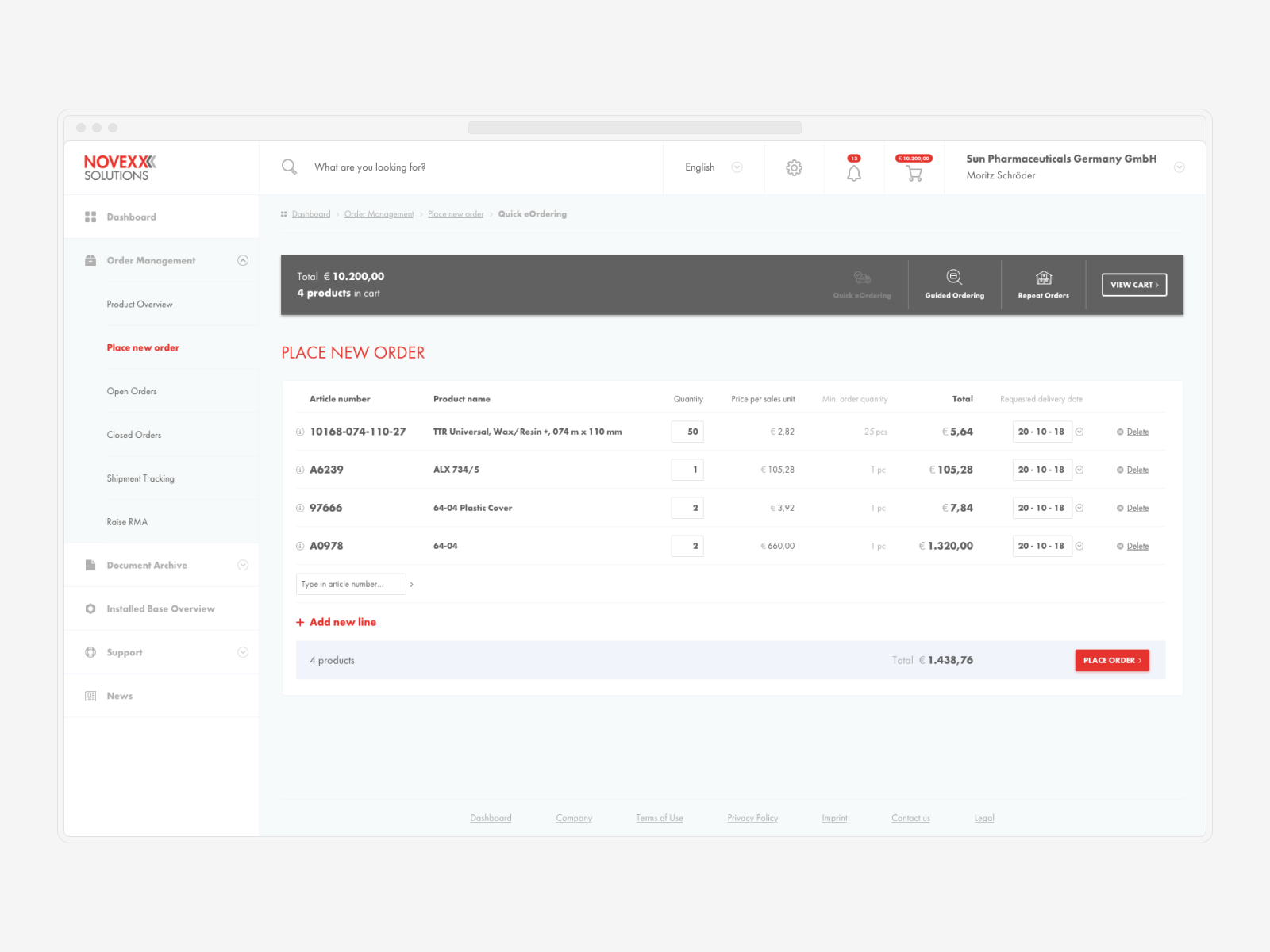
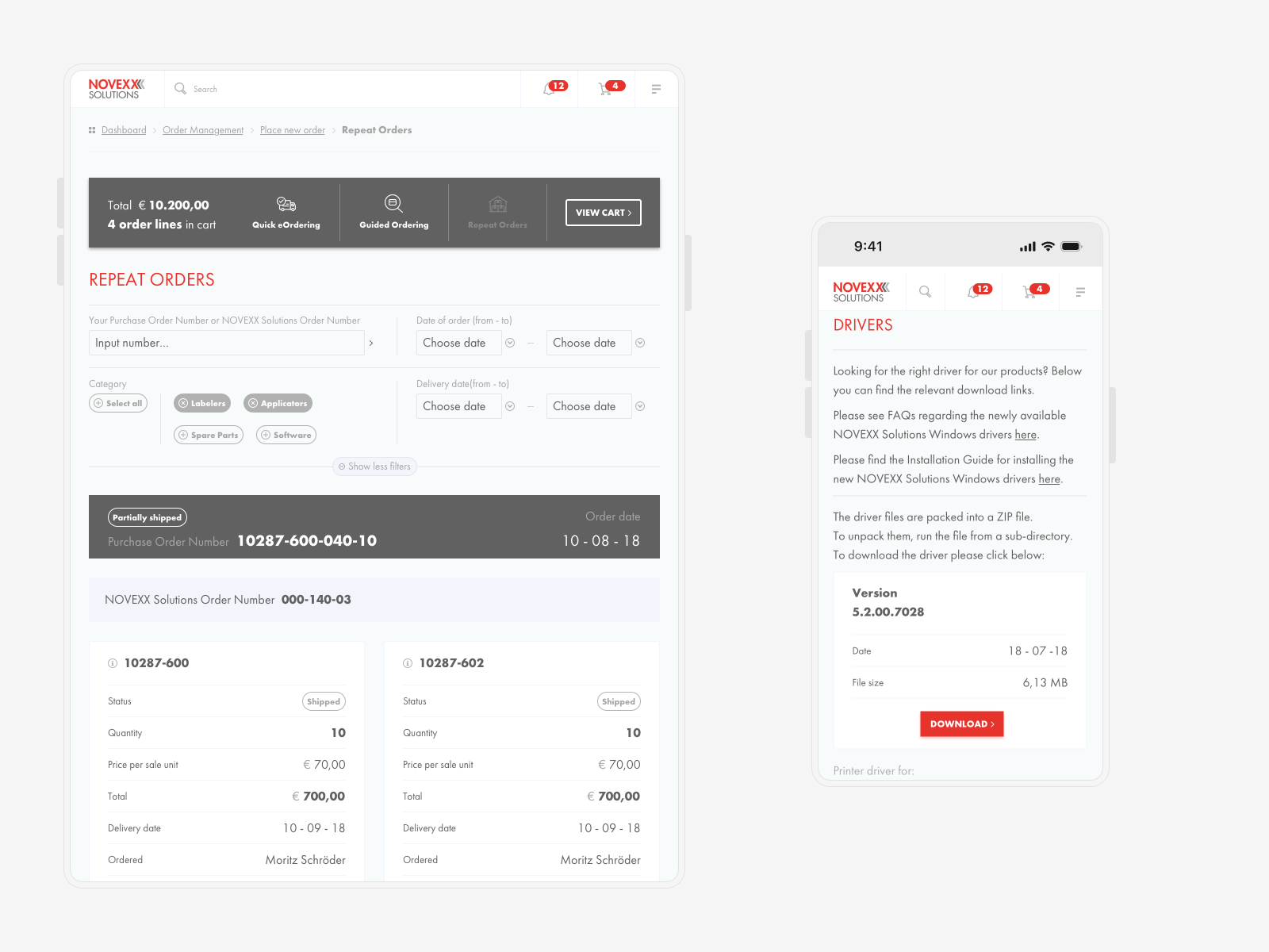
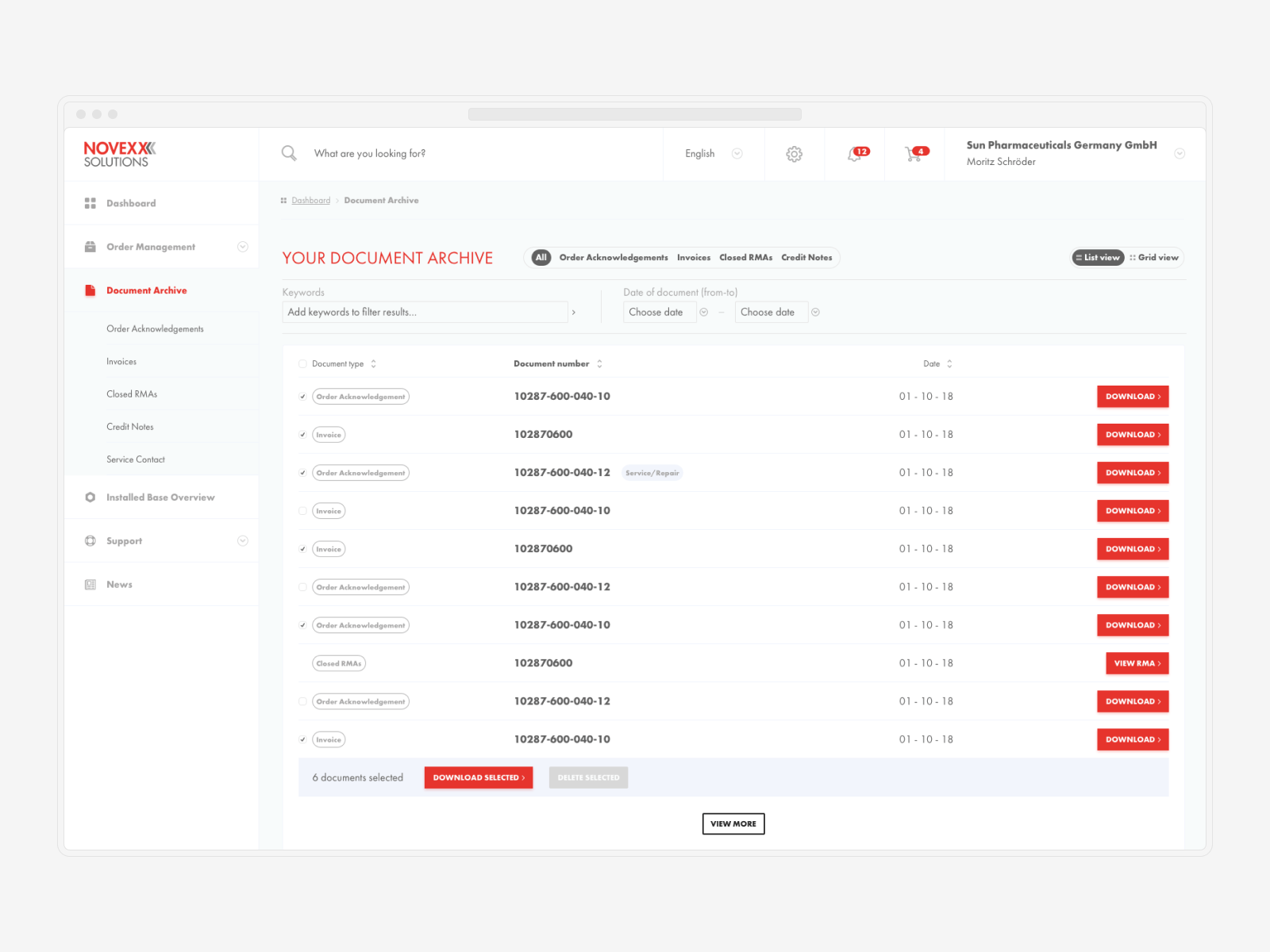
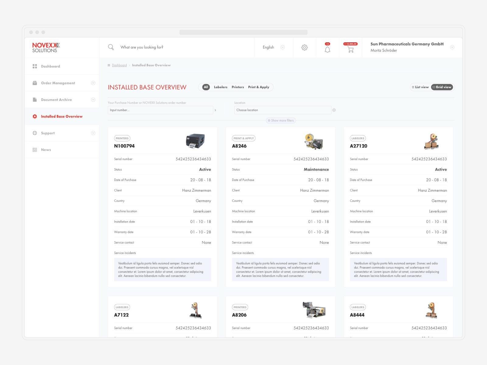
We decided on a dual approach after conducting a number of user interviews and going through a few rounds of discovery. This dual approach allows users to choose between an Excel-alike method of ordering (although highly assisted with autosuggestions based on keywords and historical data from their orders) and a wizard method that is common among modern e-commerce platforms. After that, this strategy was implemented throughout the app, allowing users to easily switch between a table view and a grid view.
↓ Cover all the angles
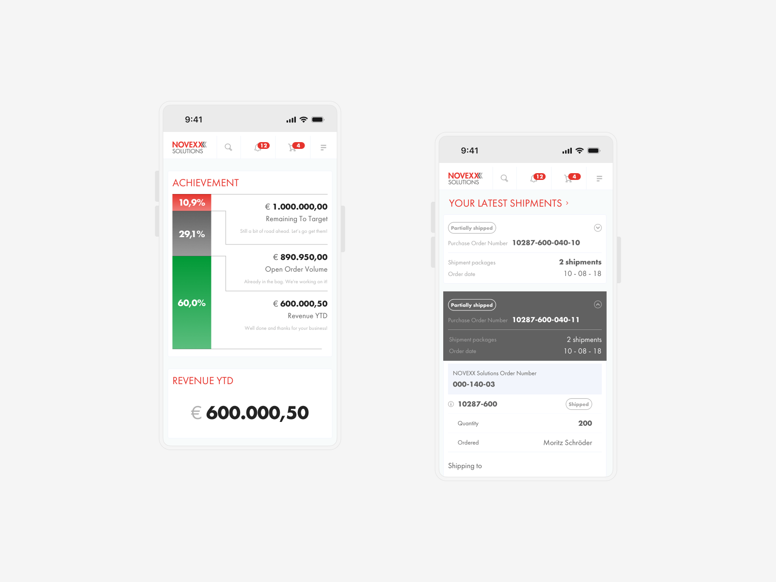
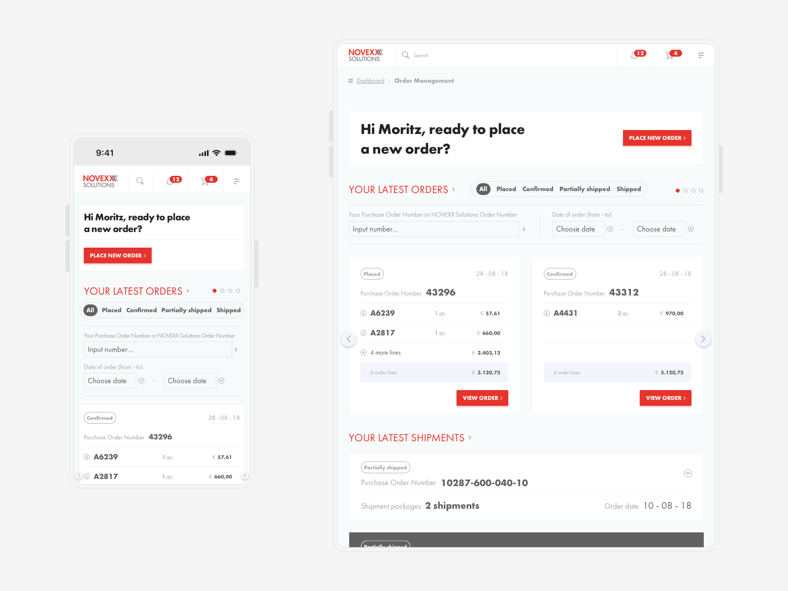
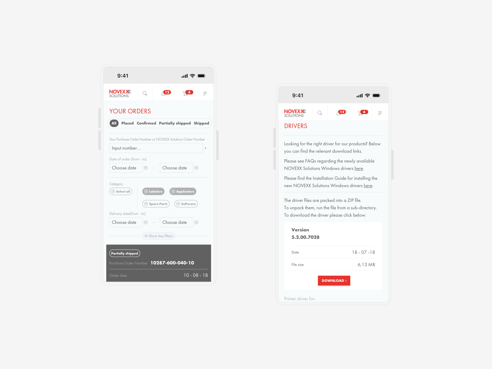
During the user interviews, we found out that in the near future there were plans to transition some of the usage to tablet devices. This was despite the fact that the majority of the usage in the early stages would still primarily be conducted on desktop computers. Due to the fact that the application placed a strong emphasis on data, a customized approach to multiple viewports was required. This necessitated a significant amount of focus being placed on working specifically on a tablet version and finding the most effective design patterns to follow. Because I had planned to use an optional grid design earlier, I am thankful that I will be able to reuse the majority of those principles for handheld versions of the app.
↓ 6 months later: Extensive body of work
Within a period of half a year, I was able to transform the extensive client documentation into a fully functional prototype of the product. Over one hundred and more designs spread across three distinct viewports were developed in tandem with a design system for the client to use in the future when developing additional online products of a more modest scale.

© Tomasz Zelmański'24 → tomek@zelmanski.pl → +48 698632226
© Tomasz Zelmański'24
→ tomek@zelmanski.pl
→ +48 698632226
