GoodDog.com - Design System
Good Dog makes it simple for people to get dogs from good sources and for reputable breeders, shelters and rescues to put their dogs in good homes. I've created a brand new design system for them.
Design System Lead
Good Dog, US
2024
GoodDog.com - Design System
Good Dog makes it simple for people to get dogs from good sources and for reputable breeders, shelters and rescues to put their dogs in good homes. I've created a brand new design system for them.
Design System Lead
Good Dog, US
2024
GoodDog.com - Design System
Good Dog makes it simple for people to get dogs from good sources and for reputable breeders, shelters and rescues to put their dogs in good homes. I've created a brand new design system for them.
Design System Lead
Good Dog, US
2024
↓ Creating a New Design System for GoodDog.com
In January 2024, Josh Weis, CEO of GoodDog, approached me to develop a new design system. With my previous experience as a Senior Product Designer at Good Dog, I was well-acquainted with their needs and vision. The goal was to create a robust and flexible design system that aligned with their new art direction and improved efficiency for the product design team.
The project involved developing a comprehensive library of reusable UI components, establishing a cohesive typography system and color palette, and creating detailed documentation for smooth implementation. The new design system successfully launched, empowering Good Dog's designers to work more efficiently and consistently, while supporting the platform's continued growth and innovation.
↓ Establishing a Solid Foundation
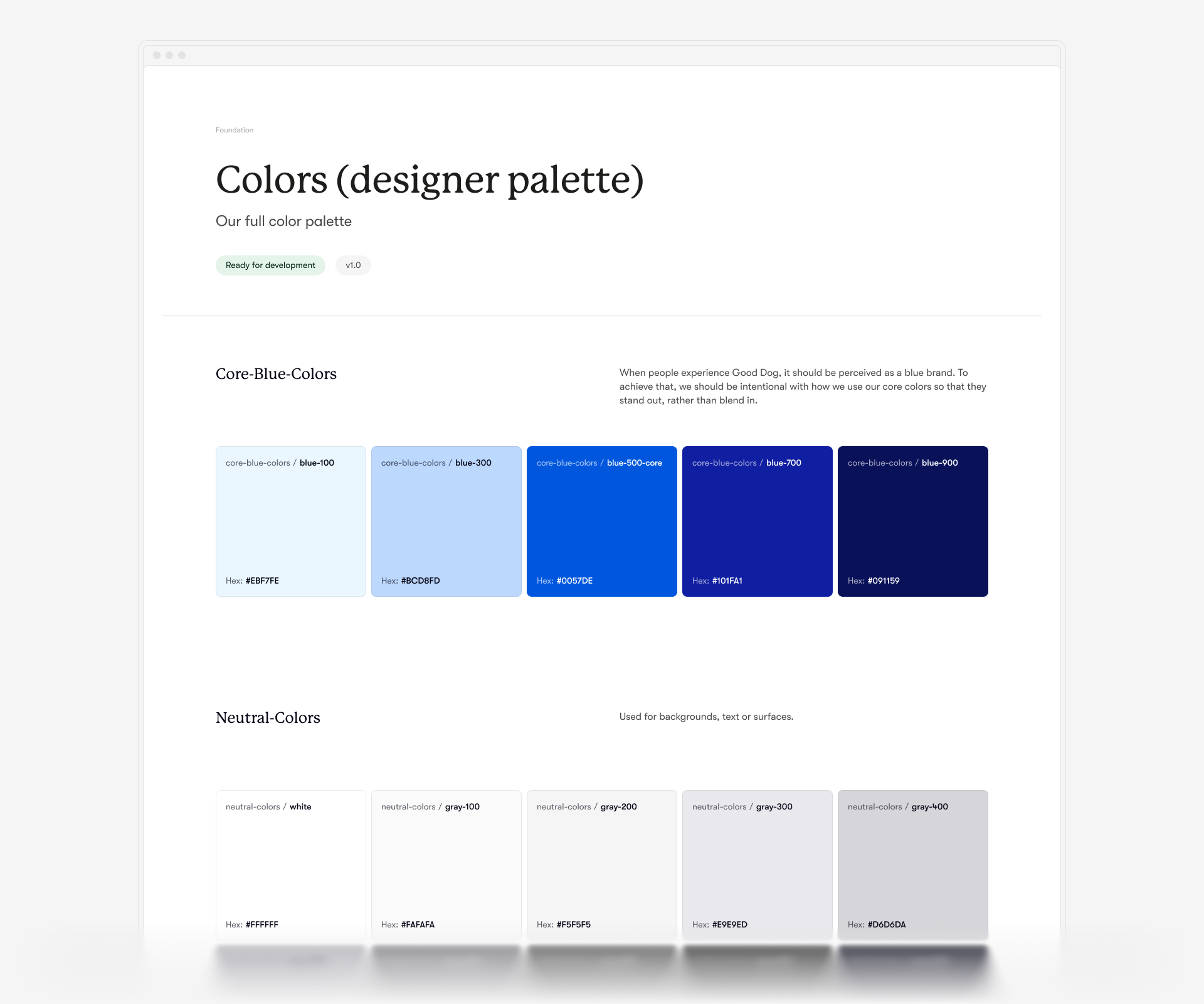
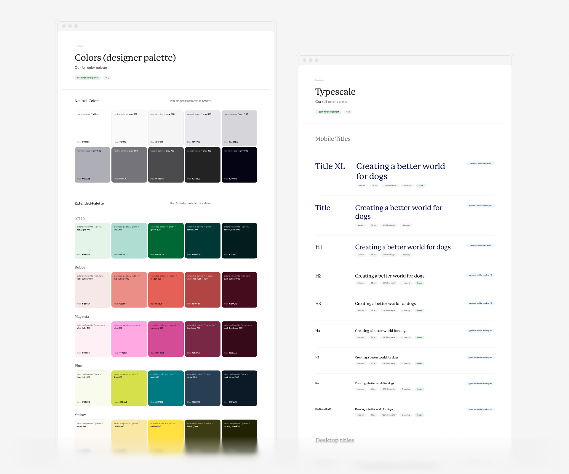
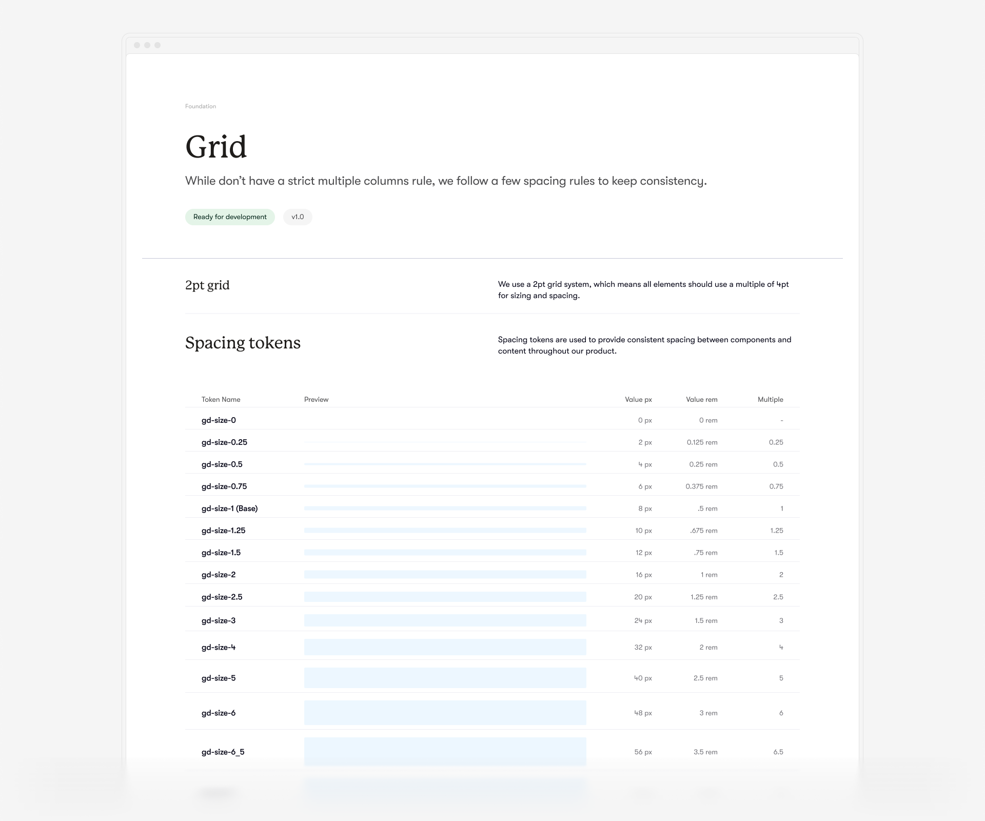
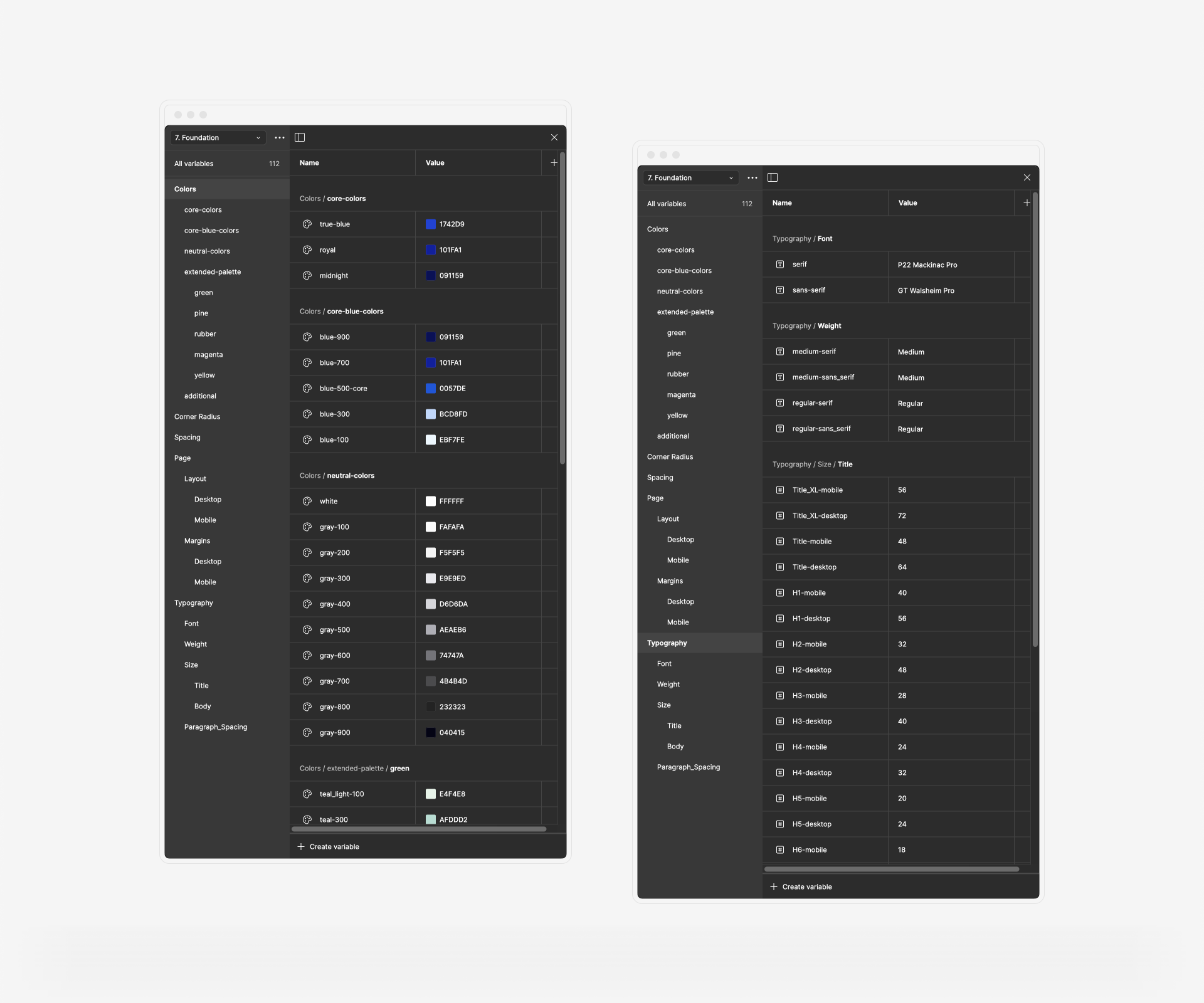
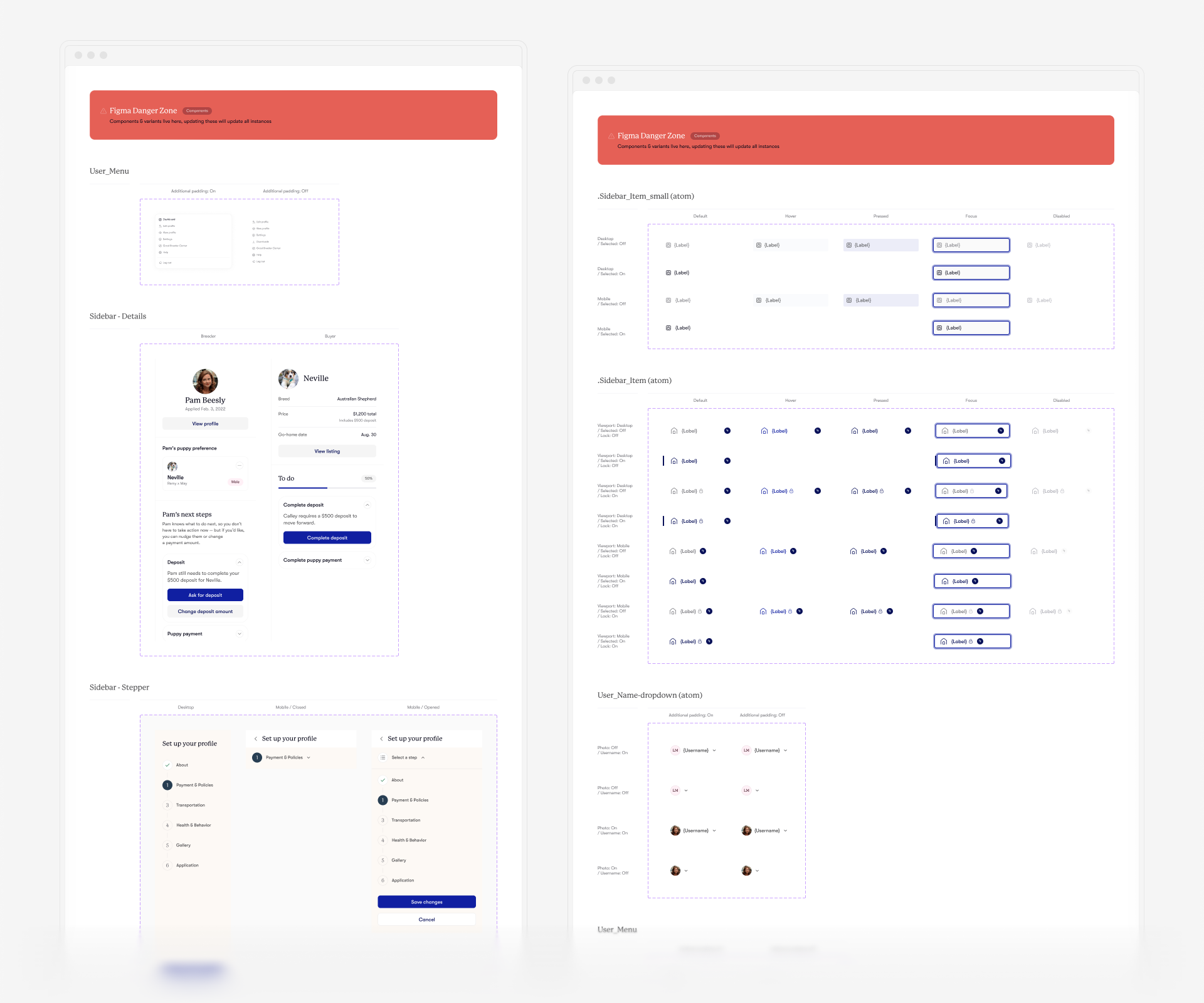
It all started with creating a proper foundation. The art direction was already established, and some elements had been implemented, but they were scattered. I began by creating thorough documentation for the foundational layer of the design system.
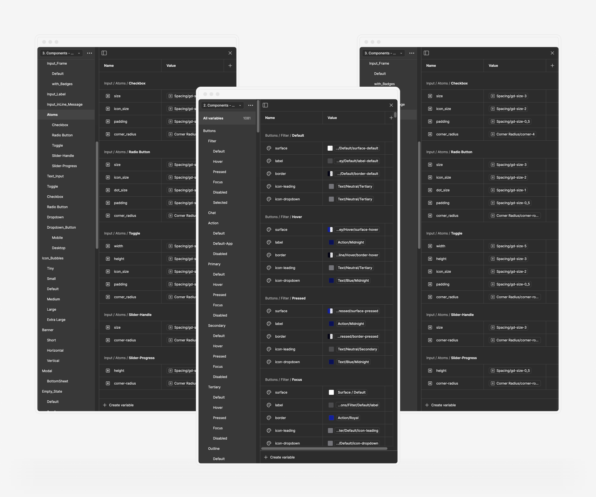
Working closely with Mariana Gomes, the Design Lead at Good Dog, we polished and implemented a new color and typography structure for the entire product. Alongside a spacing system, these foundational tokens provided precise control over all future elements. Based on these ground rules, I developed more semantic values (colors, styles, paddings, corner radii, etc.) to facilitate seamless collaboration between designers and developers.
↓ Building Components for Good Dog
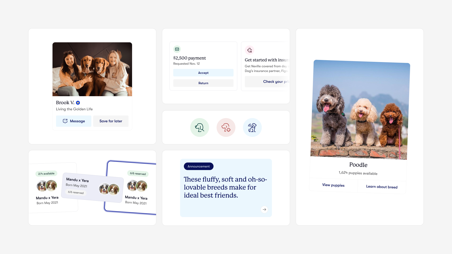
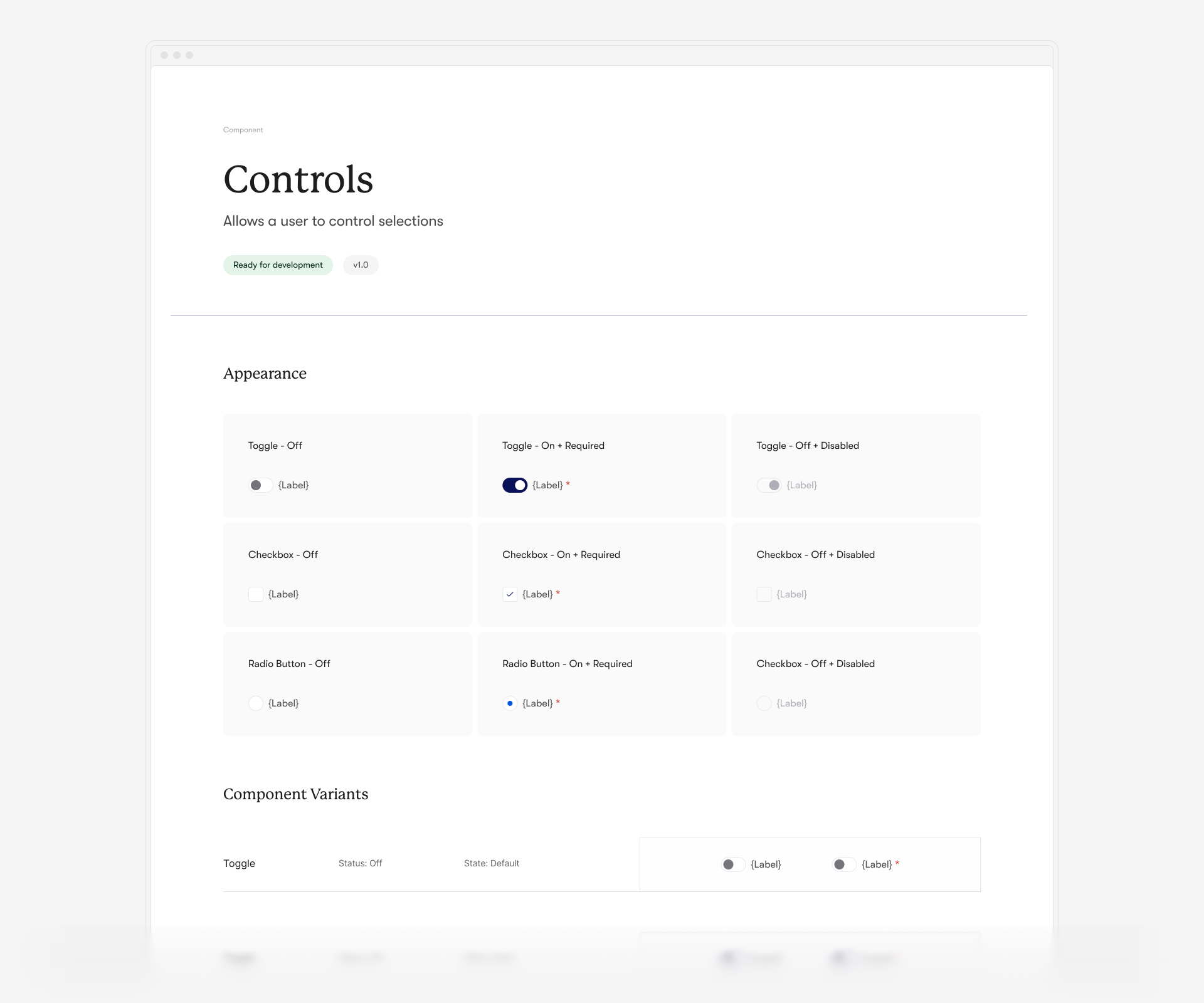
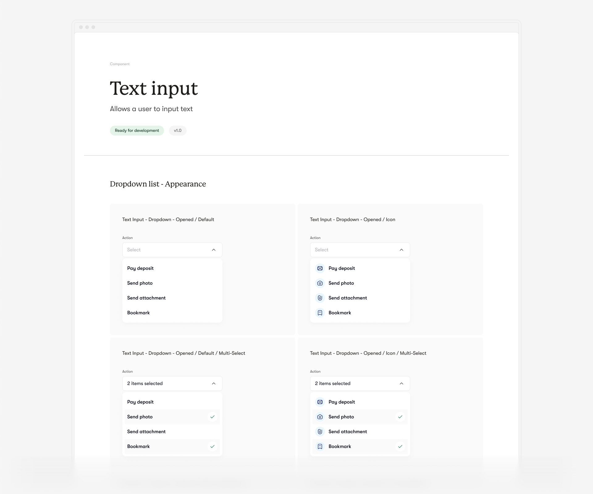
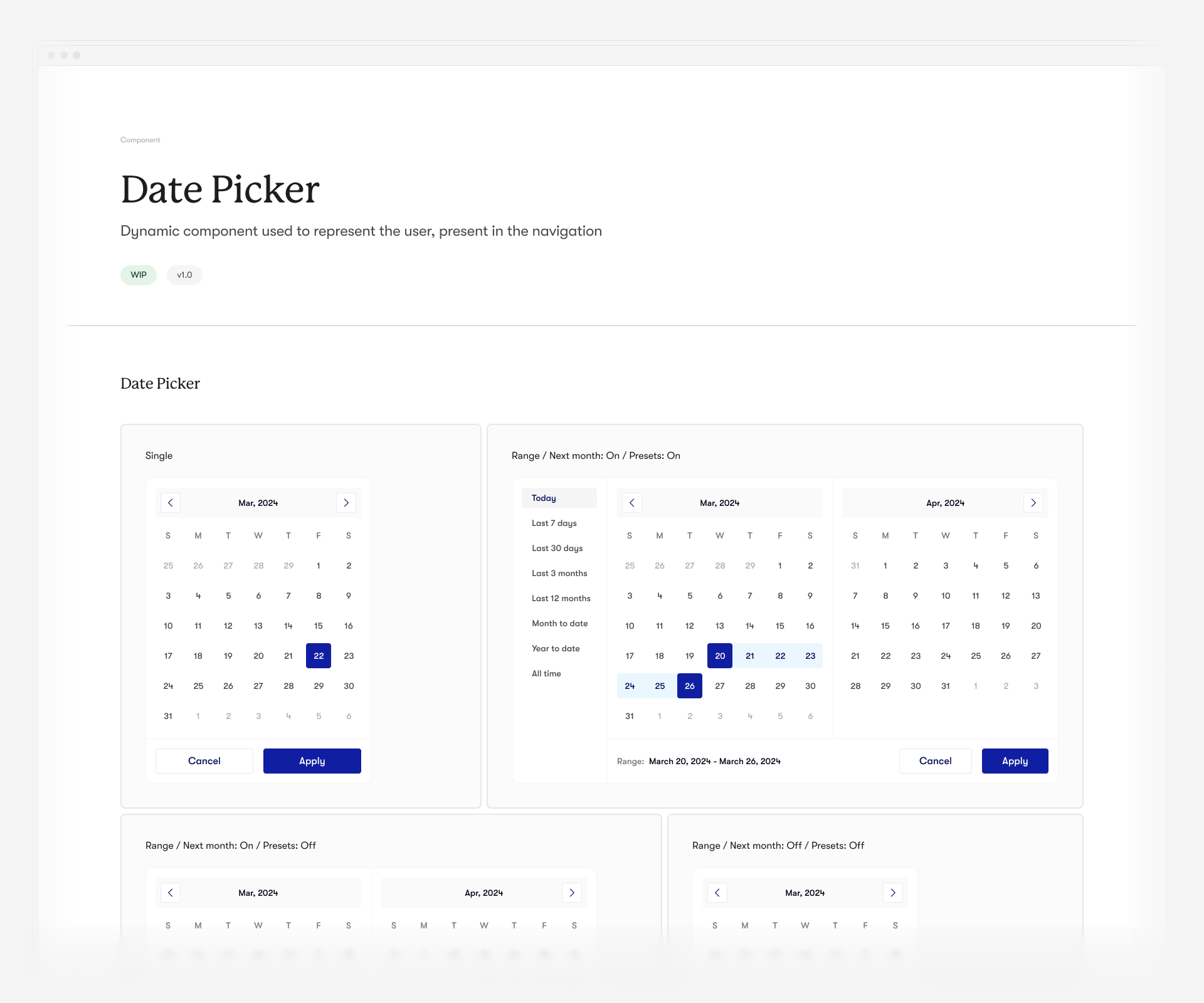
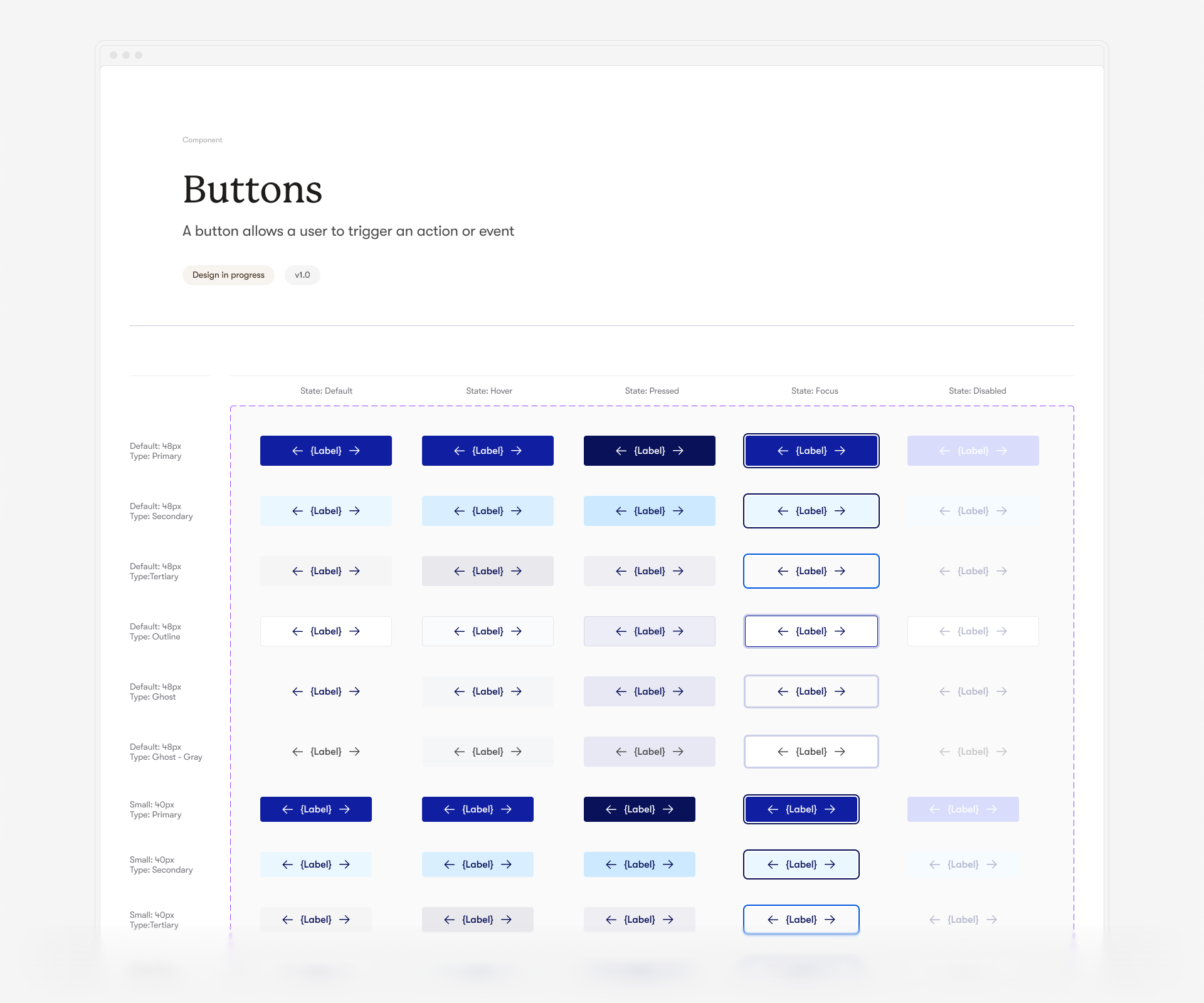
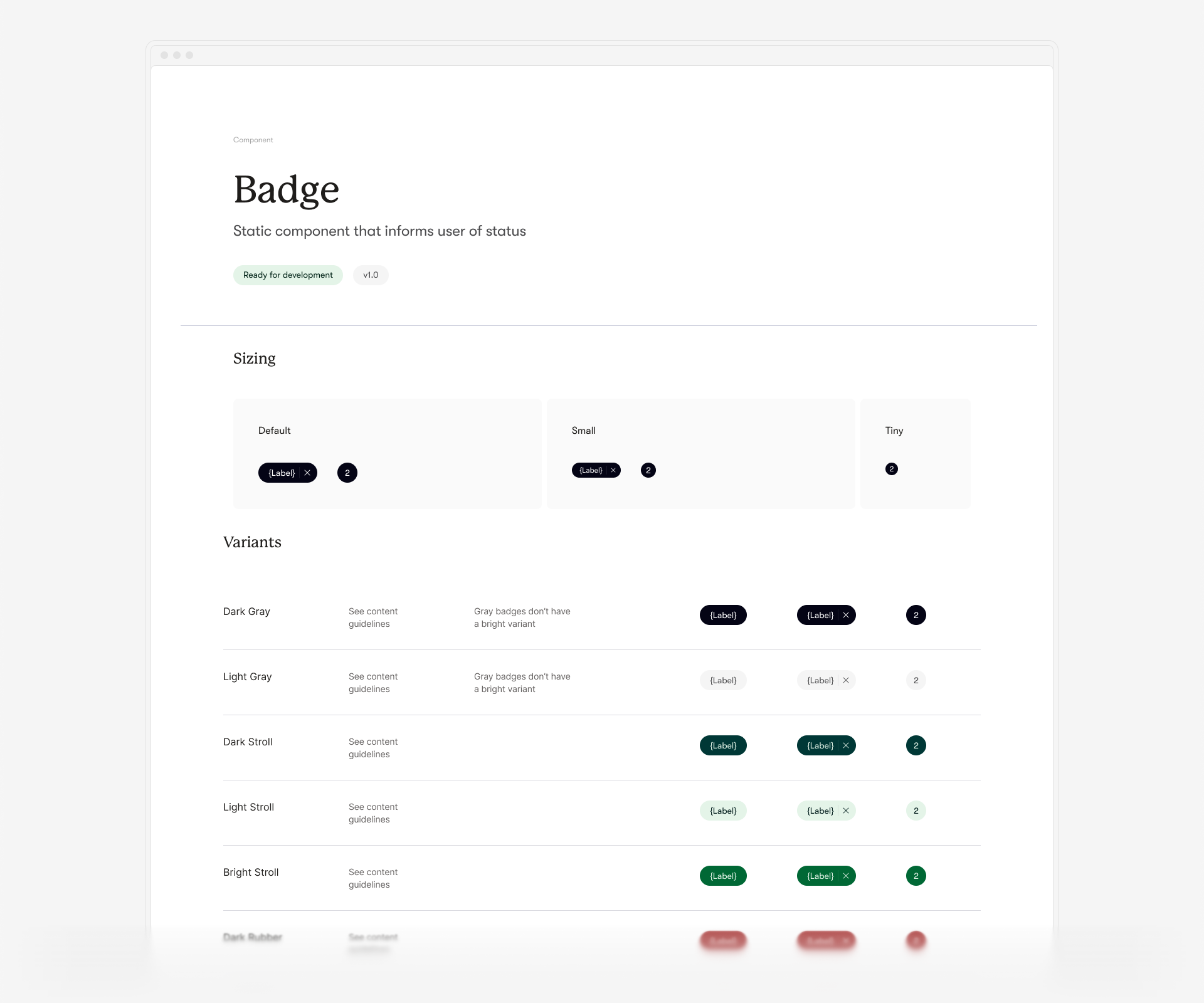
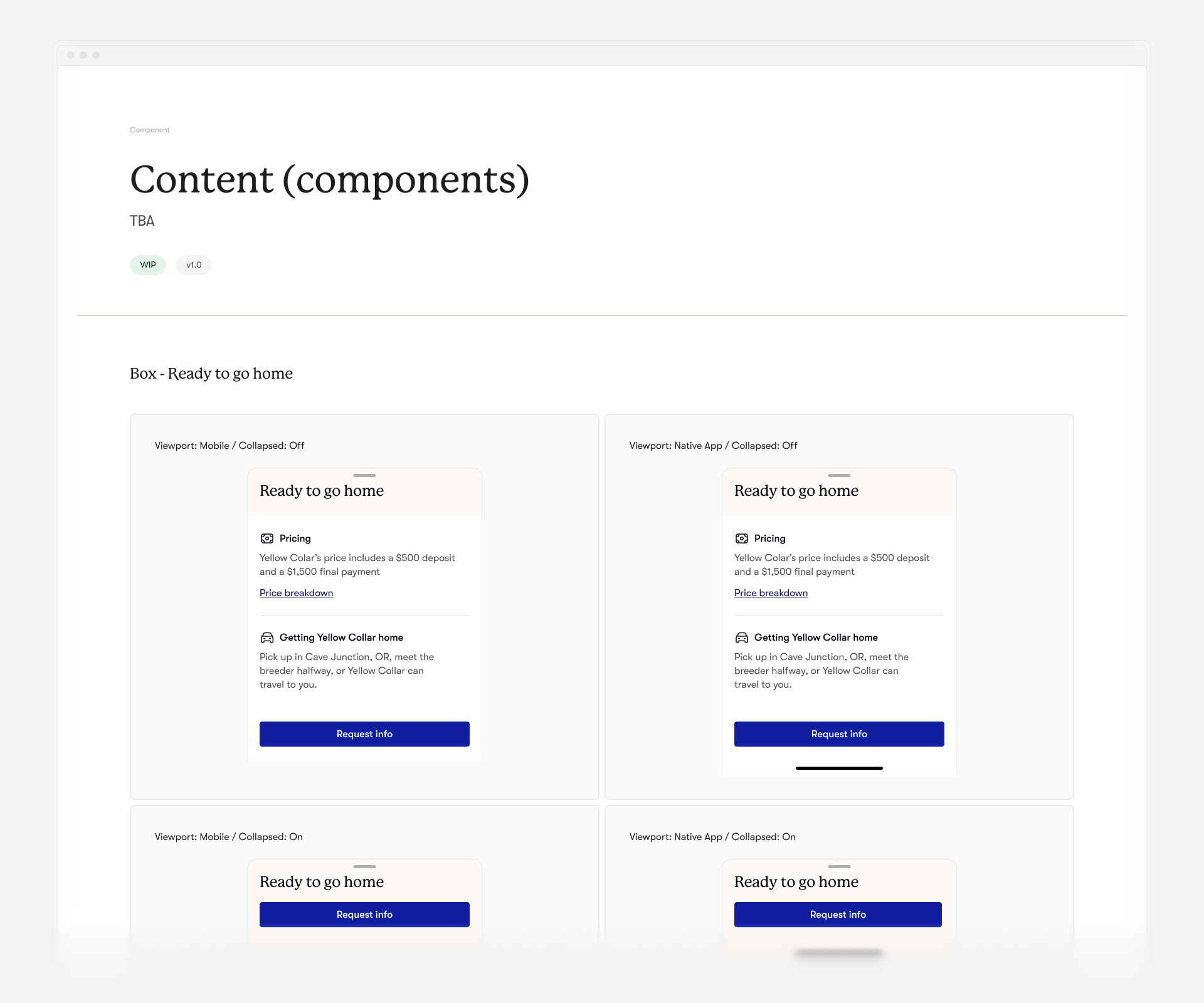
The next step was to start building components based on the tokens we created. I began with the most common ones like buttons, controllers, and inputs, then moved on to more specific and complex components.
To achieve consistency and future-proofing, each component was assigned a set of tokens, with semantics clearly separated between style and dimensions (layout). This was not a linear process; new components were continuously added as needed for new cards or patterns, and whenever a team member requested one.
I worked closely with the product designers at Good Dog, also contributing to the design aspects to ensure a cohesive and efficient design system.
↓ Embracing a Card-Based Approach
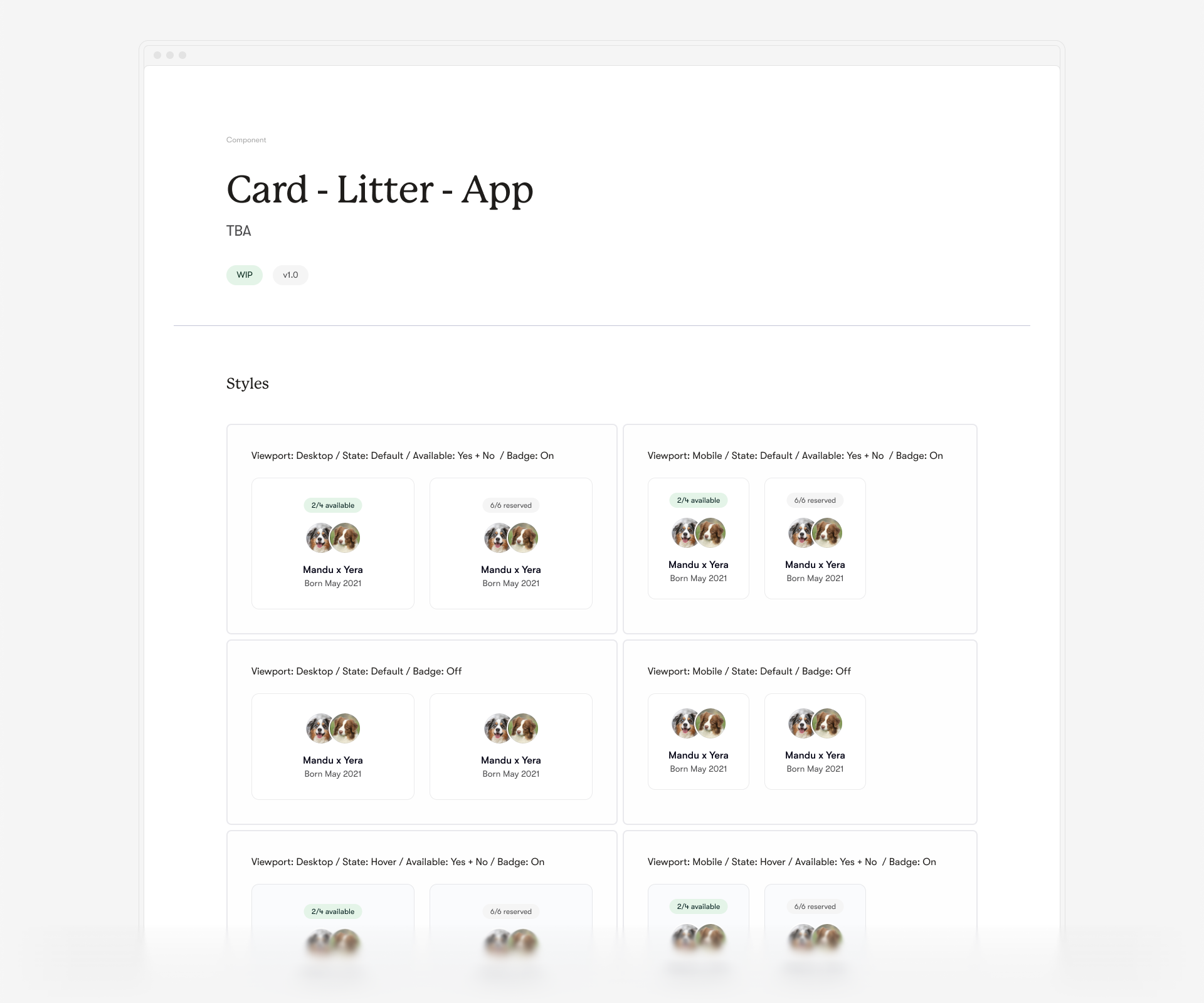
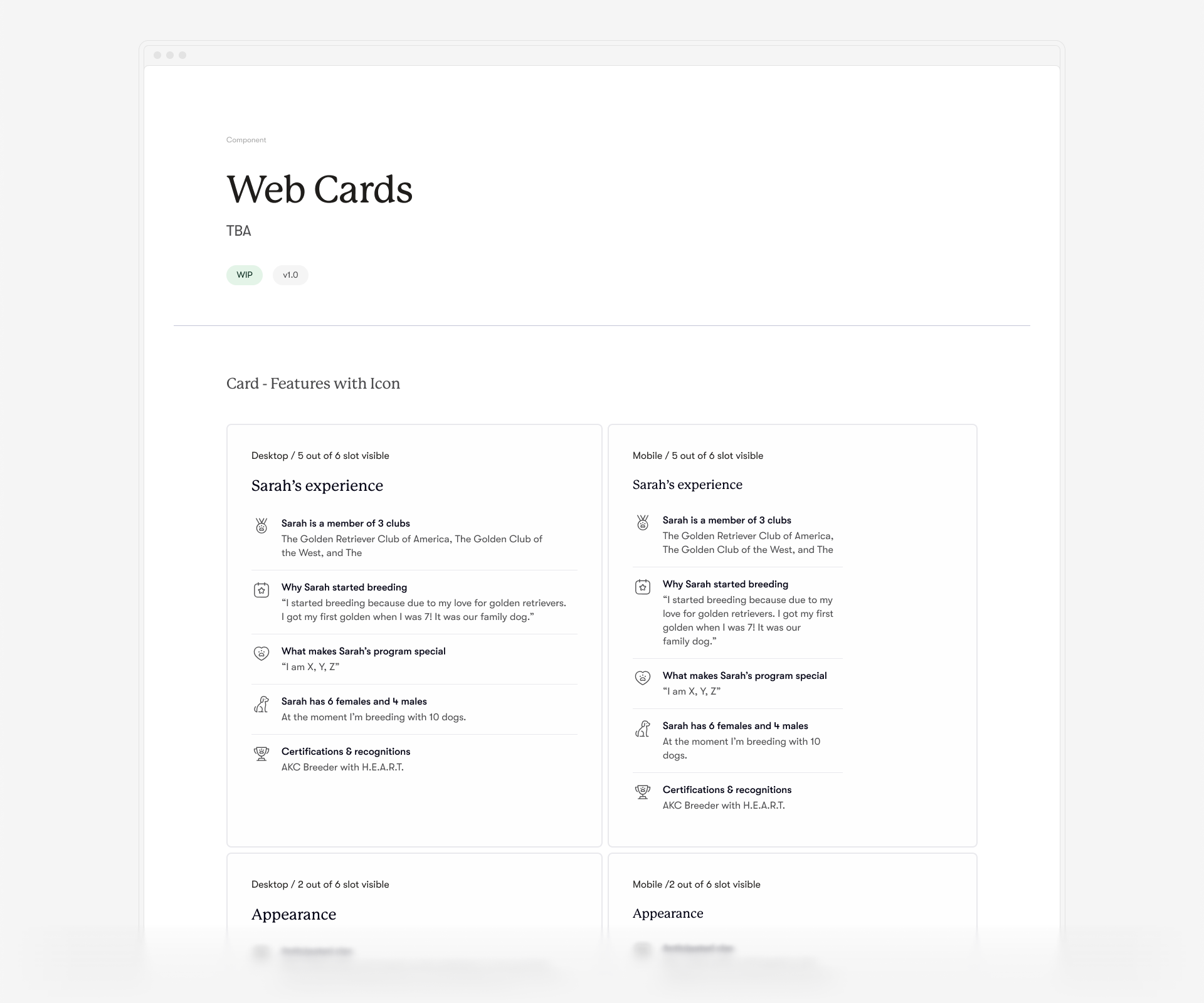
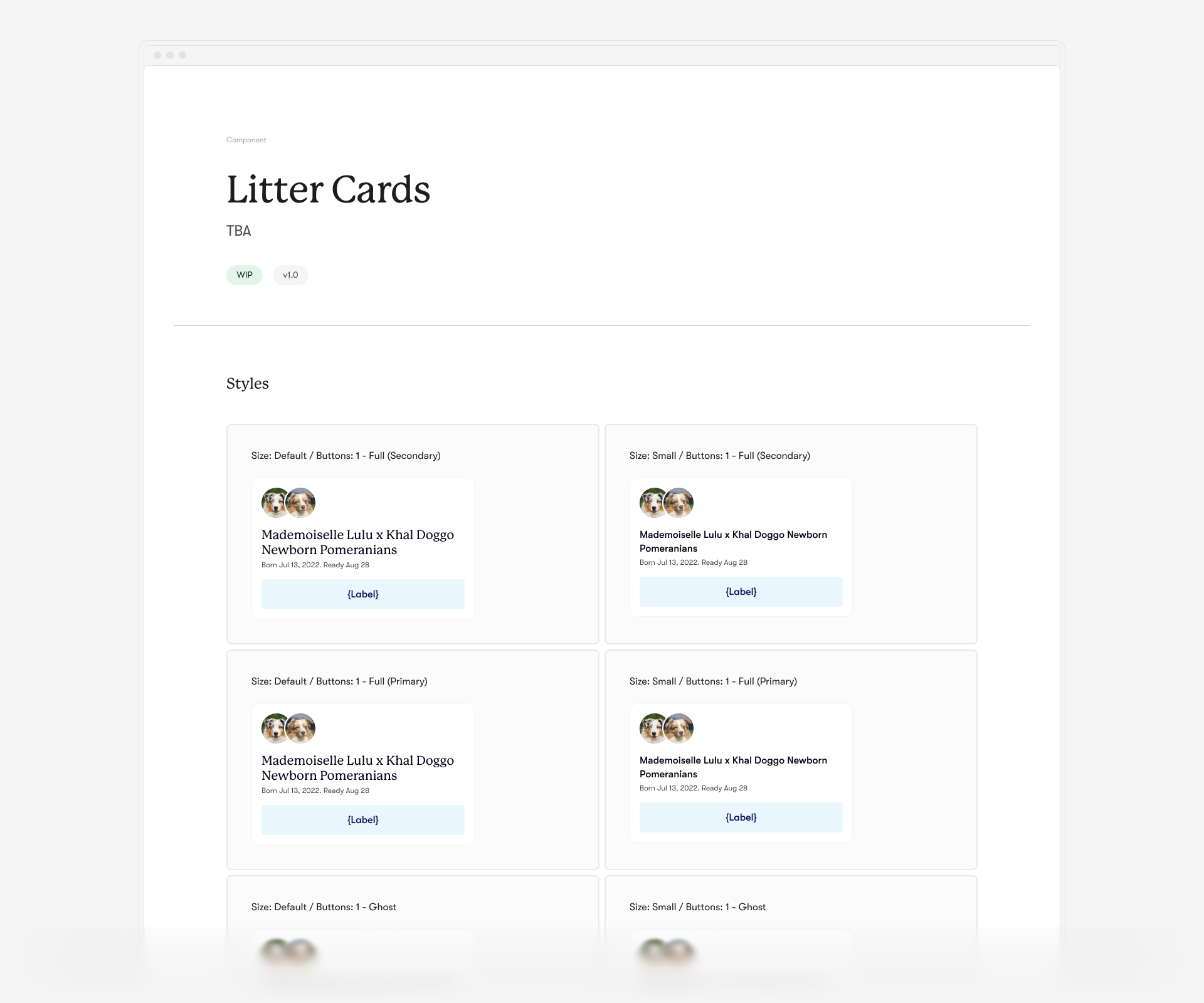
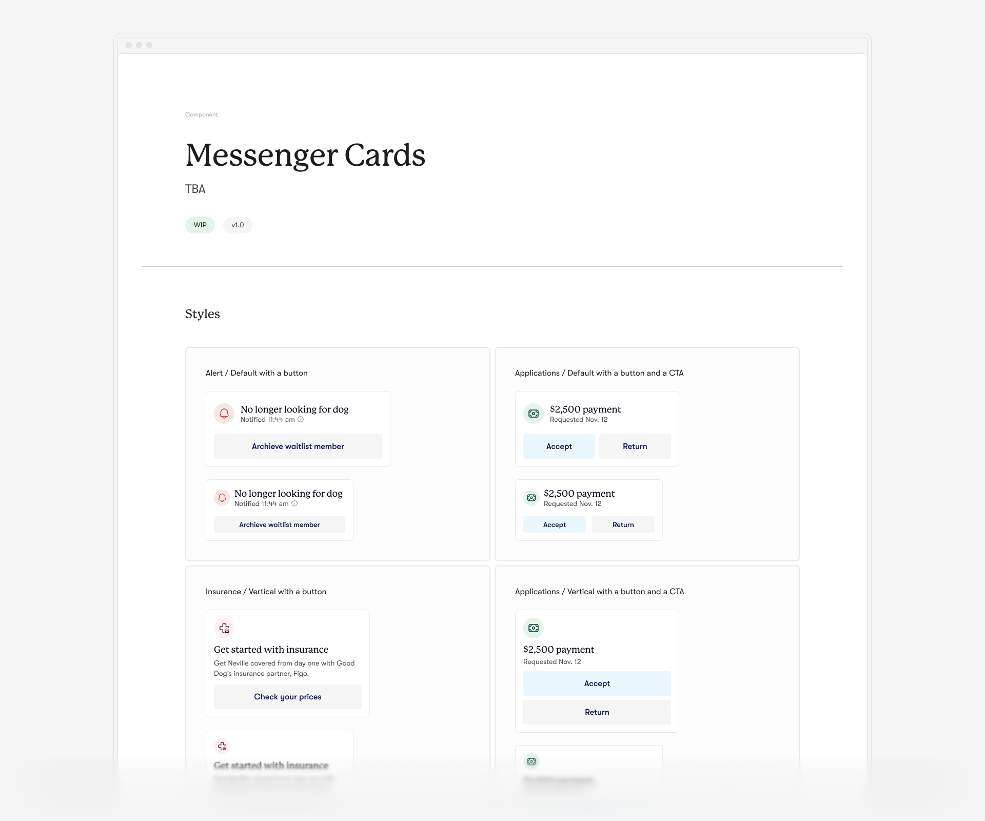
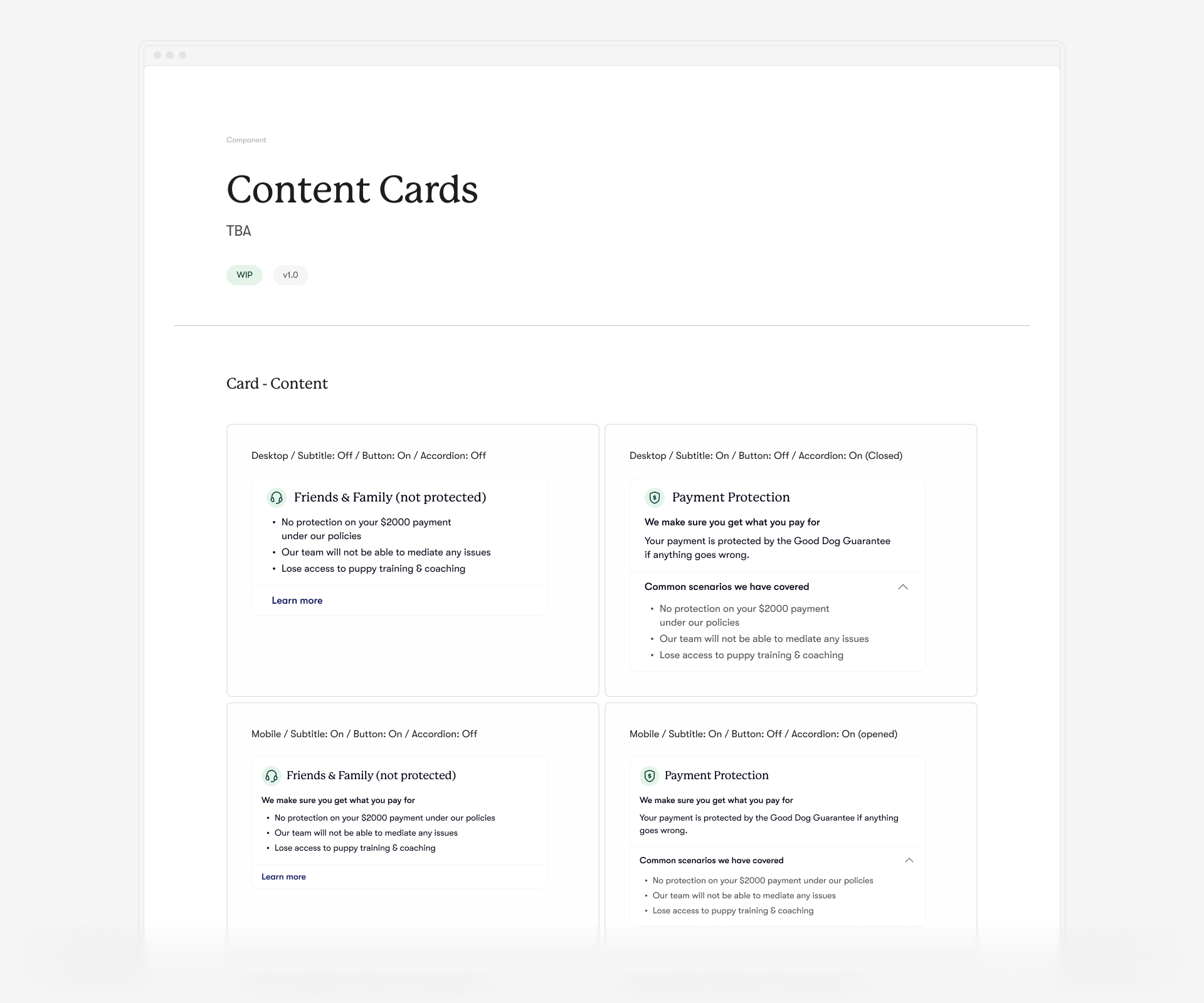
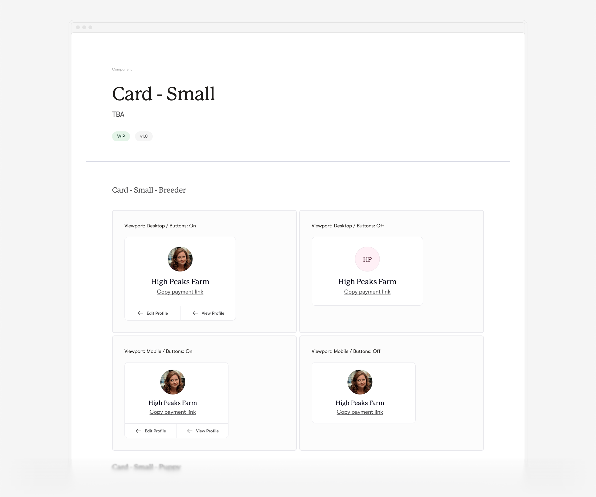
After reviewing existing and upcoming designs from the Good Dog team, I realized that a card-based approach would be ideal for this project. Cards became the linking layer between components and patterns.
This term was used loosely—some cards resembled typical layouts, while others functioned as small, drag-and-drop organisms that designers and developers could integrate into more complex layouts. Most cards offered extensive customization and multiple variants (content and viewport-related), making clear communication essential.
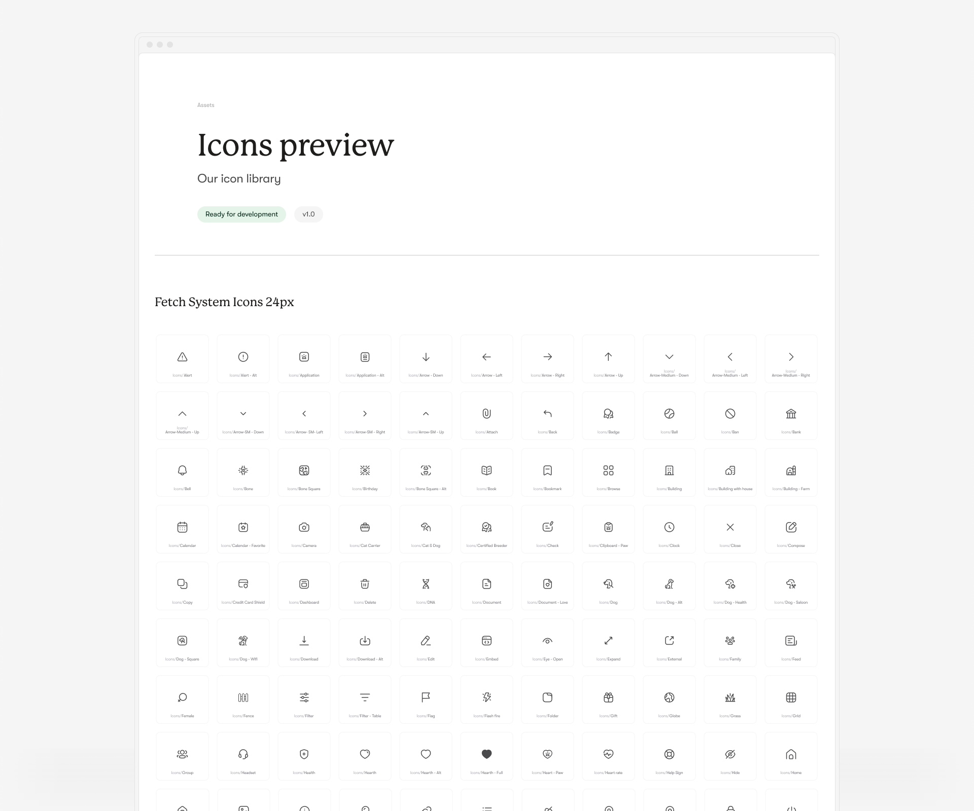
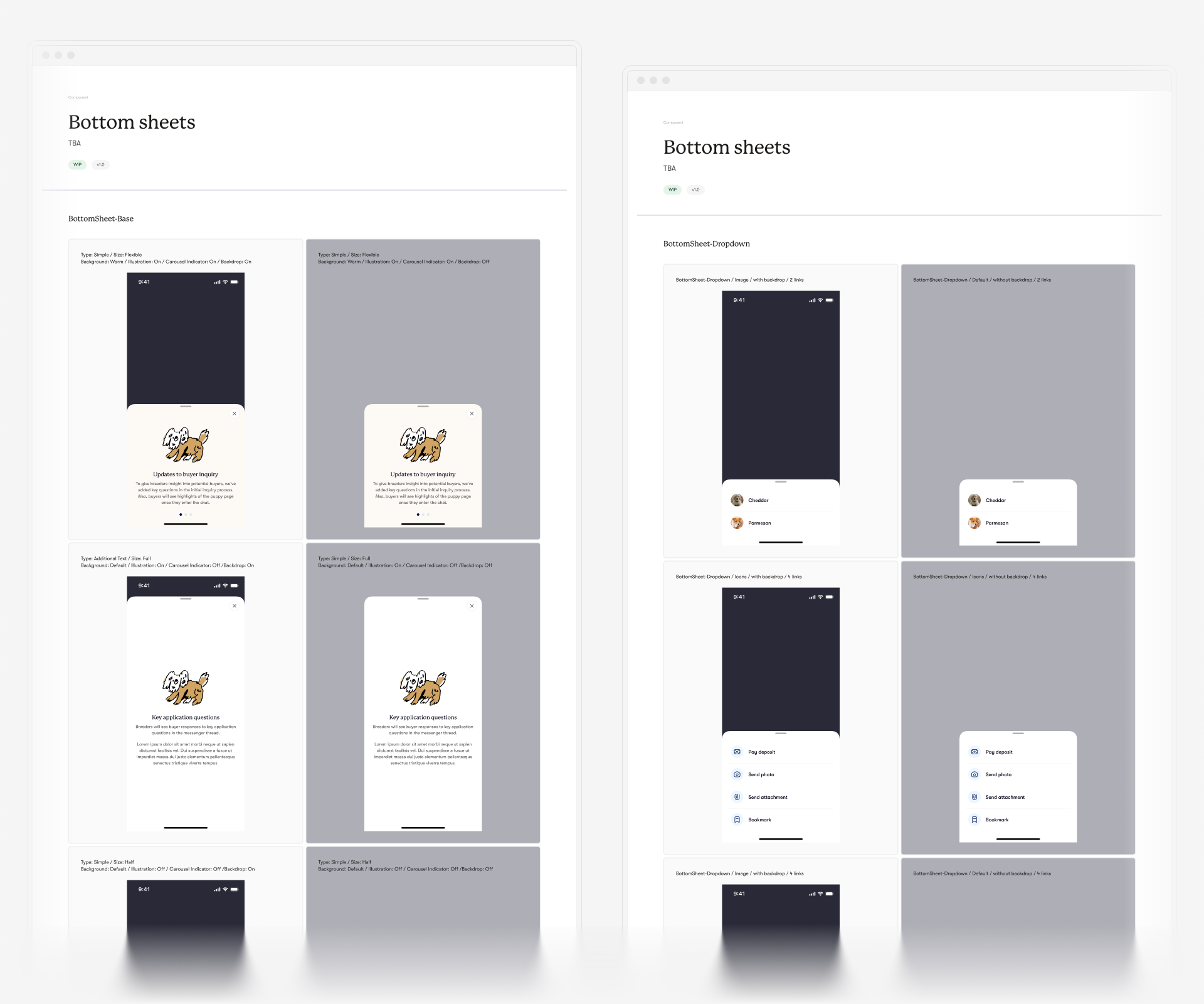
To facilitate this, each section of the design system received an overview directory, providing a comprehensive list of components and showcasing the possibilities available to the team. This ensured everyone was aligned and could effectively utilize the card-based system.
↓ Final Layer: Patterns for Consistency and Efficiency
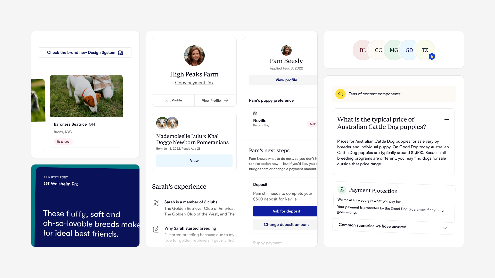
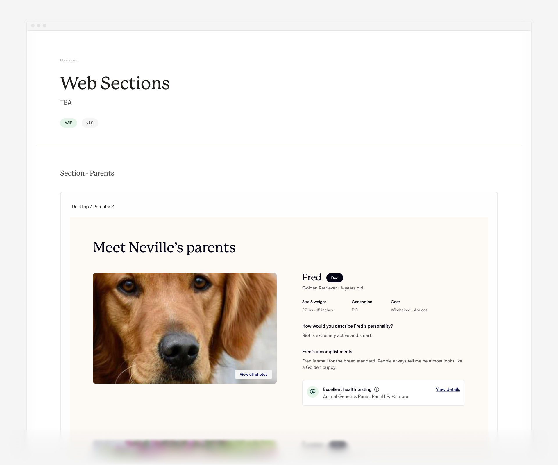
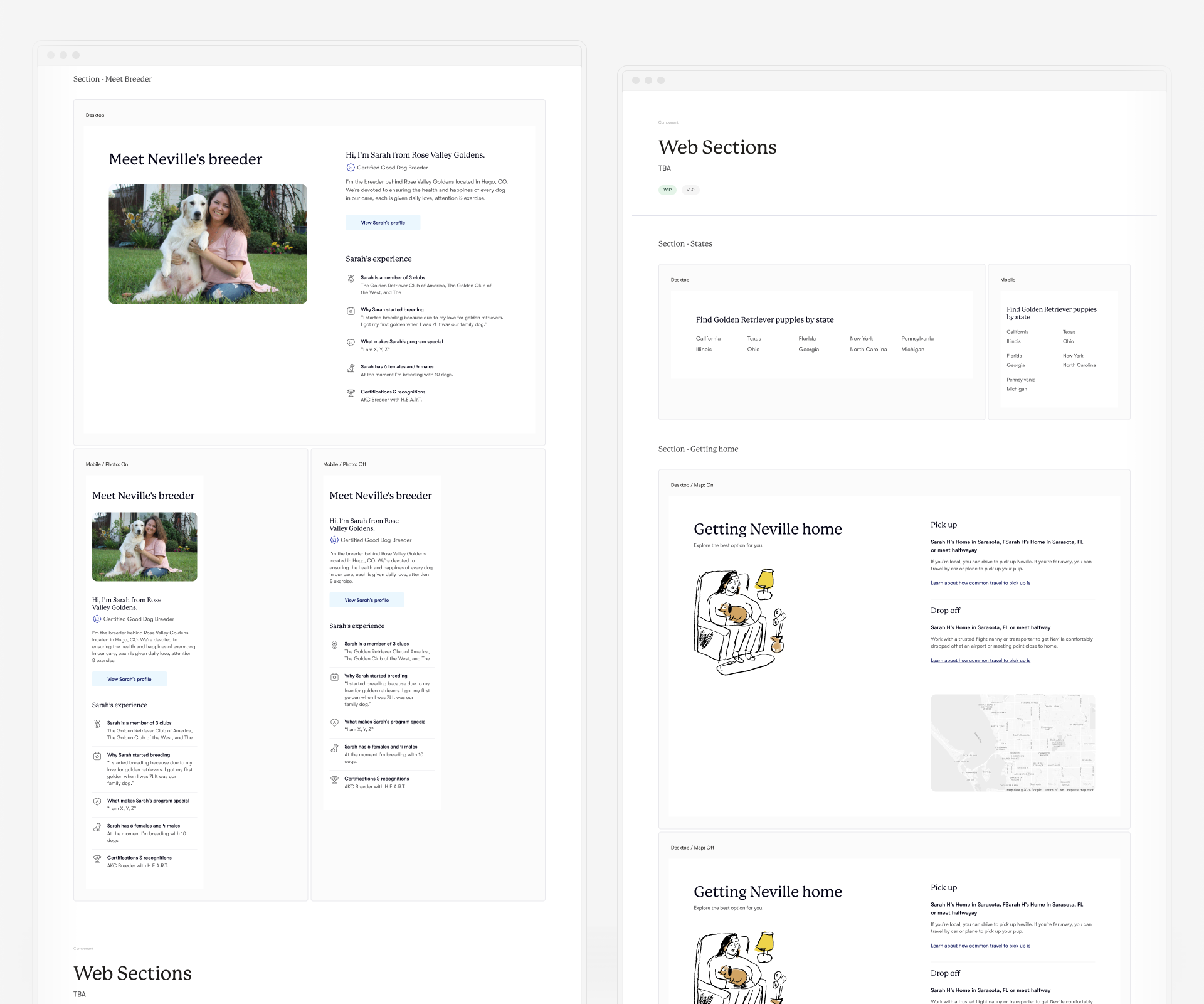
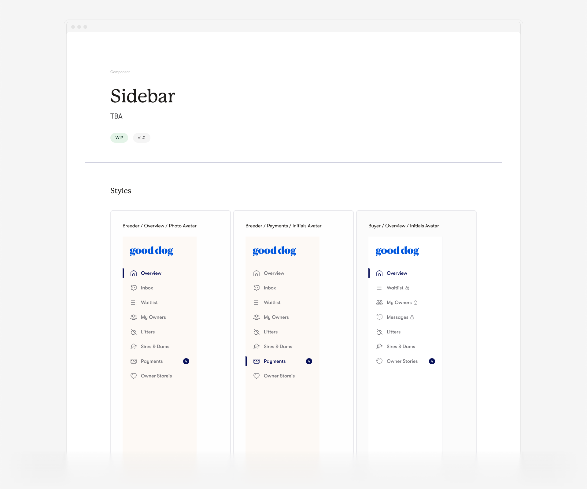
The last layer of the design system comprised patterns. These patterns included the most common sections of Good Dog's product, such as sidebars, navigation elements, and large, frequently used layouts.
The two main goals behind implementing patterns were to maintain consistency across the platform and to support team members. During early discussions, designers mentioned the difficulty of finding and copying previous or similar designs by hand. Patterns provided a solution by making these common sections readily accessible, significantly reducing the time needed for design tasks.
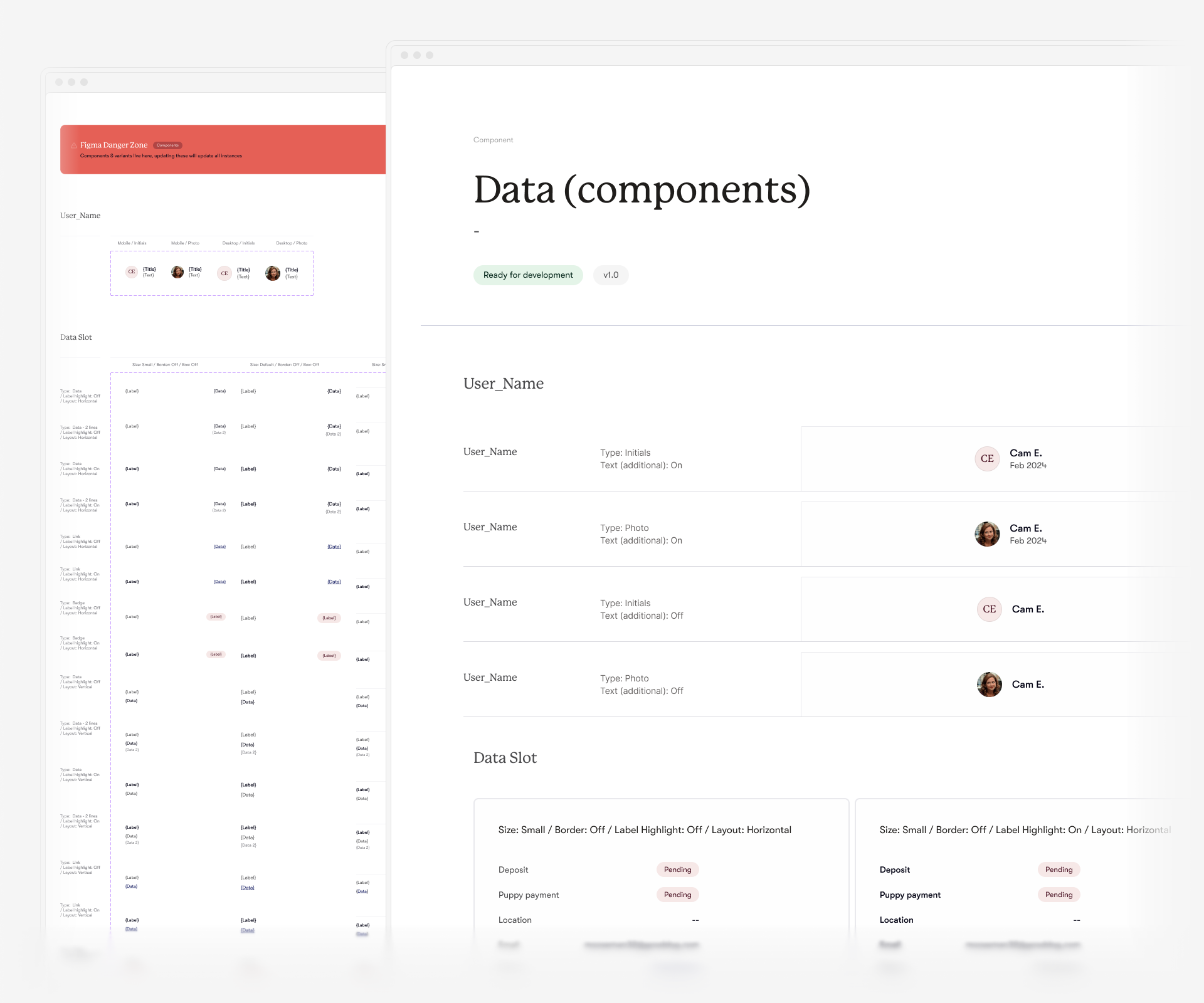
Additionally, considerable effort went into creating "Data Slot" components, which were integrated into every pattern component. This allowed designers to quickly swap content layouts to meet their specific needs, further enhancing the efficiency and flexibility of the design system.
↓ Keeping it Responsive
During the five months spent on this project, I successfully built a completely new design system for Good Dog, bringing their new art direction to life. The response from both the design and development teams was incredibly positive.
While consistency and ease of use were top priorities, I also aimed to further support the design team. My additional goal was to ensure every aspect of this system was fully responsive, enabling designers to create new products faster and providing the development team with a clearer understanding of the approach to use. This focus on responsiveness not only streamlined the design process but also enhanced overall team efficiency and collaboration.
© Tomasz Zelmański'24 → tomek@zelmanski.pl → +48 698632226
© Tomasz Zelmański'24
→ tomek@zelmanski.pl
→ +48 698632226
