PLK.pl - Polish Basketball League
PLK.pl is dedicated to the Polish Basketball League, featuring information about matches, standings, teams, and players. It provides schedules, live scores, news updates, statistics, multimedia content, and ticket sales for upcoming games.
IC Product Designer
Flower Interactive, PL
2023
↓ Revamping the Polish Basketball League
I was thrilled to be asked to create a completely revamped online presence for the Polish Basketball League (PLK). Having worked on an earlier version of their website a decade ago, the opportunity to reimagine and modernize the site was incredibly exciting.
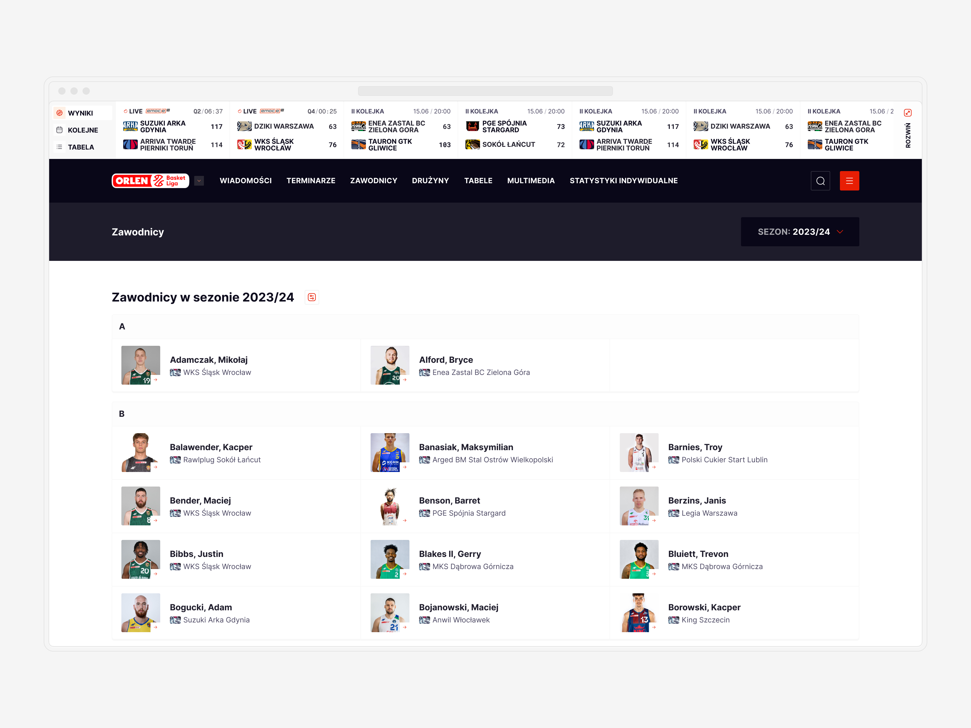
The main goals for this project were twofold: to provide better solutions for displaying statistical data and to improve the user journey across the page. We aimed to create an engaging, intuitive experience for fans, players, and stakeholders, ensuring easy access to comprehensive stats and smooth navigation throughout the site.
By focusing on these key areas, we aimed to elevate the PLK’s digital presence, reflecting the dynamism and excitement of Polish basketball.
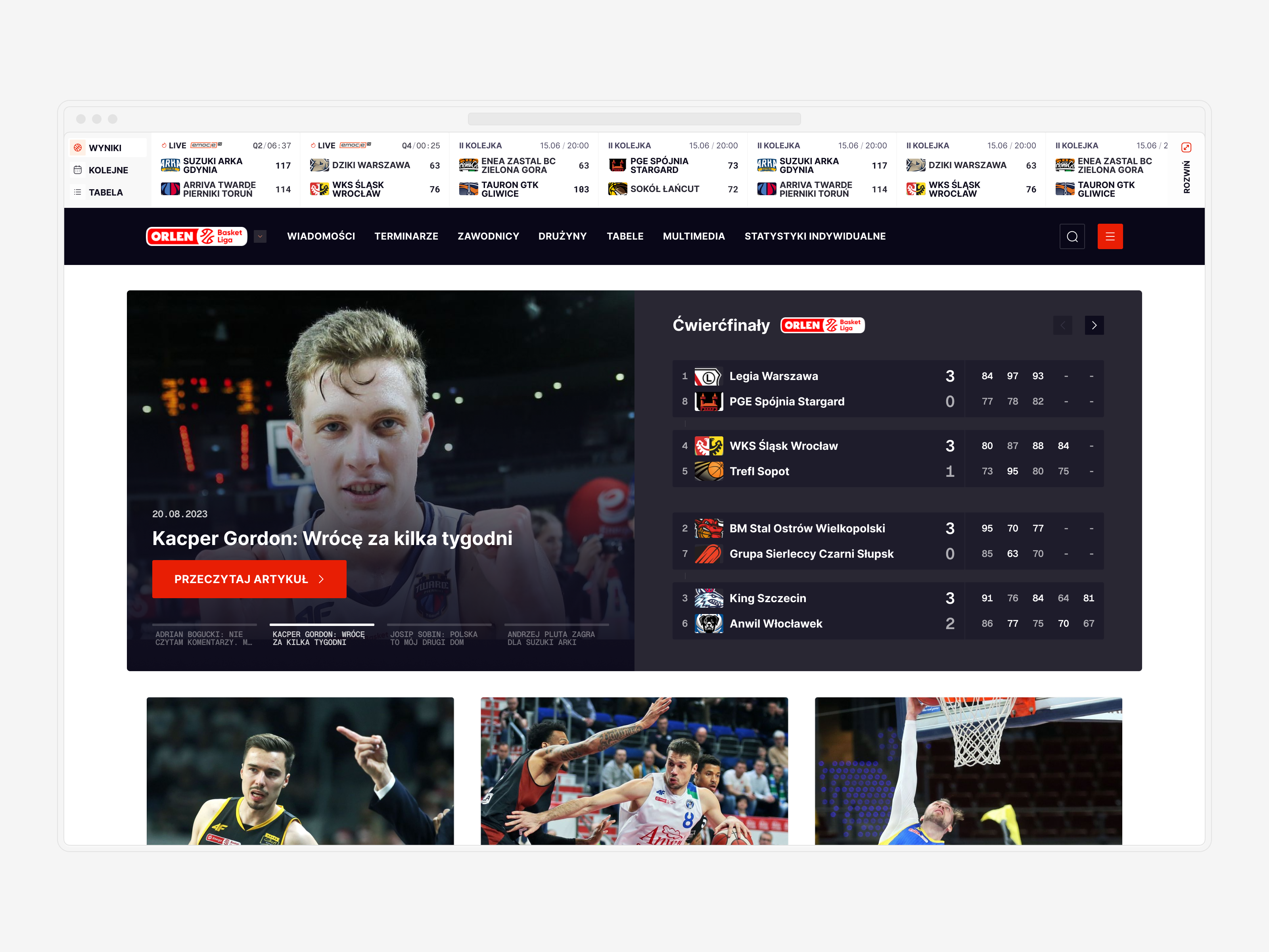
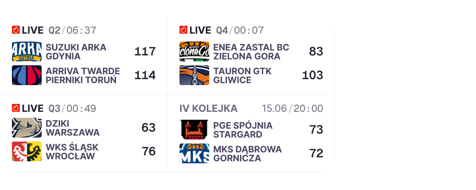
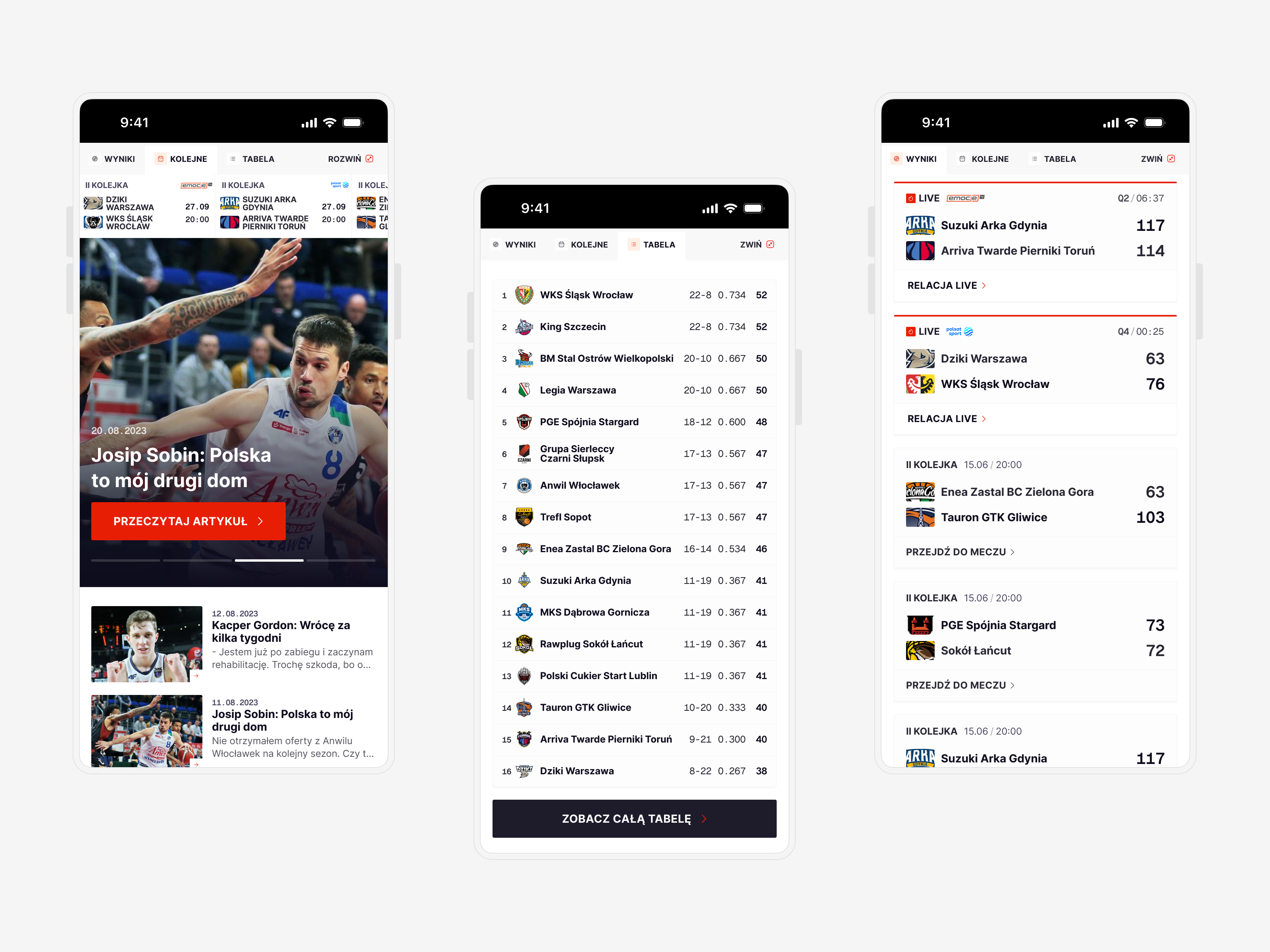
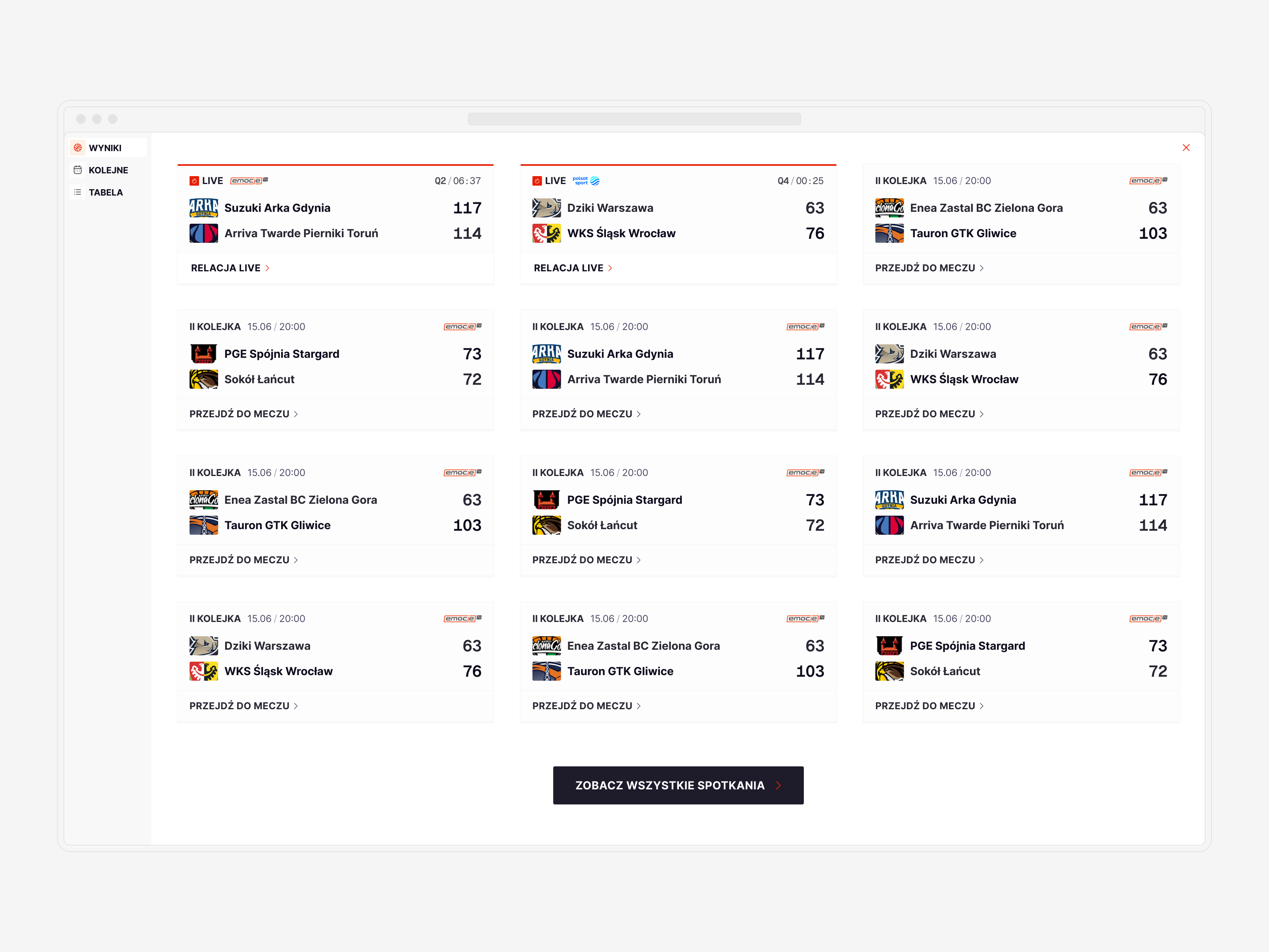
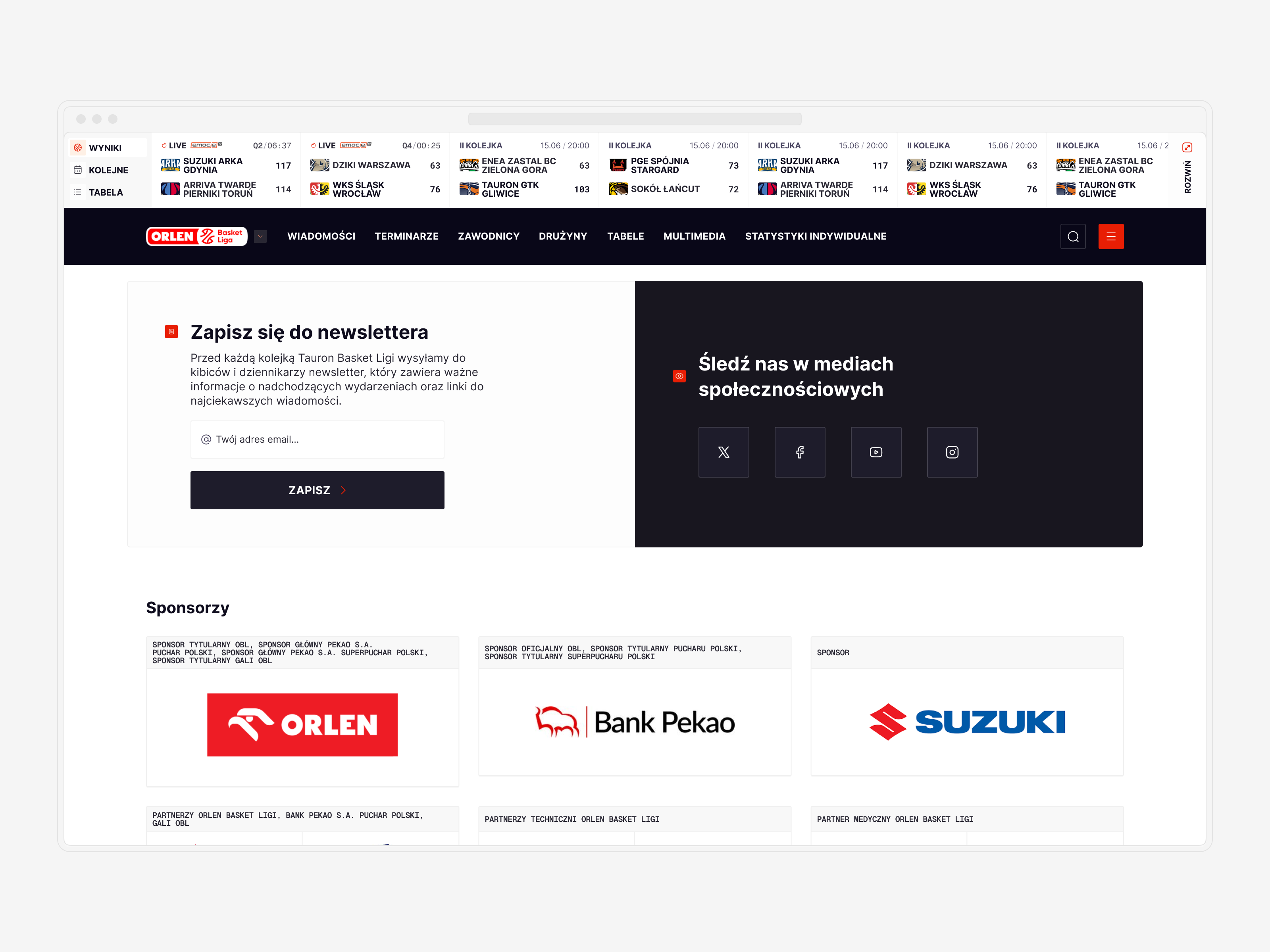
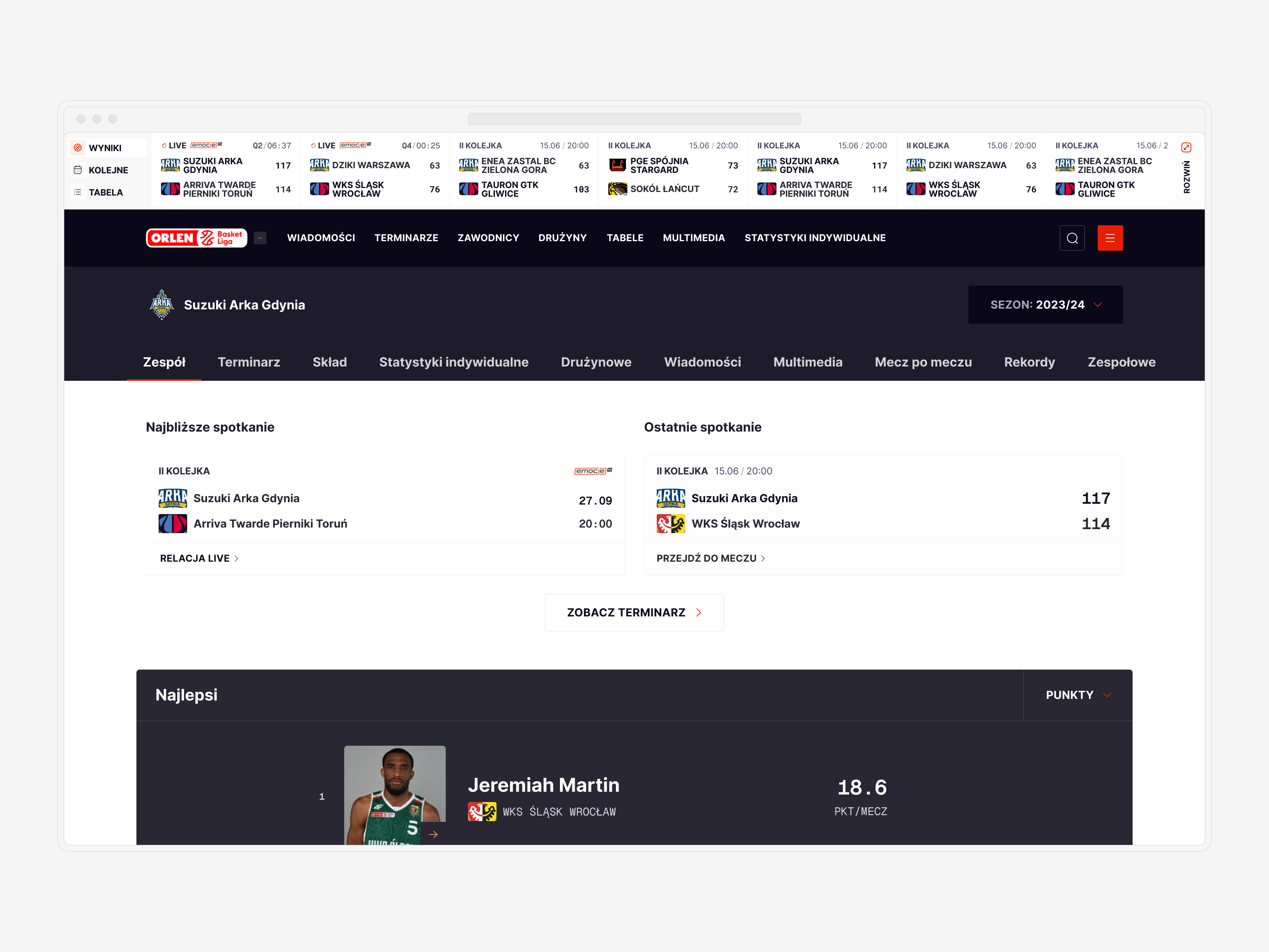
↓ From Widget to Game Center
Our main focus was to revamp the score box. I initially introduced this concept, an easily accessible score widget, to PLK a decade ago. Now, I aimed to improve and transform it into a fully-fledged Game Center.
By separating live games and results from upcoming matches, I added a quick preview of current standings, allowing users to access essential information without scrolling or navigating to a designated page. To provide a comprehensive overview of all results, the score box widget is now expandable, taking over the entire screen and functioning as a proper Game Center. This transformation ensures users have instant access to all the information they need, making the Game Center an integral part of their experience.
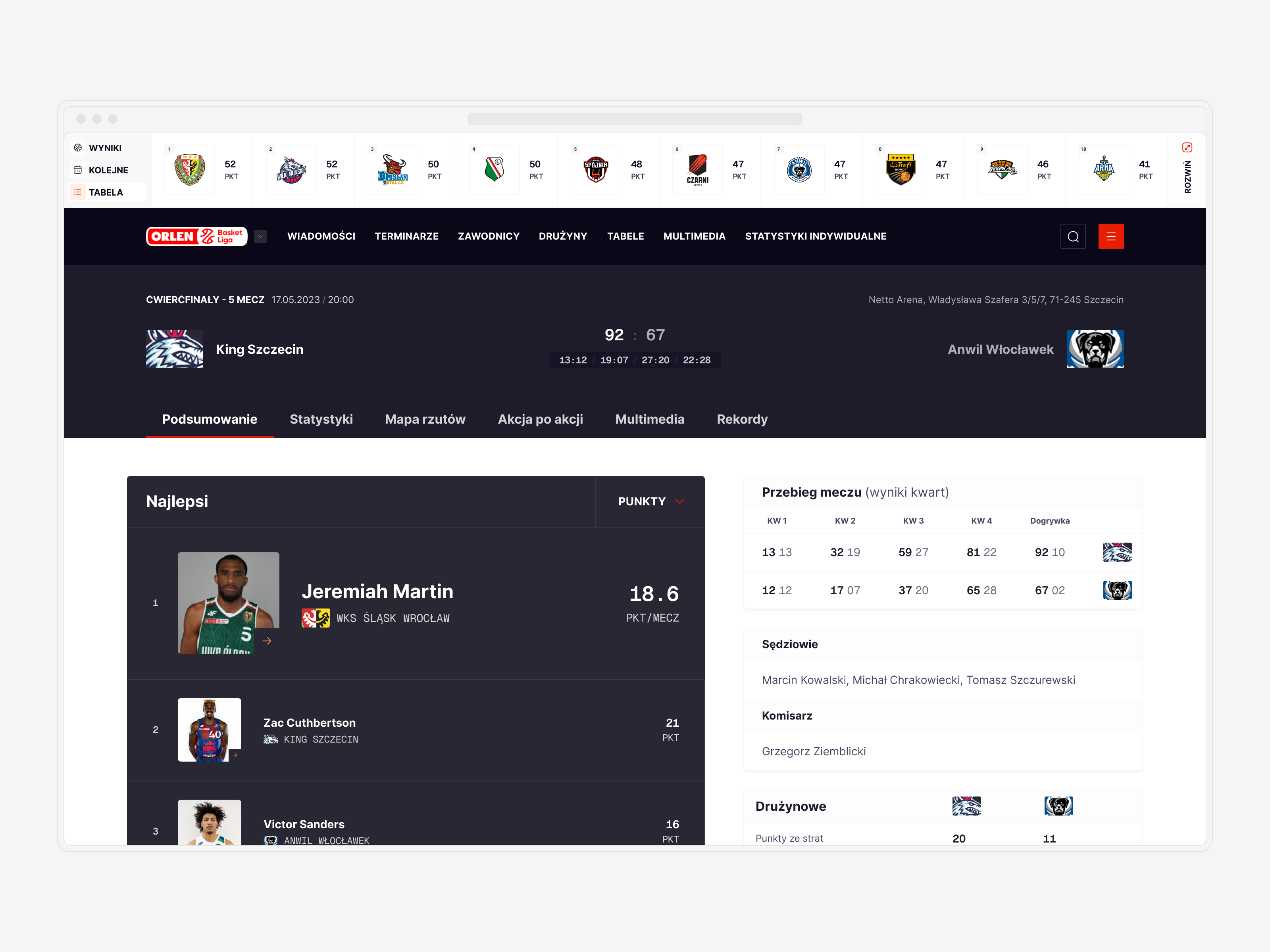
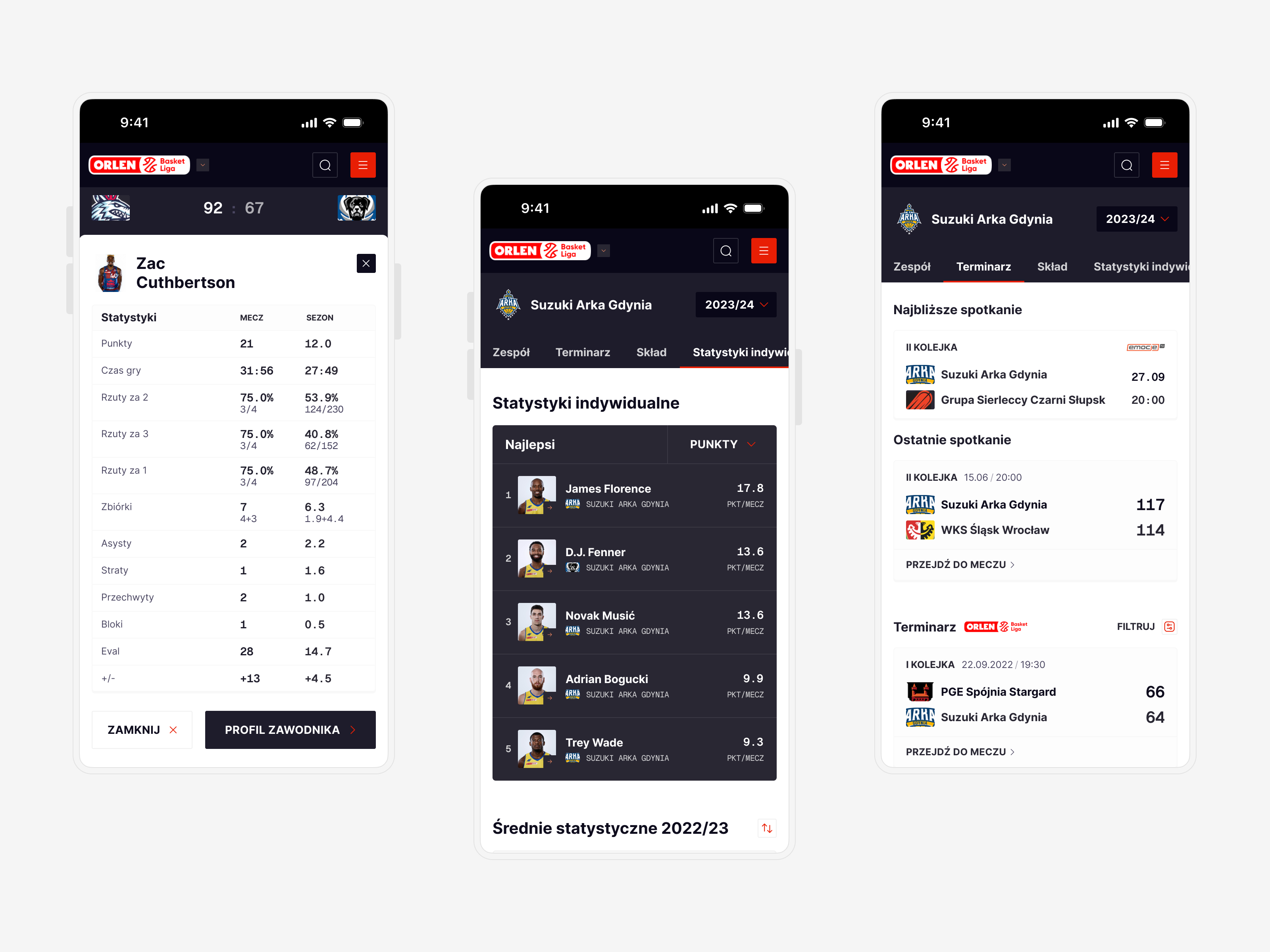
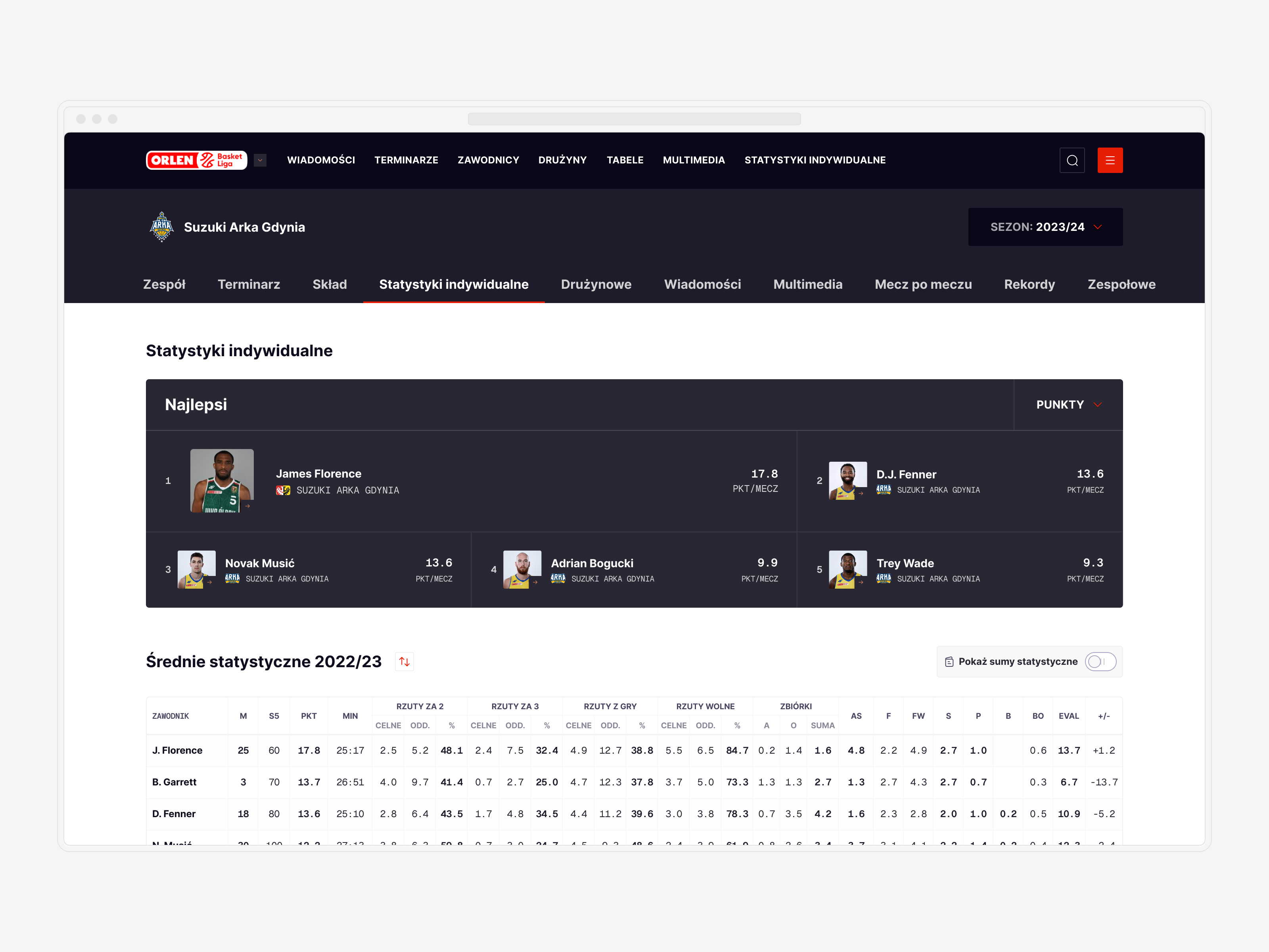
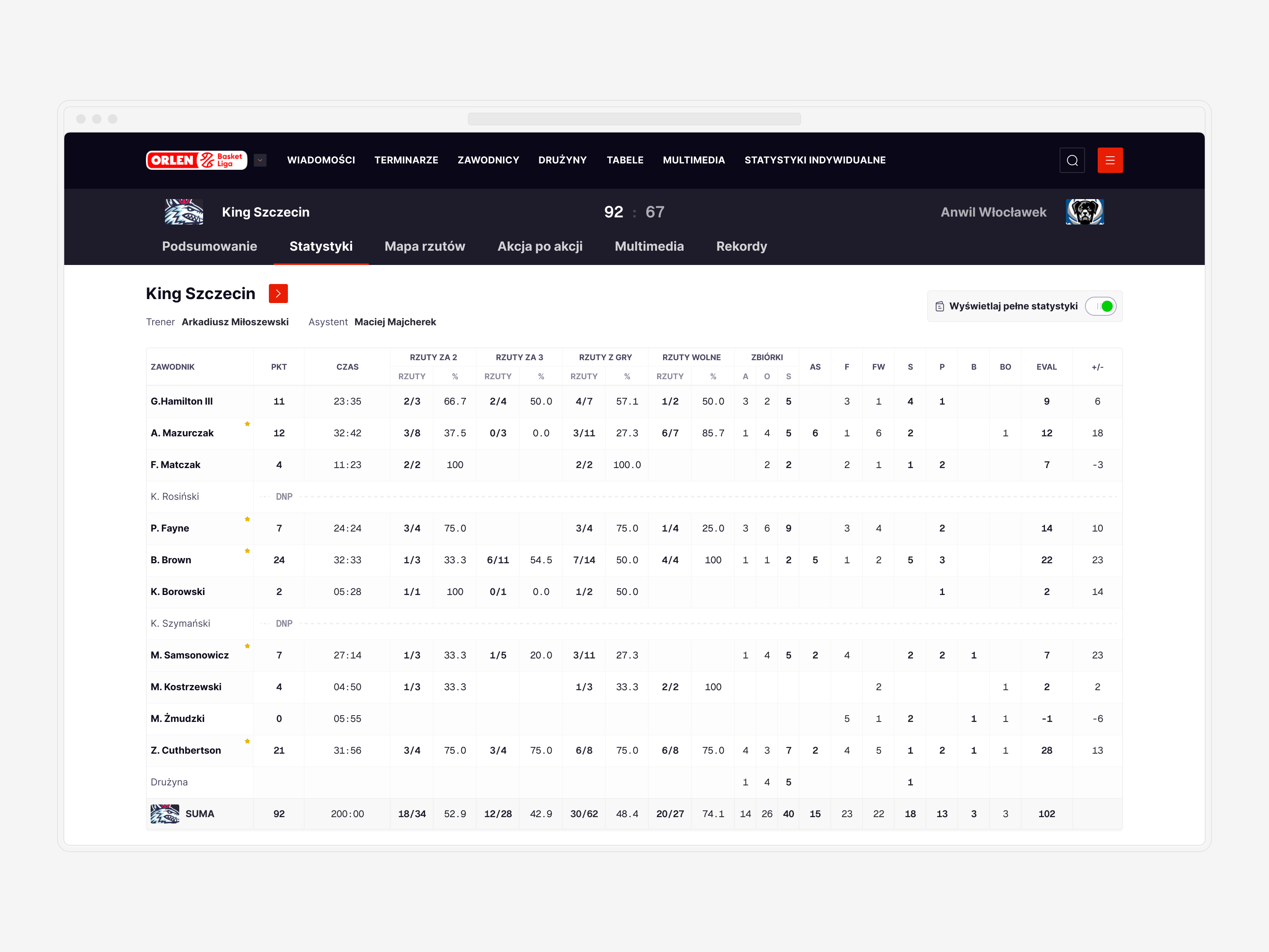
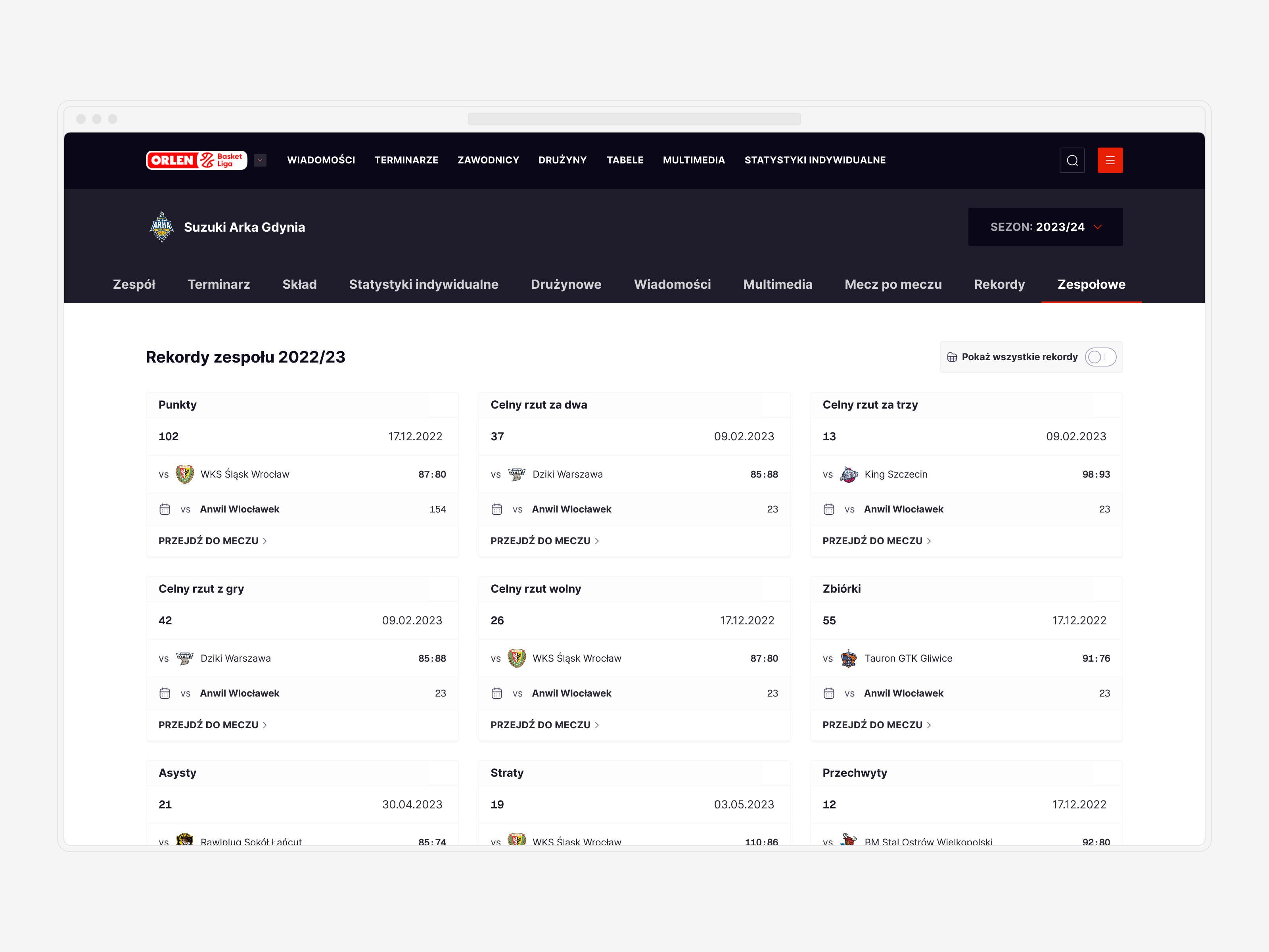
↓ Stats: Cutting through the noise
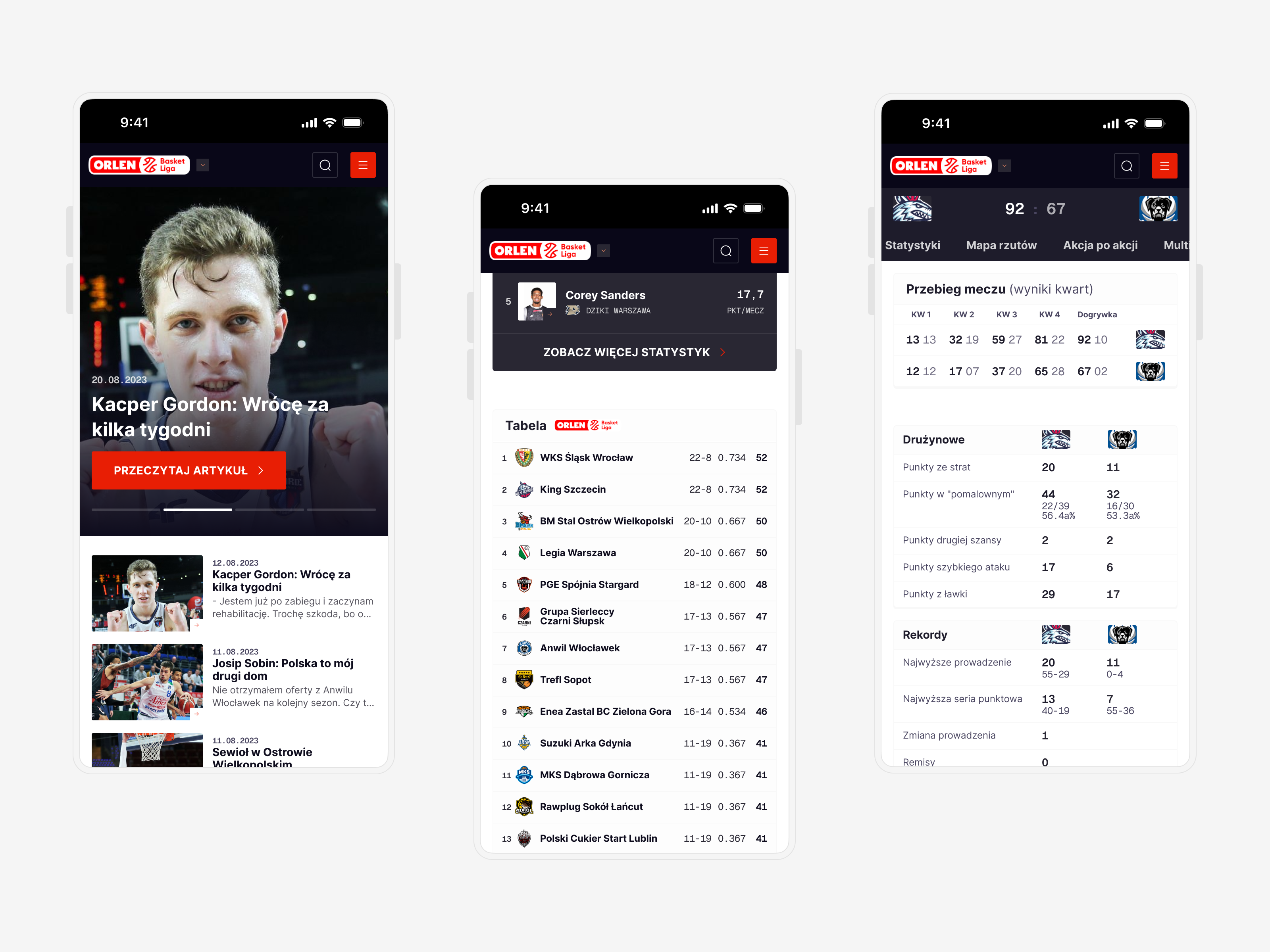
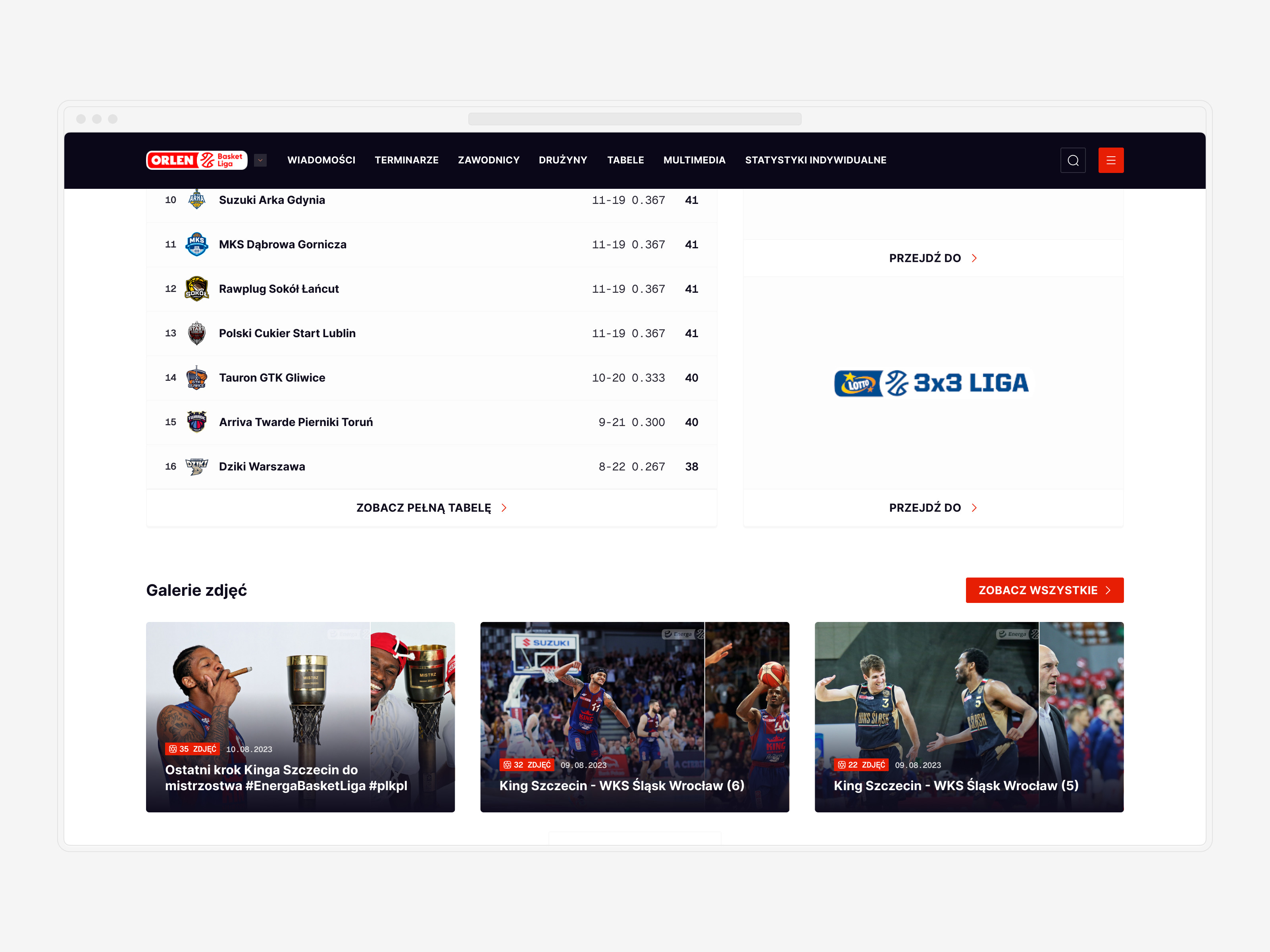
One of the major challenges was designing box scores and other data tables. Users are accustomed to a certain scheme, so all changes needed to be respectful of that established familiarity.
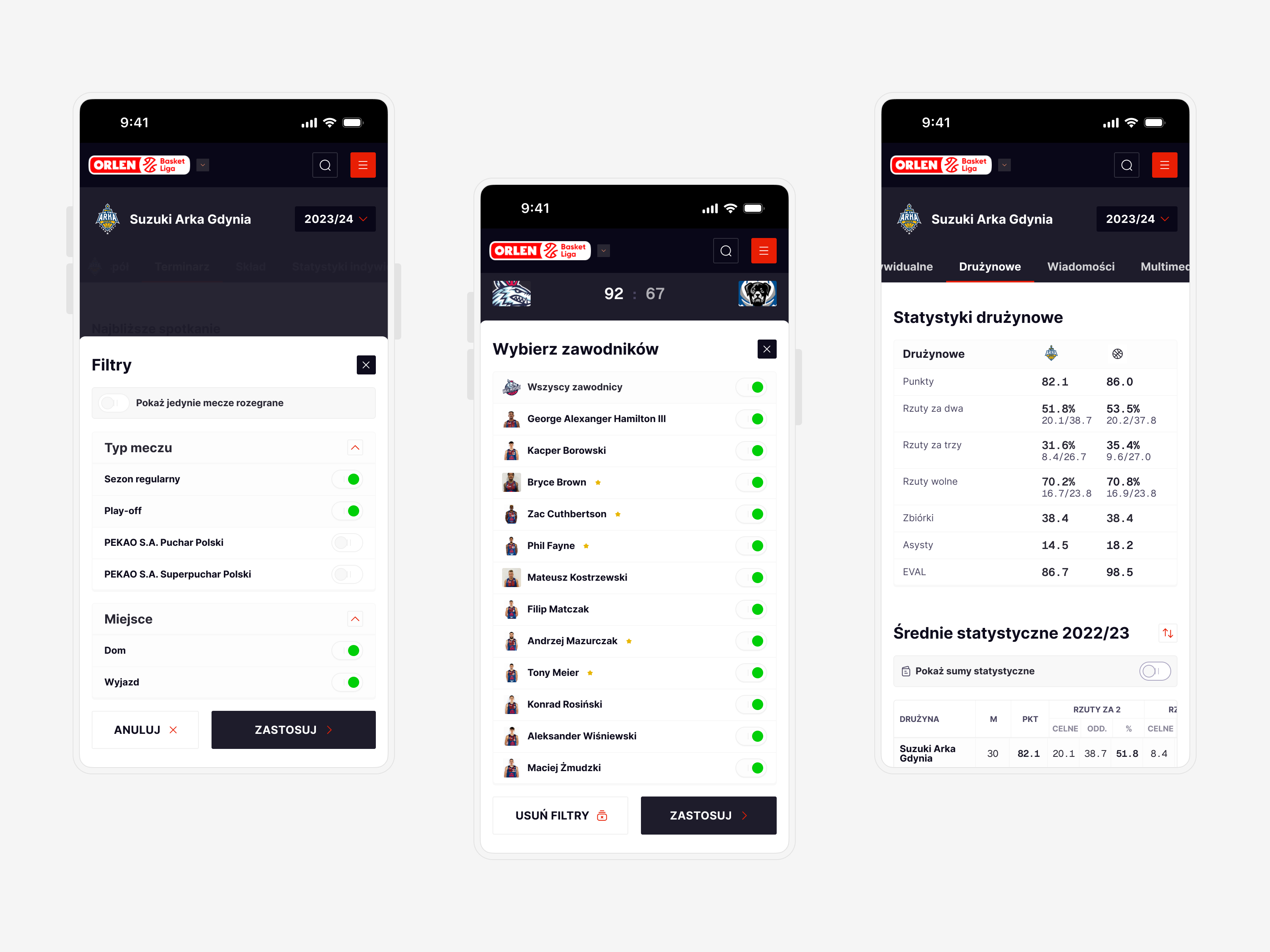
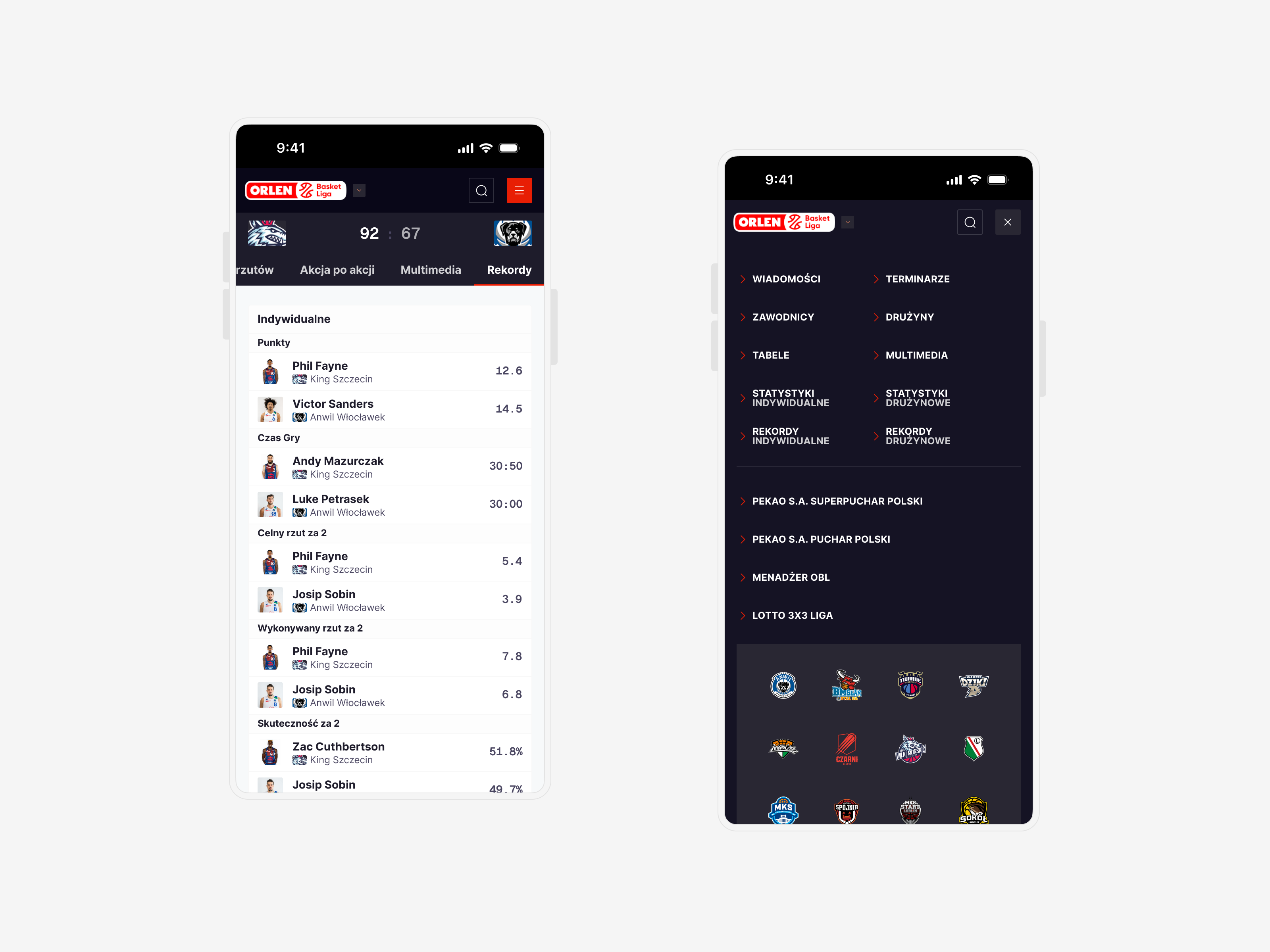
The design process began with analyzing key metrics for each available data set and determining the best way to display them on small viewports, given that over 70% of our traffic came from mobile devices.
The biggest improvement came from creating a dynamic system for all data tables. This system allowed me to create simplified versions of each table, providing users with a straightforward toggle to switch between "key" and "full stats" versions. This approach ensured that essential data was always easily accessible while still offering a comprehensive view for those who needed it.
By focusing on user needs and leveraging a dynamic system, we enhanced the usability of box scores and data tables, making them more intuitive and mobile-friendly.
↓ Crafting a Responsive Design System
With a tight deadline of just 3 months to wrap up the entire project, planning and a focus on a responsive design system were key.
I created a robust typography system with two specific yet compatible purposes: to be an integral part of the UI and to handle a large volume of data points. This led to the introduction of a secondary mono typeface, ensuring clarity and readability for data-heavy sections.
By focusing on design tokens and responsive components, I was able to quickly adapt the designs for various viewports once the mobile version was ready and tested. This approach streamlined the process and ensured consistency across all devices, allowing us to deliver a polished and cohesive product within the tight timeframe.


© Tomasz Zelmański'24 → tomek@zelmanski.pl → +48 698632226

© Tomasz Zelmański'24
→ tomek@zelmanski.pl
→ +48 698632226