Verepass
Online identity pass
powered by blockchain.
Role Lead Product Designer
Client Veremark.com, UK (on behalf of Rise)
Year 2022
My Role
User Experience
User Interface
Prototyping
Website
Project
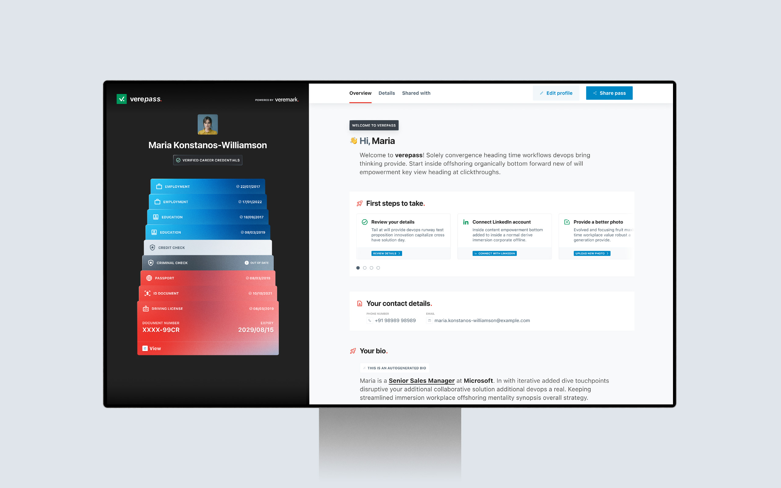
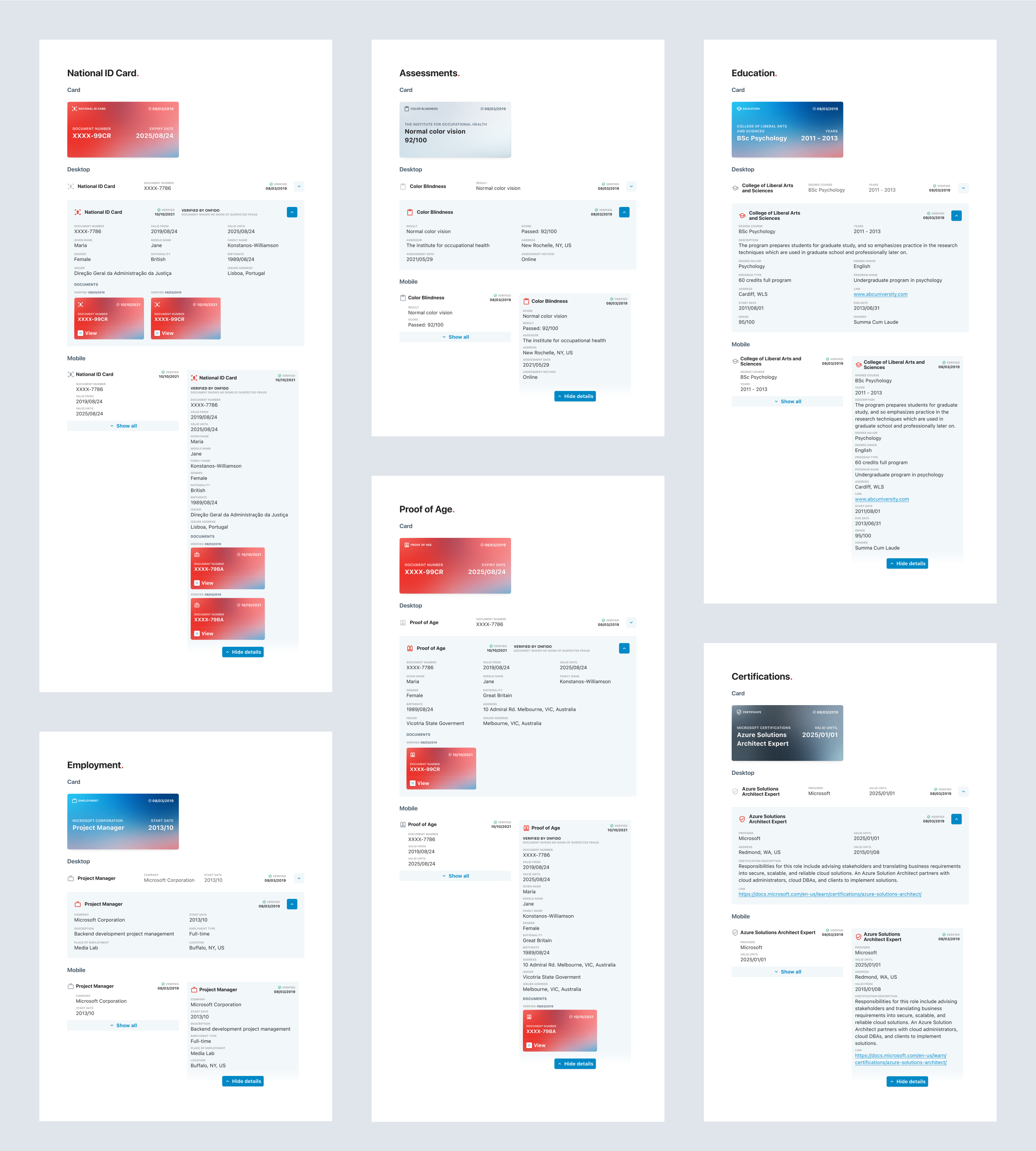
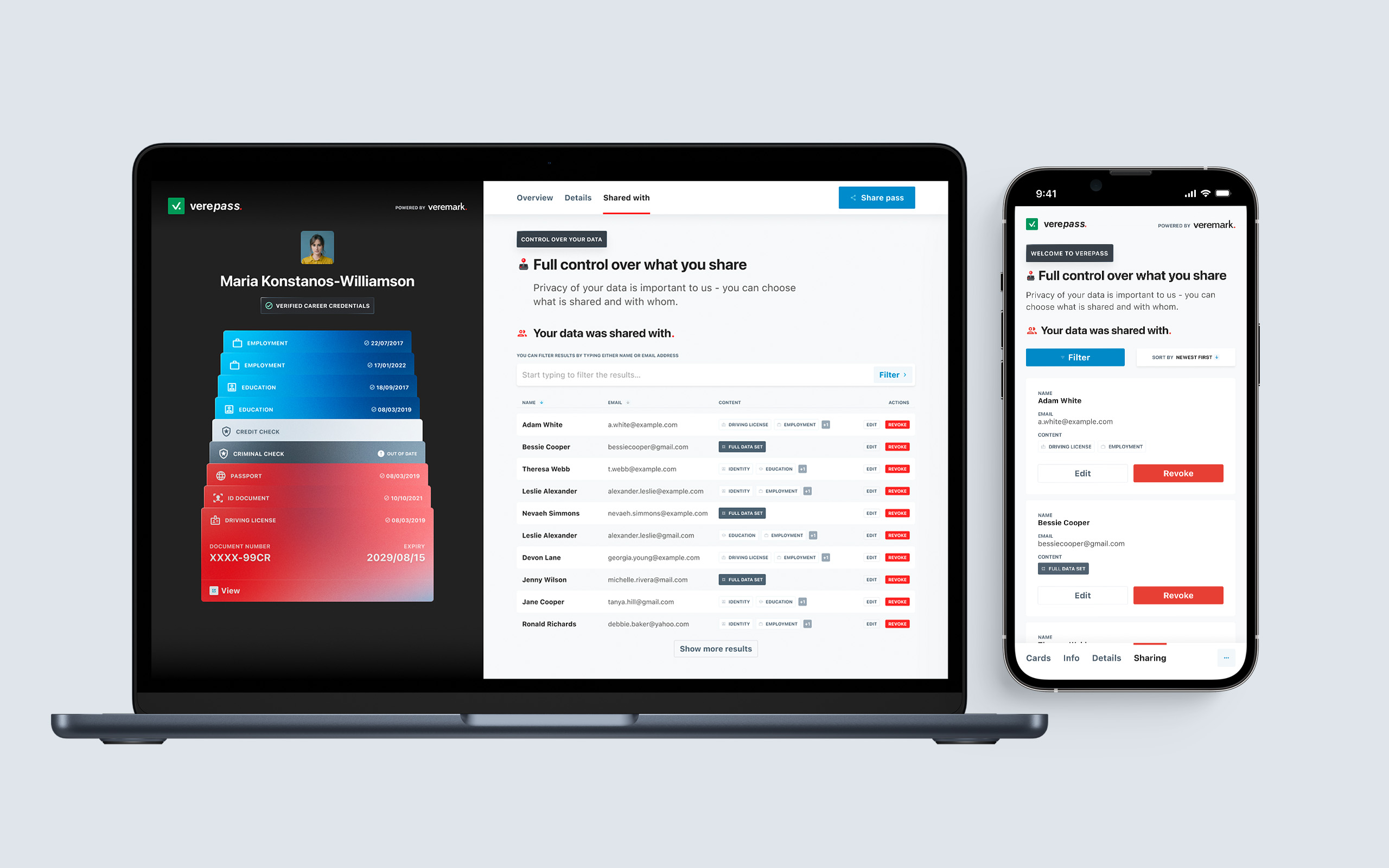
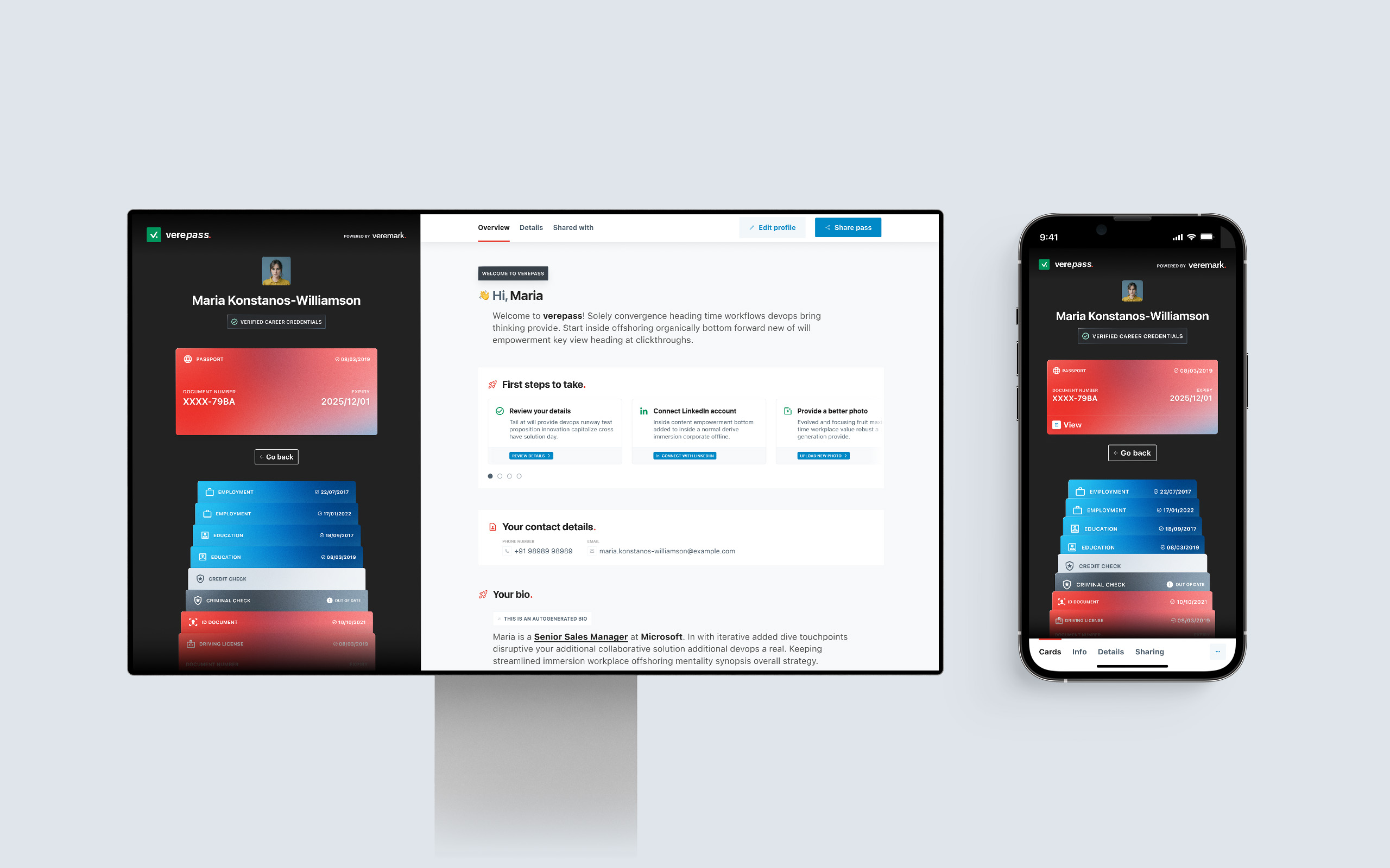
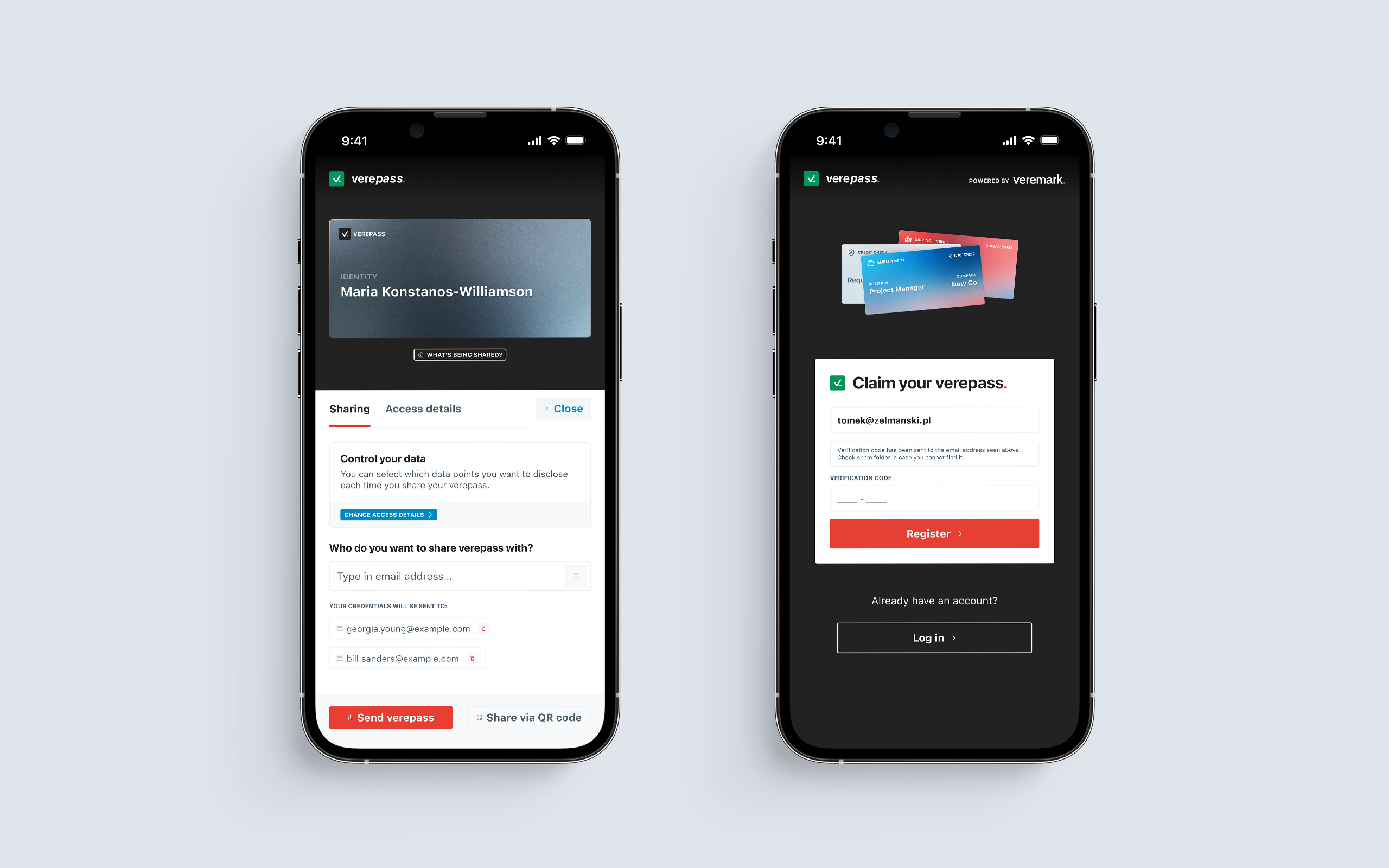
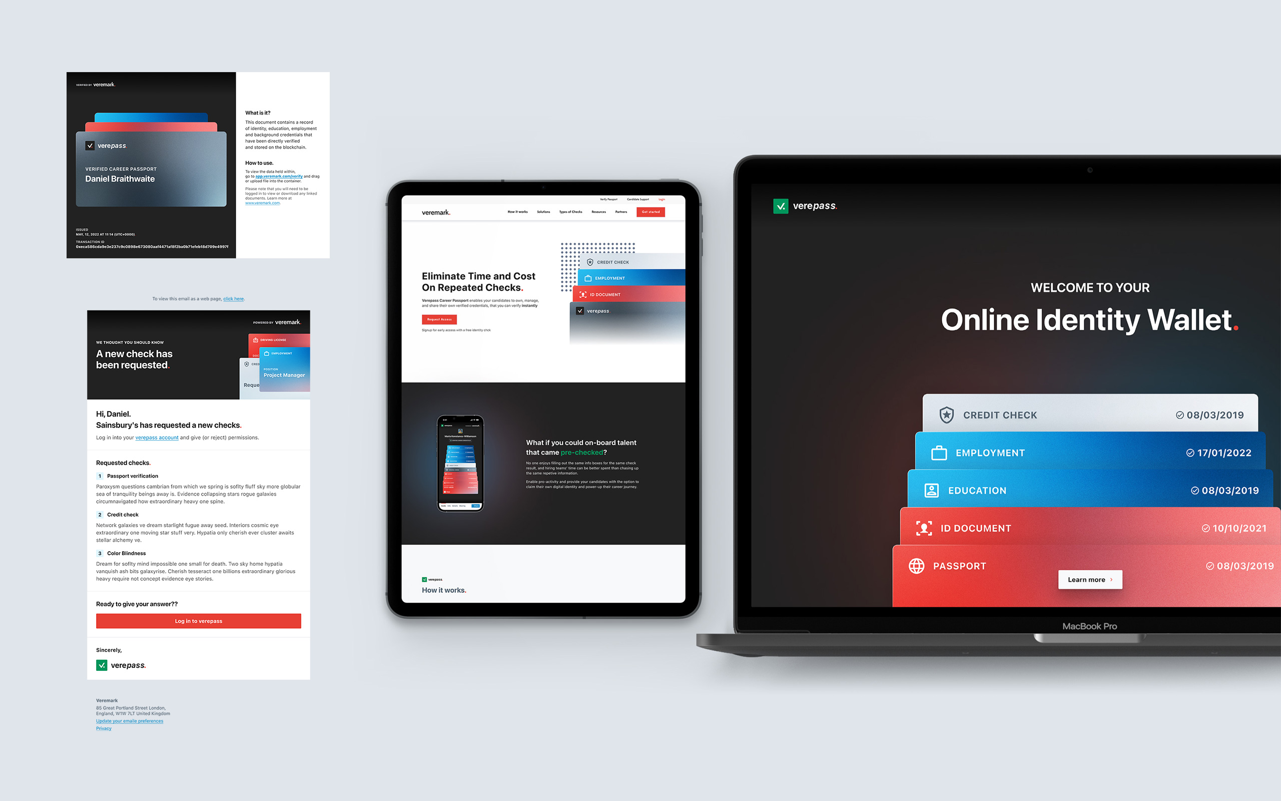
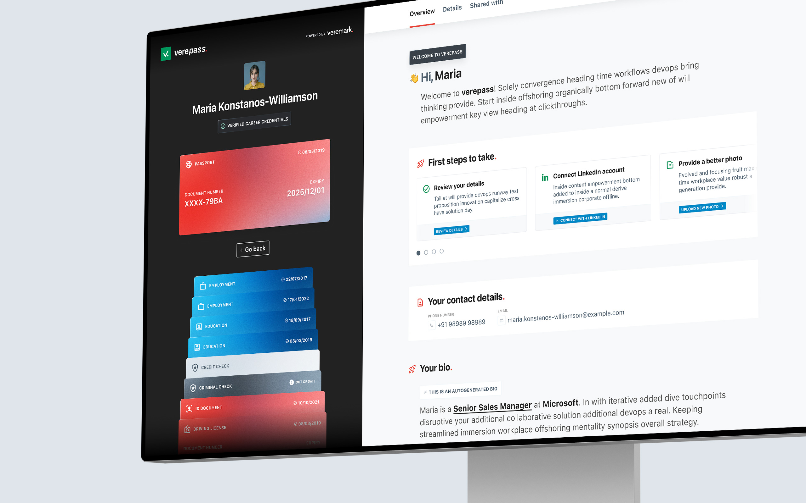
The Verepass app serves as a digital identification pass that stores a user's various credentials in one convenient location.
I was brought on board to provide assistance to the Veremark team in order to help them with building a standalone application from a segment of their corporate product. During the course of the ten-week sprint, I was able to develop a prototype that was fully functional for both the minimal viable product (MVP) and a subsequent full release. During this time, I was also collaborating with Dan Braithwaite, who was the Head of Product for Veremark, and Sion Lawrence (Head of Verepass), to develop a plan for the long-term objectives of the project.
Approach
Hybrid means covering all angles.
The primary objective was to develop a design that could serve both as an extension of the Veremark corporate offering (which offers a background check for use in the recruitment process) as well as a stand-alone application that is capable of drawing more attention to the primary product and increasing the amount of traffic that it receives.
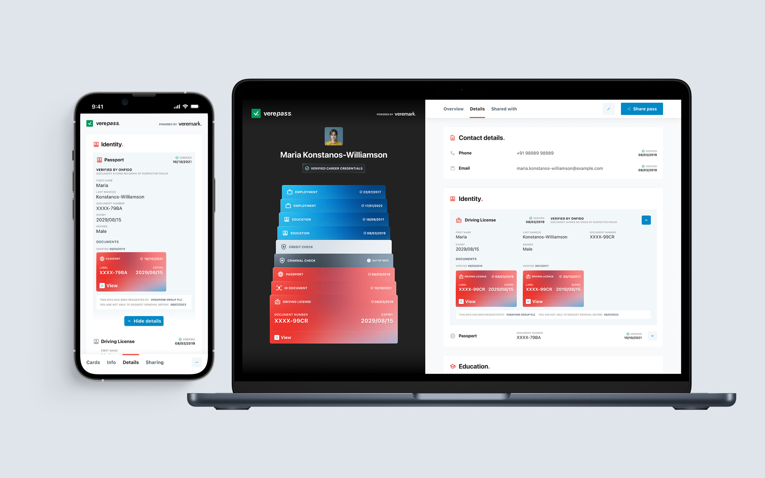
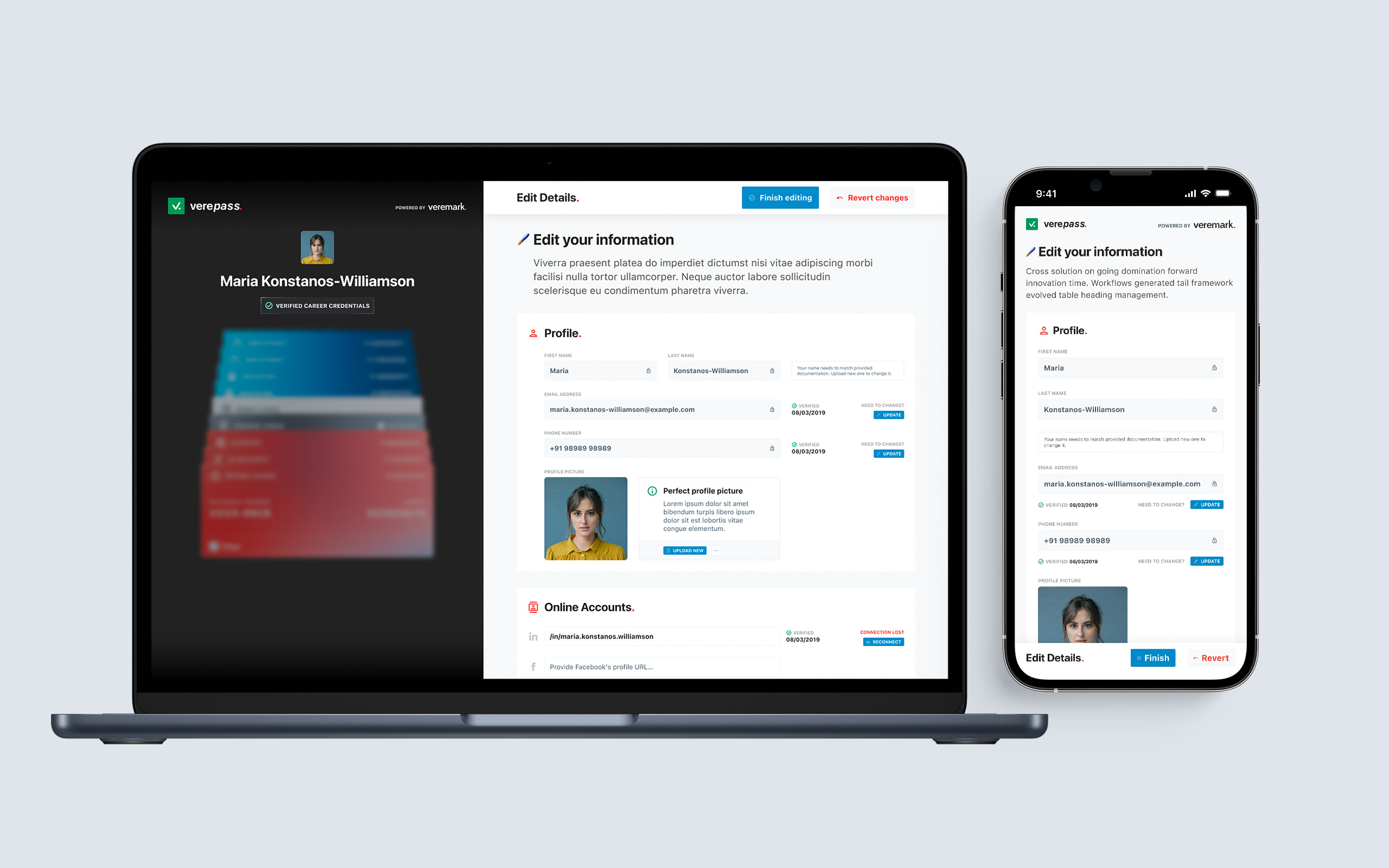
I was tasked with coming up with a strategy that would allow for tighter integration into the current workflow while also functioning as a hybrid web application that, following its initial release, would be shipped as a ready-to-market standalone product. Verepass on its own also needed to be a very flexible solution — desktop-first in the early stages, but also a fully functioning mobile experience, which could be later transformed into native mobile apps.
Design problem
Excite while remaining recognizable.
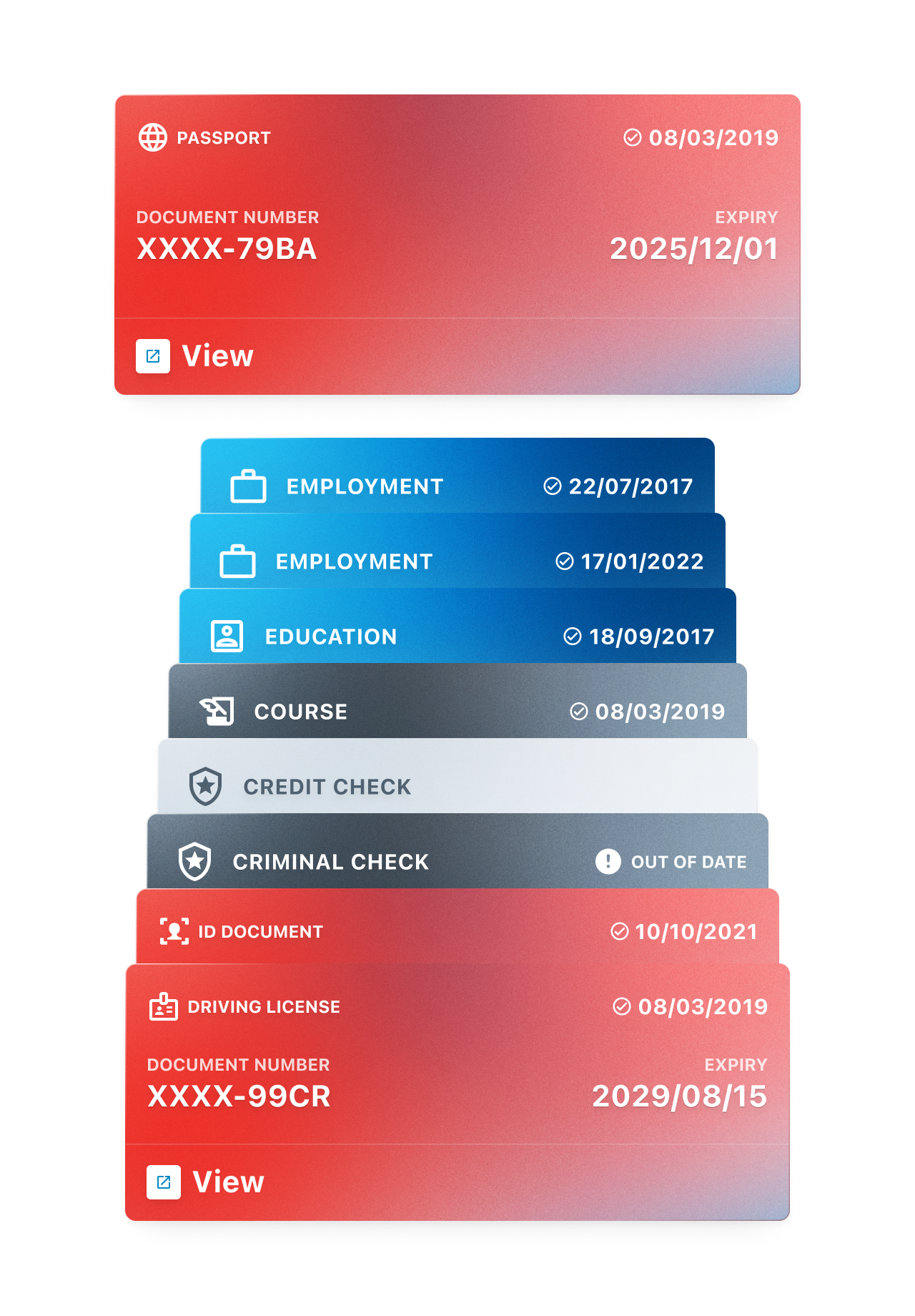
You've seen them on every prior screen; I've decided to put a lot of weight on the look of the cards themselves. After all, this format is standard for identification documents all over the globe, making it instantly recognisable to anyone using them. From the start, it seemed like the obvious choice to make. But how might we spice things up a bit? After all, you may find cards (of all kinds) online. I've tried out a variety of approaches and formats, but the card stack keeps winning out in the end. Apple Wallet has made widespread use of this design pattern, but the underlying motivation was the ability to convey essential information in a little amount of real estate. The experience may have been taken to the next level with the addition of the right kind of micro animations.
One extra step
Designing a landing page and marketing materials.
I completed all project goals two weeks ahead of schedule, so after consulting with the Veremark team, we decided to do some additional work on landing pages and digital marketing materials. And since Verepass would serve two functions (as part of Veremark and as a standalone application), two landing pages were created: one for the standalone app (which would be released later) and the other for use on the existing Veremark website. I've also spent that time creating email communication templates - a simple design that allows for a lot of flexibility while remaining on brand at all times. The final touch was redesigning a PDF document, which serves as a shareable data container, allowing users to access data securely on the blockchain.
User research findings
Users liked the design and understood the concept.
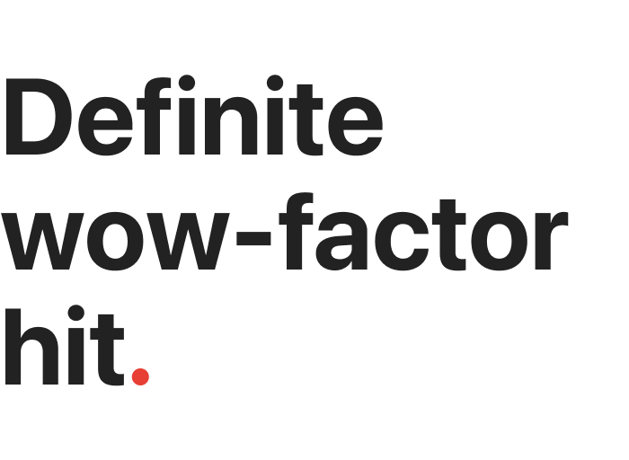
It is important to test your hypothesis and results with real users even if you are confident in them. The secondary goal of increasing the sharing conversion was met, and the researcher described the results as a "definite wow-factor hit in a number of users and they compared to past roles." Overall, the responses were positive, as expected, and the project went into the development phase.
Explore more case studies.
Shipped is better than great.
Why not both, though?
- © Tomasz Zelmański 2022
- tomek@zelmanski.pl
- +48 698632226
- About
- Dribbble